We may earn revenue from the products available on this page and participate in affiliate programs. Learn More ›
Paint not only adds visual interest to a space, but it can encourage personal expression and create an overall mood. Choosing a color can be difficult, but major paint brands make it easier when they announce their top color picks for the year, setting the stage for the coming décor trends. A common thread in this year’s top colors is that they were inspired by nature. From the sea to the soil, the natural world is clearly reflected.
While blue is always popular, it’s certainly having a moment in 2024, with picks ranging from livelier shades to more subdued tones. Earthy greens take a close second in natural, olive hues. For those who prefer simplicity, a couple of neutral tones in the pack are sure to satisfy. Before committing to a new wall or accent color, take a look at this year’s paint colors of the year.
1. Sherwin-Williams: Upward
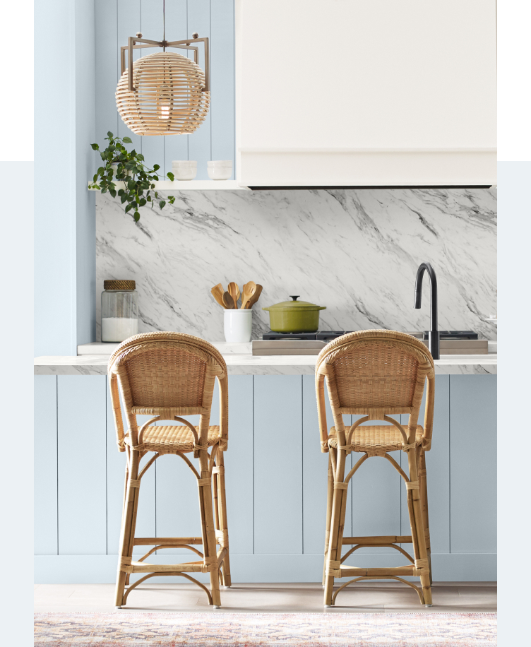
The Sherwin-Williams color of the year, Upward, is a breezy sky blue with touches of gray. The company describes the shade as “The color found when we slow down, take a breath, and allow the mind to clear.” The breezy blue will work well in any room of the home, especially ones that require a touch of brightness and comfort.
Get Sherwin-Williams paints at Sherwin-Williams Paint Store
2. Dutch Boy: Ironside
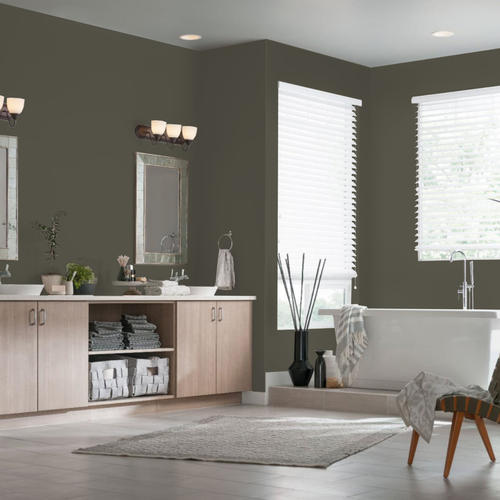
Acting as the anchor for the company’s 2024 color palettes, Ironside is Dutch Boy’s top pick of the year. The olive-green hue has black undertones for a shade that is both earthy and sophisticated. The company says, “This deep, comforting green is a richly dimensional hue that soothes and reassures.” Try it on built-ins and millwork for a refined look.
Get Dutch Boy paints at Menards
3. Graham & Brown: Viridis

Another top pick in the olive green family, Viridis from Graham & Brown is meant to embody “fertile green hills” found in nature. According to the company, the color follows the trend of blurring the division between inside and outside for an earthy and welcoming look. They recommend using it in entrances and entertaining areas to provide a seamless transition to the outdoors.
Get Graham & Brown paints at The Home Depot
4. Behr: Cracked Pepper

Unsure about black on as the next hot wall hue? Behr’s color of the year, Cracked Pepper, will have you reconsidering. This soft black is perfect for an accent wall or details like built-ins, inducing a moody and sophisticated look. Pair it with gold hardware or fixtures for a stand-out design statement.
Get Behr paints at The Home Depot
5. Glidden: Limitless
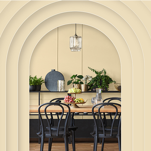
A departure from the other selections on this list, Limitless from Glidden is a neutral beige with yellow undertones. The color is perfect for dark spaces that could use a bit of brightness. The hue is sunny while also offering warmth, making it a great choice for kitchens and bathrooms, especially when paired with darker wood tones.
Get Glidden paints at The Home Depot
6. Krylon: Bluebird

For smaller accent pieces, Krylon’s Bluebird will infuse personality into a modern space. The bright blue shade can be sprayed on multiple surfaces to create stand-out design pieces, such as tables, chairs, benches, and bedframes. “Bluebird gives a nod to the trending theme of dopamine decor, which promotes choosing colors that spark joy and contentment,” says Ashley Banbury, Color Marketing Manager for Krylon.
7. Benjamin Moore: Blue Nova
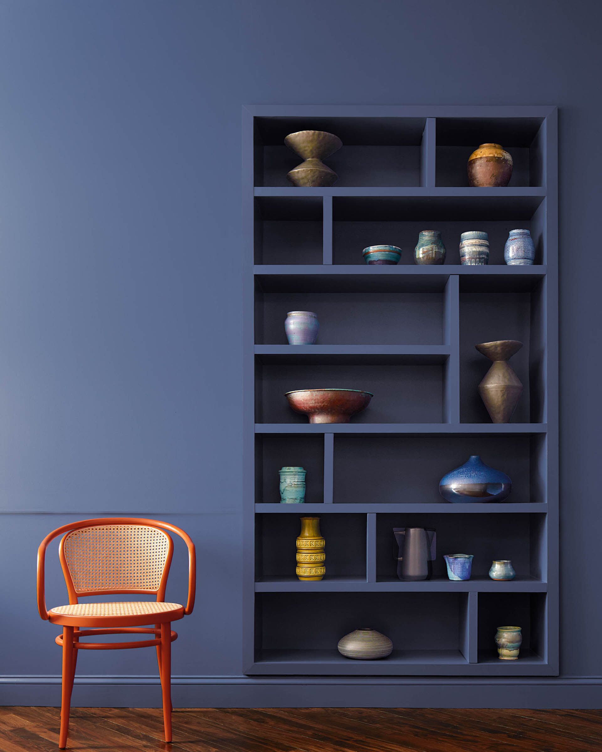
Benjamin Moore’s top pick, Blue Nova, is a mid-tone indigo with violet undertones. Inspired by the night sky, the company says the color has depth and intrigue but is balanced by “an undercurrent of reassurance.” The cool shade will evoke relaxation, making it an excellent choice for spaces dedicated to unwinding, such as living and dining areas.
Get Benjamin Moore paints at Ace Hardware
8. Valspar: Renew Blue
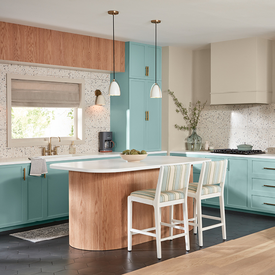
A departure from the moodier hues on this list, Valspar’s Renew Blue is all joy. Valspar describes it as “A nourishing, green-influenced blue that creates a sense of peace wherever you place it.” With natural blues and green tones, the color evokes a spa-like feel that is ideal for bathrooms or any area where relaxation is the goal.
9. Dunn-Edwards: Skipping Stones

Another mid-tone blue, Skipping Stones from Dunn-Edwards is a steely hue with hints of gray and green. The color is meant to reflect the sea with a meditative yet energizing quality. The company says, “Skipping Stones lets you capture the feeling of dreamy nostalgia blended with a future of unlimited possibilities.” The shade brings brightness and relaxation, ideal for bathroom spaces and rooms that could use a cool touch.
Get Dunn-Edwards paints at Dunn-Edwards
10. C2: Thermal

C2 describes their color of the year, Thermal, as a fluid and refreshing tone that is both invigorating and calming. Like many others on this list, this soft shade was inspired by nature, mimicking a bright sky or clear blue sea. “C2 Thermal serves as a call to action, urging us to live boldly, to express our unique styles freely, and to acknowledge our responsibilities as stewards of our planet,” says C2 Paint’s Director of Marketing, Tia Clarida. This option would look great on kitchen cabinetry or a bathroom vanity.
11. Minwax: Bay Blue
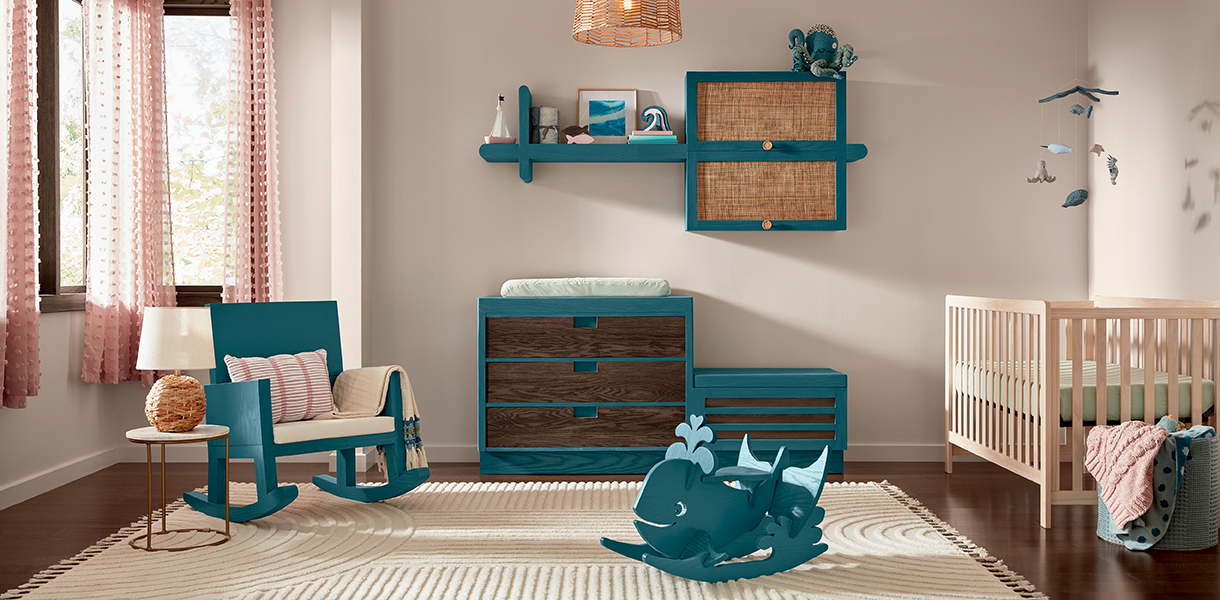
Don’t dismiss wood finishes when considering a new color option. Minwax’s color of the year, Bay Blue, is an innovative stain that allows the natural grain to show while adding a bold color to wood surfaces. The teal shade with warm undertones will serve as a playful accent color throughout the home, adding a bit of fun and personality to any space. Pair it with natural wood tones for a design-forward match.
Get Minwax wood stains at Lowe’s
12. York Wallcoverings: Bay Brown

While wallcoverings don’t fall into the traditional wall color category, they are a close next-door neighbor. The York Wallcoverings color of the year, Bay Brown, is central to their new wallcovering designs. Inspired by root systems and soil, the color is earthy and grounding. The neutral tone also offers a nod to retro styling that will look luxurious in a cozy library or office space.
Get York wallpaper and textiles at Wayfair
13. James Hardie: Mountain Sage
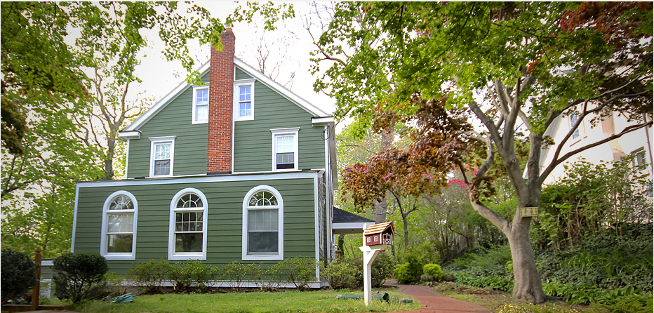
Those looking to refresh their home’s exterior will want to consider James Hardie’s color of the year, Mountain Sage. Inspired by the forest, this earthy mid-tone green is perfect for achieving a woodsy, natural quality for a home’s outdoor siding. Pair it with wood accents to achieve an understated elegance.

