We may earn revenue from the products available on this page and participate in affiliate programs. Learn More ›
It’s a classic challenge in an older neighborhood: How can a growing family increase their living space without expanding their home’s footprint?
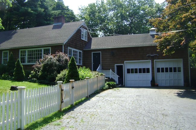
Architect Ann Sellars Lathrop answered that question by transforming a 1950s Cape Cod into a modern farmhouse informed by the bungalows of the 1920s.

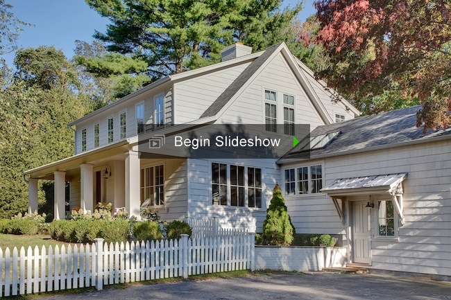
“The client wanted it clean and modern, in a transitional style to fit the vernacular of the neighborhood,” she says. “This was a farming community in the late 1800s, so there are farmhouses, colonials and onion barns down the street. A lot of the homes have front porches.”
By creating a continuous shed dormer, she was able to turn former roofline into useful living space. “That gives you the floor area and the ceiling height on the second floor, and you get a peak that’s enough for an air handler up there,” she says. “It’s a trick to reduce costs and keep the scale down, so you don’t end up with a big, boxy look.”
When she started, the client consisted of a young couple with one daughter. A potential job change coinciding with groundbreaking slowed things down a bit, and simplified their plans somewhat. By the time the renovation was complete two and a half years later, the family had grown by one child, with another on the way.
So the expansion was timely. Upstairs she added a master suite with walk-in closet and bath, and renovated two existing bedrooms and a bath for the children. “It gave them more space,” she says. “By taking the roof off and coming out to the edges of the first floor walls, we added 600 square feet.”

The renovated home now totals 2,900 square feet.” She took one bay of a two-car garage, and gave it a new and useful set of functions. Where once there’d been no entry from garage to home, there’s one now, along with a new mudroom and powder room. Lathrop also enhanced the street presence by designing a welcoming front porch.
Related: 17 Design Inspirations for Mudrooms and Entryways
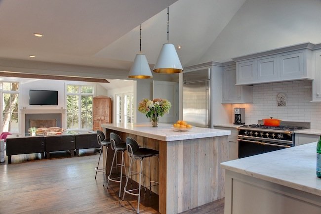
The only addition is in the rear of the house, where a poorly constructed and poorly insulated screened in porch was taken down to the foundation and rebuilt as an expansive family room off the kitchen. A higher pitch to the roof, and energy efficient windows and skylights make the space even more expansive, while providing passive heat gain in winter.
The home was sheathed originally in tall wooden shingles. When the client suggested making the change to more of a Nantucket Maybeck look, the architect resisted. “I said ‘No – paint them,’” she says. “So we wove in some new ones and painted them an off-white color – a light, pewter gray.” It’s a monochromatic, oyster-colored tint that works well with the color palette of the region.

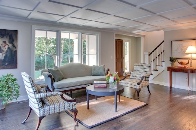
Inside, the home is awash in natural light from new windows and skylights, with an easy, open flow from kitchen to family room to dining room.
“It was a Cape Cod that was totally unusable for a young family—with a small scale and little rooms” she says “They wanted to keep the nature of that smaller scale. So now it’s tight and compact, but a very livable, warm space.”
It’s also a smart renovation with a stylish response to a classic question.
J. Michael Welton writes about architecture, art and design for national and international publications, including The New York Times, The Washington Post and Dwell. He also publishes an online design magazine at www.architectsandartisans.com.

