We may earn revenue from the products available on this page and participate in affiliate programs. Learn More ›
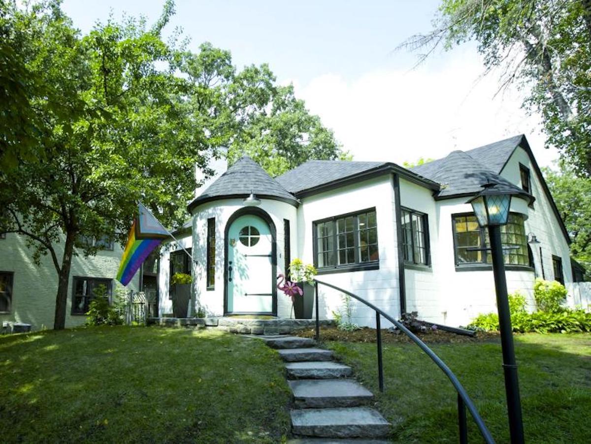
HGTV recently unveiled the makeover of the house it named the “ugliest” in the country, and fans are even more divided than ever.
The house, which was given the distinct honor in the fifth season of the hit HGTV show ‘Ugliest House In America’, had a rather unique appearance before its makeover.
Of course, a renovator’s vision dictates decisions during any home improvement project. No two visions are exactly alike, but there are many standards that people typically agree on. There’s a standard height for ceilings, for example. Some paint trends are not meant to last. There are no rules about exterior paint colors, but most experts would agree that there are general guidelines: some colors are simply better than others when it comes to curb appeal and even resale value.
When this ‘ugly’ house was revealed, it was clear that the exterior’s teal color was a little controversial. Of course, many offered the opinion that the color was simply not for them. One fan wrote, “It was never ugly it just needed a little love and a nice new color scheme.”
Many people also expressed their surprise that this was considered an ugly house to begin with. One Instagram user commented, “That house wasn’t even ugly…”
Another wrote, “This was not the ugliest house. So disappointing.”
However, where most people agreed was that the renovation took away from something crucial: the house’s charm. Ultimately, most people agreed that the house became a home that lacked personality. One user commented, “While I appreciate the modern updates, I do wish it hadn’t been completely stripped of all its former personality. It was such a chromatic wonderland before, and it was kind of sad to see all that joyful color replaced with white walls, white tile, beige wood, and zero personality. With so many amazing design trends on the horizon, how beautiful would a little Japandi style or even 70s Bohemia have looked…how about a little Biophilic Design? As designers, our spaces can still look tasteful and timeless while still being vibrant and interesting.”
Others have been echoing his sentiments. One user chimed in, saying, “The before was super cute and unique! People have just become really boring with their design choices,” while another gave their two cents, “Soooo, just took away the character and just slapped on the current trend? Fun.”
Hopefully, the designer behind the home makeover, Alison Victoria, is taking those comments in stride. It certainly seems like more and more people want to make every facet and feature of their home truly reflect them and their personalities, rather than follow trends—regardless of how controversial the paint color of their choice is.


