We may earn revenue from the products available on this page and participate in affiliate programs. Learn More ›
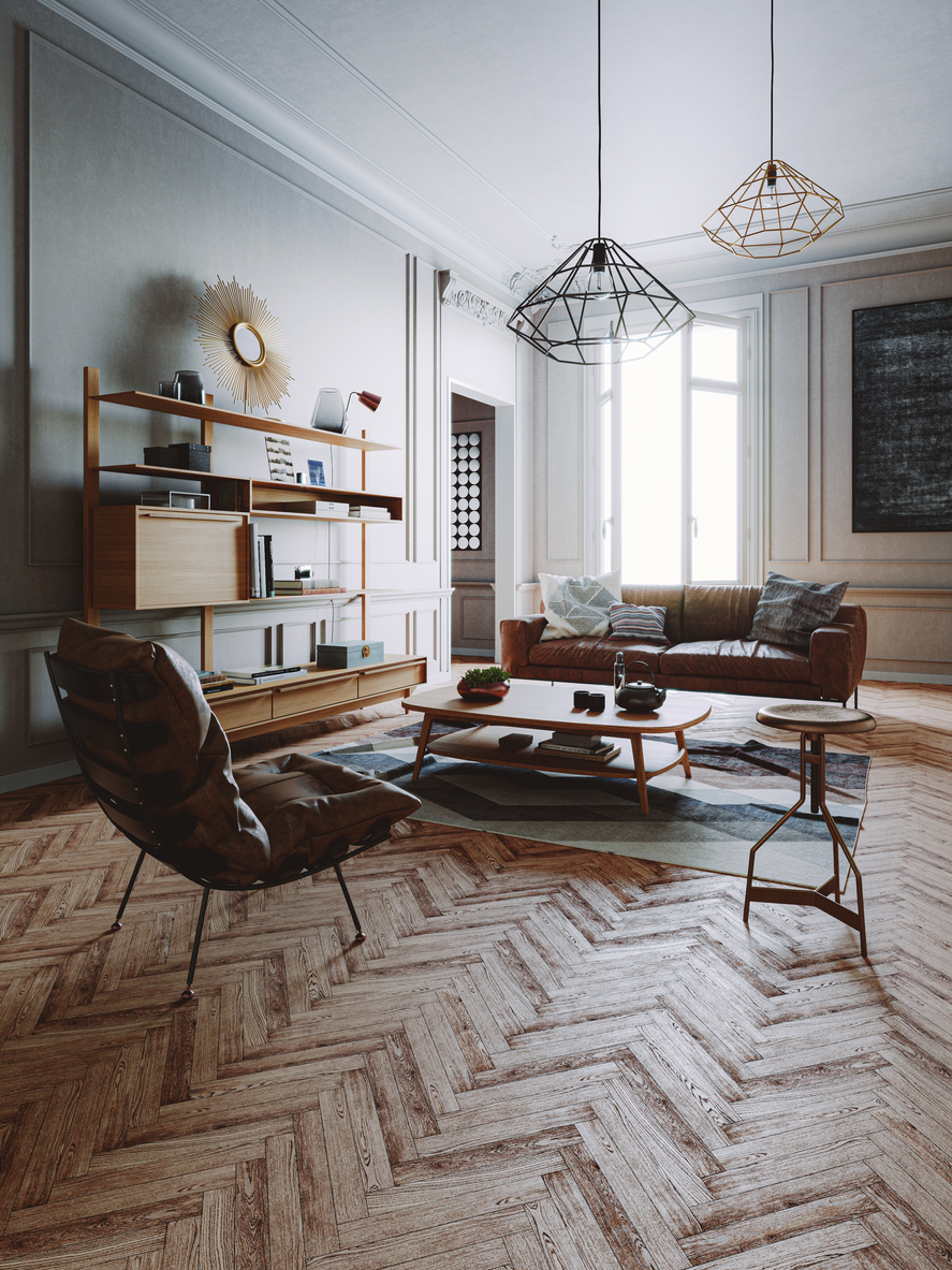
Contemporary interior design isn’t dominated by a singular look, but one style that has prevailed for nearly 100 years is mid-century modern. Characterized by clean lines, organic forms, minimal ornamentation, and high functionality, mid-century modern (MCM) style first rose to prominence in the 1950s, but it has become desirable again in the 21st century. Mid-century modern design never really went out of style, but its resurgence in popularity can be explained by its timeless yet modern aesthetic.
Let’s define what mid-century modern design is, look at the movement’s history, outline some iconic mid-century modern furnishings, and explore how to best incorporate the style into your own home interior.
Related: 15 Old House Features We Were Wrong to Abandon
What is Mid-Century Modern Design?
Mid-century modern style is an architectural, interior, product, and graphic design style that reflects developments in design that took place in the early and mid-20th century.
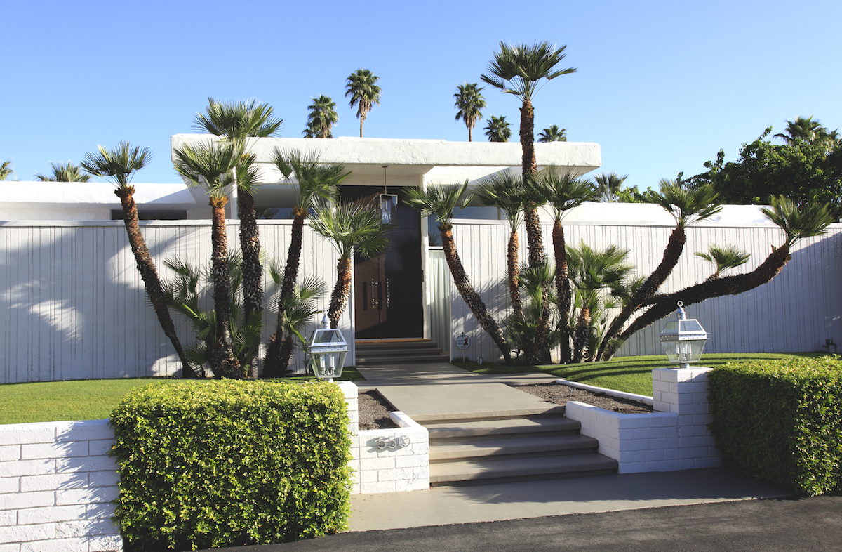
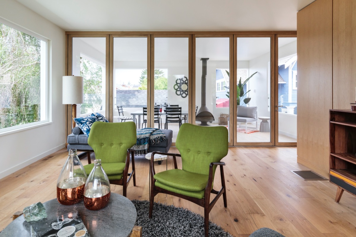
The most prominent characteristic of mid-century modern design is its emphasis on function. Whereas older styles focused on ornamentation and decorative embellishments, this new style promoted clean lines and minimal clutter for a more efficient living space. To exemplify this, a mid-century modern house typically features an open floor plan and includes plenty of natural light.
Over the years, mid-century modern design has been used in everything from houses to office buildings and is reflected in building styles, furniture design, art, and more.

The History of Mid-Century Modern Design
The term “mid-century modern” has become shorthand for a design style that was popularized in America in the 1950s, but the history of the style goes back much further than that. The style was born at a pivotal time in history. The first half of the 20th century was marked by two world wars, as well as major social and economic changes. In the United States, people were moving to urban areas and taking advantage of new technology. The desire for increased simplicity and efficiency in the postwar era shaped this design style.
Mid-century modern design evolved from the International and Bauhaus movements in Europe in the 1920s and 1930s, which were focused on bringing quality design to normal people by using mass production. Famous architects like Ludwig Mies van der Rohe, Marcel Breuer, and Walter Gropius emigrated to the United States after World War II and went on to bring these ideas to North American design.
These trends were reflected in home design, which moved away from ornate Victorian style toward a simplified aesthetic that focused on function over form. Mid-century modern pieces also incorporated new materials like aluminum, steel, vinyl, and plywood, often made using mass-production techniques that allowed manufacturers to create furniture at lower prices than ever before.

Key Characteristics of Mid-Century Modern
These characteristics define and exemplify mid-century modern design principles.
- Minimalism: Uncluttered, open spaces are emblematic of mid-century modern architecture.
- Curved shapes: While many examples of mid-century modern decor have sleek lines, there is also a focus on curves. In particular, you’ll find rounded armrests and legs on chair and couch designs.
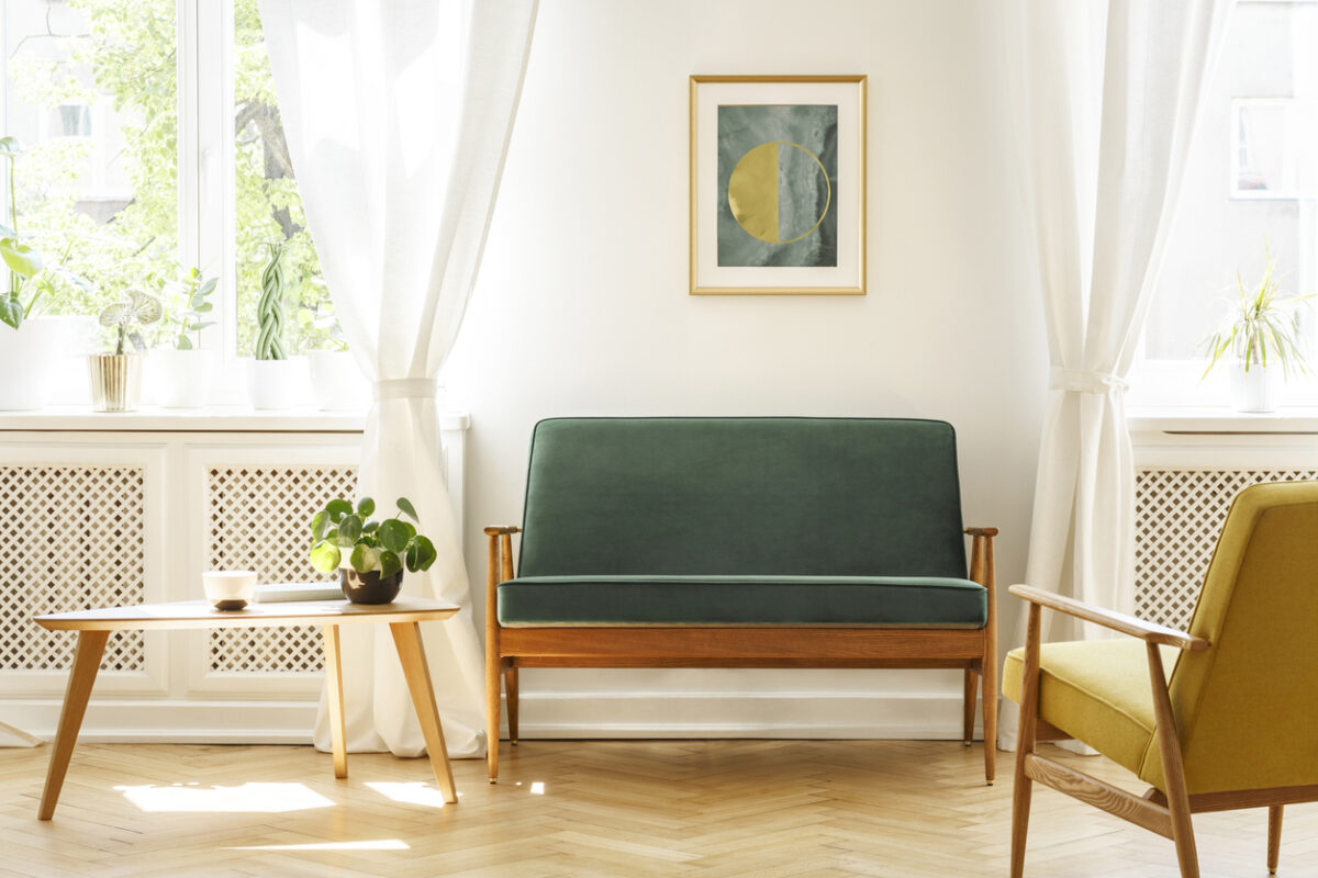
- Wood: Wood plays a key role in many MCM furniture pieces. Common types of wood used in mid-century modern furniture include teak and walnut. You might also find rosewood and other woods with warm wood tones (including rustic woods).
- Mixed materials: While there is a major focus on natural materials in mid-century decor, what really exemplifies the style is a mixture of natural and man-made options. Wood, leather, and stone are often mixed with vinyl, plastic, lucite, and fiberglass.
- Pops of color: Mid-century modern homes typically featured a largely neutral color palette, but also incorporated pops of color in natural shades like burnt orange, muted yellows, and forest green.
Tips for Designing a Mid-Century Modern Space
Now that you know more about mid-century modern’s history, let’s talk interior design. Whether you’re designing a new home or just updating some rooms in your current one, this style can be a great way to give your space a fresh-yet-classic look. These tips will point you towards creating your own mid-century-inspired space:
- Avoid clutter. Mid-century modern design emphasizes openness. This means avoiding clutter in every way possible—especially when it comes to furniture. Instead of including many small pieces in one room, try a few larger pieces instead. This keeps the area clean and gives it an airy feel in keeping with MCM design principles.
- Opt for natural materials. Wood, stone, and leather are all popular in mid-century designs.
- Incorporate bold colors. While simplicity is important, don’t be afraid of color or patterns when adhering to this design style. Make a statement by incorporating bold splashes of colors and graphic prints into your space.
- Embrace natural light. One of the hallmarks of the mid-century modern style is the use of natural light in spaces through large windows and skylights.
When searching for mid-century modern furniture, the easiest—and most affordable—option is shopping vintage. Look for authentic pieces at second-hand shops or online stores like Chairish and Etsy. You can also find quality retro furniture at stores like West Elm, CB2, and Target.

Iconic Examples of Mid-Century Modern Furnishings
These furniture pieces were conceived decades ago but still hold sway over the design world today.
- Eames Lounge Chair and Ottoman: Designed by husband and wife team Charles and Ray Eames in 1956, this chair and ottoman pair is a good example of mid-century modern design because they combine three important elements: comfort, utility, and beauty.
- Knoll Sofa: While it has inspired many imitators, the original mid-century modern couch was the Knoll Sofa. With angular lines, thin legs, and tufted fabric, this design has influenced the look of many contemporary sofas.
- Wassily Chair: In 1925, Marcel Breuer created the Wassily chair, which uses tubular steel and leather to achieve a striking effect, acting as a minimalist upgrade to the standard club chair.
- Cesca Chair: Also designed by Marcel Breuer, the Cesca chair uses a combination of steel and caning to achieve an effect that’s at once natural and ultra-modern.
- Pedestal Table: This design has become so ubiquitous, that it’s hard to imagine it being novel. But when Eero Saarinen designed this pedestal table in 1956, it was groundbreaking to create a dining table with only one leg.
- Arco Floor Lamp: The Castiglioni brothers designed this curved lamp for Flos and managed to conceive something both practical and visually stunning.
- Eames Shell Chair: Made from molded fiberglass, the Eames shell chair features angled wooden legs and is designed for both comfort and visual impact. While there are many inexpensive knock-offs available, nothing can compete with the original.


