We may earn revenue from the products available on this page and participate in affiliate programs. Learn More ›
Painting can be one of the easiest and most cost-effective ways to update the look of your space, whether it’s inside or out. But choosing a color that brings out the best in your room and is also on trend can be difficult.
Some major paint companies are out with their picks for what they anticipate will be hot colors in the year to come. Whether you’re looking to go bold or stick with colors that are a bit on the reserved side, consider one of these hot new paint hues to bring new life to your home.
Dutch Boy
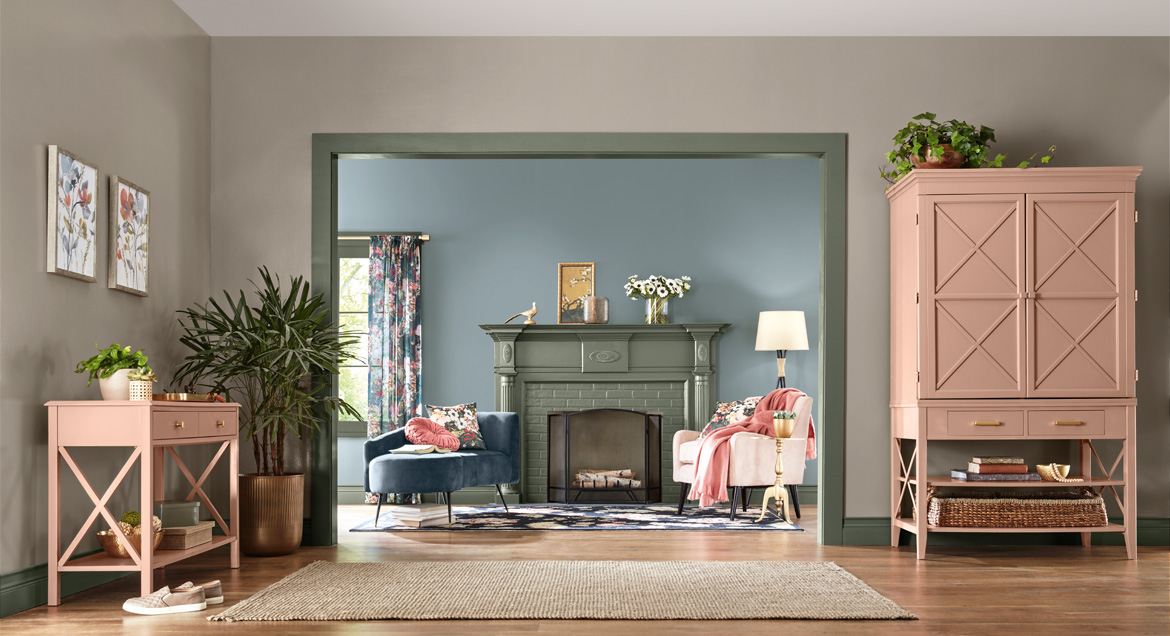
For its 2023 color of the year, Dutch Boy drew inspiration from home and workplace aesthetics, including feelings of safety, harmony, and comfort. Rustic Greige is the result. It’s a neutral hue that not only gives off a soothing vibe but also adds a bit of sophistication to any space. Bonus: It can be applied with just a single coat.
Rustic Greige is a neutral in the medium-toned range. Since it has a slight red undertones, it pairs appealingly with both warm and cool colors as well as wood furniture and accents, making it a great choice for any room in the home, whether it’s a bedroom or living space, home office, bathroom, or kitchen.
The hue also serves as the grounding color for the three palettes in the company’s 2023 Color Trend Forecast.
Plush: This palette offers colors that are fluid, relaxing, and restorative. These colors bring a feeling of luxury, along with spiritual and emotional well-being, to a room.
Wistful: Hues in this palette draw inspiration from nostalgia. Think spaces that are special to our lives with both soft and energizing colors.
Botanic: This palette is rooted in shades of warm florals and romantic hues that bring forth a feeling of creativity and soulfulness.
Get Dutch Boy Paint at Menard’s
Graham & Brown

If you’re in the mood to update with a color that’s, well, deep and moody, Alizarin should be on your radar. Graham & Brown’s 2023 Color of the Year is a refreshing auburn hue that is dark enough to be eye-catching, yet also natural and inspiring. The company notes that it’s a “creative alternative to the grey and beige shades that have grown wearisome.”
The rich red may make you think of ancient lands, but it’s perfect for adding warmth to any room in the home, whether used on walls or as an accent color.
“The rise of earthly neutrals has been growing recently,” notes Paula Taylor, head stylist at Graham & Brown. “They are warm and welcoming, providing the cosy feel we love in our homes. With energy bills getting higher, we are looking at ways we can evoke a sense of warmth in our homes, and these tones and their connection with nature create a warm, relaxed atmosphere.”
Get Graham & Brown Paints at The Home Depot
Behr
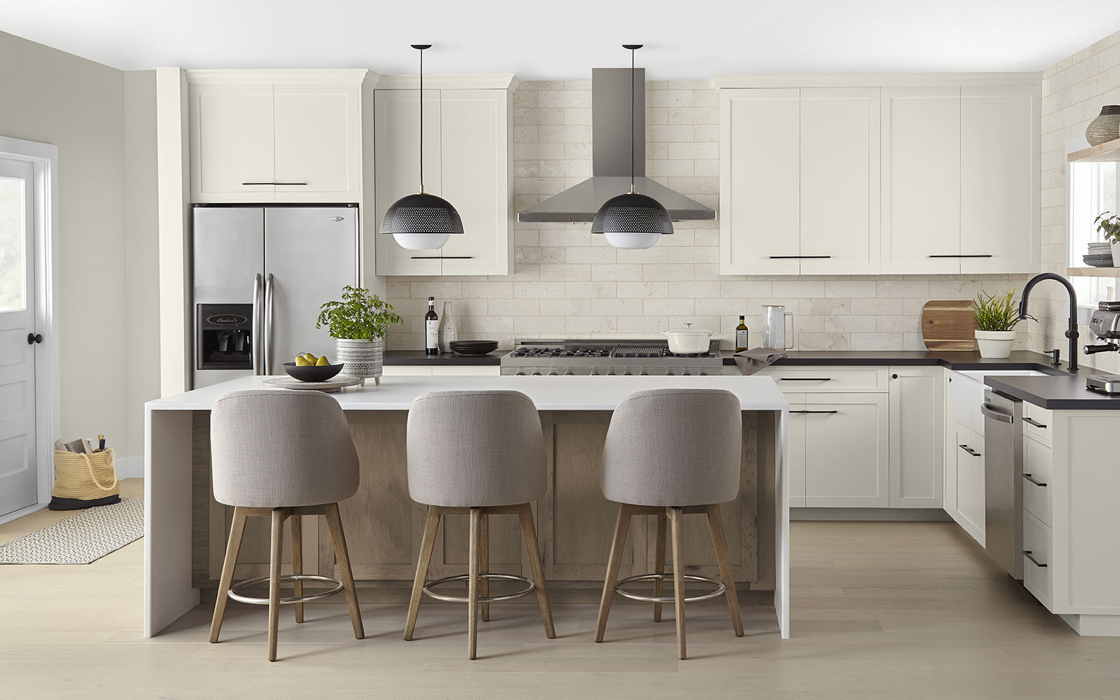
For those who are unsure if they’re ready to jump into the world of bold hues, Blank Canvas may be more your speed. Behr’s 2023 Color of the Year is a great choice if you’d like to build upon a neutral hue with more colorful accents. Blank Canvas establishes a serene setting, yet it’s versatile and can be paired with more vibrant hues to create the perfect space to promote a feeling of relaxation and calmness.
“Blank Canvas effortlessly offers a clean and inviting blank slate that allows individuality and creativity to flow freely. This white easily harmonizes with a wide range of hues, including neutrals, earth tones, and pastels, for a charming and cozy appeal. Blank Canvas also pairs beautifully with black for a dramatic impact and with bright accents like green or cobalt blue to instantly lift your mood.”
Try Blank Canvas in shared spaces like the living or family room to foster a feeling of tranquility. Or use it to update the look of kitchen cupboards and pair it with bright accents, such as tile and fixtures.
Get Behr Paints at The Home Depot
Glidden
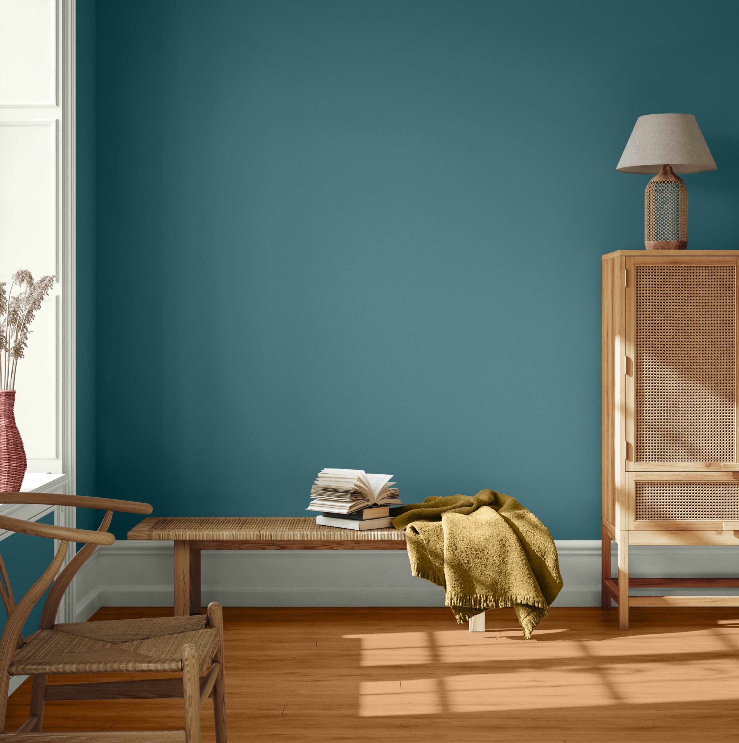
When it was time to choose their 2023 color of the year, Glidden paint by PPG asked consumers what they wanted to see in a new hue. Turns out they wanted a pop of color for those with more traditional tastes.
The result is Vining Ivy, a color that is not quite blue and not quite green. This deep teal will bring a feeling of calmness to any space, and its rich undertones make it a good choice for those who want a bold color that’s also sophisticated. The best part? It’s versatile!
“Consumers are seeking to simplify in this post-Covid era, as the past 2 years have shed a new light on the importance of serenity and little moments,” said Ashley McCollum, Glidden color expert. “Vining Ivy embodies this vibe perfectly. It is energizing yet grounding, and it works in literally any space. Its versatility takes the guesswork out of design, leaving consumers with more time to indulge in the things that matter most to them.”
Vining Ivy
If you’re on the hunt for a color that’s symbolic of water, Vining Ivy (PPG1148-6) is a great option, as it combines the boldness of blue with the calming and refined characteristics of green. The color pairs well with richly colored woods as well as a range of whites. And pairing it with gold accents, such as doorknobs, light fixtures, and furniture, will bring a glamorous feeling to your space.
For those not ready to go all in, Vining Ivy can rejuvenate kitchen cabinets, make an accent wall pop, or freshen up the look of your front door.
“Even the most modest spaces can benefit from the teal treatment. For those short on square footage but big on style, we recommend using this rich hue as a bold contrast to a neutral palette, making a petite room feel plush,” McCollum said.
Additional 2023 color trends from Glidden include:
Foxfire Brown (PPG1069-6)
Stonehenge Greige (PPG1024-5)
Cool Clay (PPG1071-5)
Dark Granite (PPG1005-7)
Spicy Mustard (PPG1108-5)
Pine Forest (PPG1134-7)
Fossil Stone (PPG1102-2)
Lazy River (PPG1148-4)
Mostly Metal (PPG1036-7)
Get Glidden Paints at The Home Depot
Sherwin-Williams
If earthier and more traditional hues are your style, you’ll want to check out the Terra Collection from Sherwin-Williams, which is composed of 40 colors across four palettes.
Sherwin-Williams invites consumers to think of these earthy colors not just as a collection but as a representation of ourselves and our planet. Designers of the Terra palette chose the muted hues as a reflection of our connection to the Earth, our fondest memories, and future hopes.
“All kinds of trend topics are considered—from climate change to mental health—and emerging trend topics are then thoughtfully translated into defining colors and cohesive palettes,” the company noted in its press release.
Terra Collections
The 40 colors in the Terra Collection fit in one of four curated palettes: balanced Biome, passionate Lore, serene Nexus, and vibrant Origin. Within these four palettes are a variety of hues, including earthy naturals, reds and violets, and deep blues and greens—meaning there is something for every style.
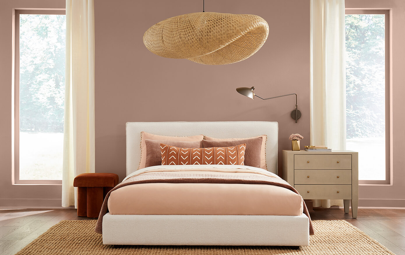
The company’s pick for the 2023 color of the year comes from the Nexus palette. Redend Point is a calming blush-beige that inspires expanded horizons and eye-opening discoveries. “The color is a natural choice for those looking for a warm and joyful neutral in both interiors and exteriors,” noted Sue Wadden, director of color marketing at Sherwin-Williams.
Here’s a look at the four curated palettes, the types of colors in each, and how they could work in your space.
Biome: The Biome palette is a representation of our planet’s changing ecosystem that also gives a nod to its balance. For those looking to bring a feeling of peacefulness and sophistication to a room, this color palette delivers. Think taupes, foggy greens, and a deep bronze.
Lore: Colors from the Lore palette are a representation of the world. These ancient reds, powdery pastels, and jewel tones are, according to the company’s website, “present in the very air we breathe, binding us together in a community of makers that spans centuries and crosses cultures.” For an unexpected look, try Serape, a muted orange, or Mineral Gray, which brings a warm, dramatic feeling to a room.
Nexus: The Nexus palette represents our communal well-being. These colors reflect love and kindness, quiet and healing. “Enkindle a sense of support and serenity with a potter’s palette of natural clays and sunbaked desert sands, grounding brown, and soft, soulful white.” Lei Flower, a deep coral and the brightest hue in the palette, is mixed in among Cool Beige, Malted Milk, and Chatura Gray.
Origin: The Origin palette brings a joyful energy to the Terra Collection. Those looking for vibrant colors to enliven their space will gravitate toward these hues. Check out options like gold-yellow Goldfinch and not-quite-maroon Peppery. Indigo, a darkish blue, is a dignified entry from a color family that never seems to go out of style.

