We may earn revenue from the products available on this page and participate in affiliate programs. Learn More ›
Real estate agents see dozens of homes each week. They know which amenities sell a house, and which can cause a listing to languish. Like any homeowners, though, agents have their own style preferences—and not every home trend wins their approval. Though there’s nothing inherently wrong with the following amenities and trends, the agents we talked to could do without them.
1. Carpet
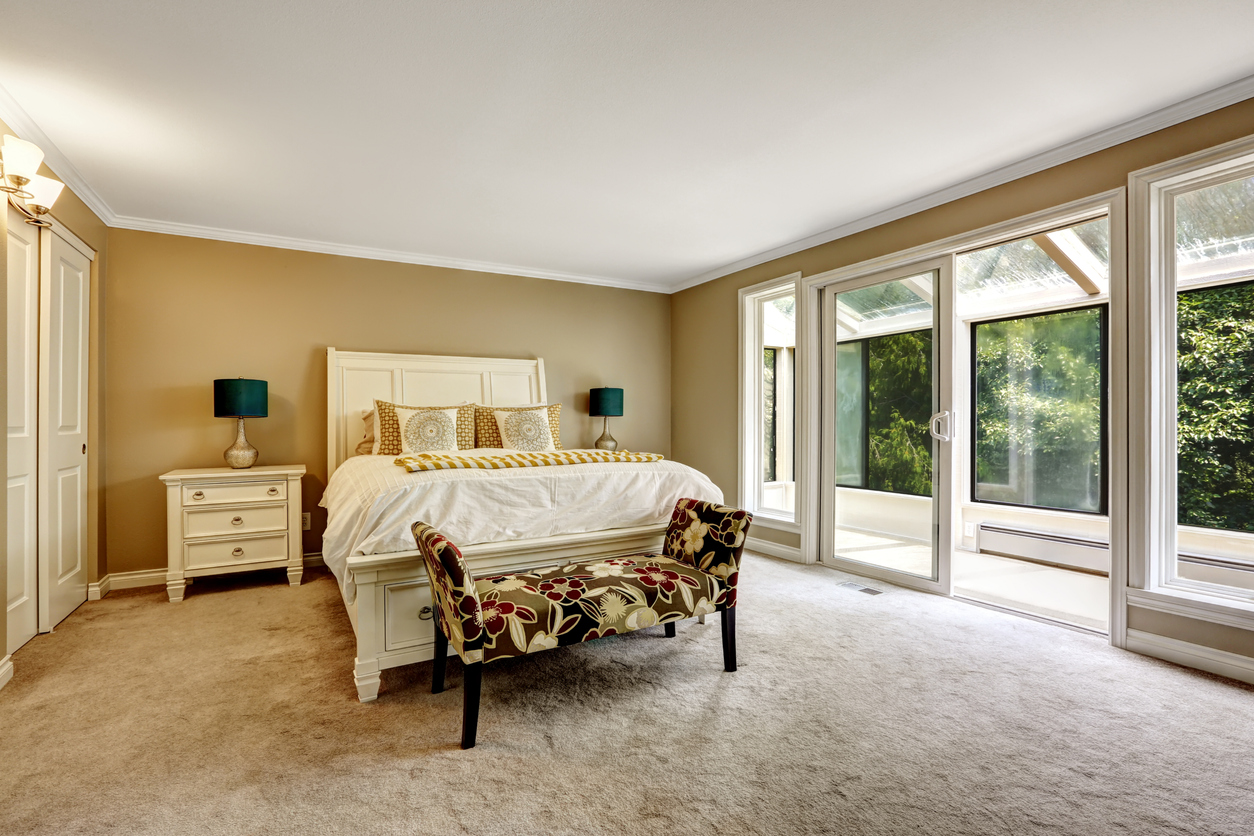
Although wall-to-wall carpeting is making a comeback, it turns out that not all real estate agents are fans. “Carpets hold allergens no matter how often you vacuum. The very products that they’re made from often spark allergy symptoms and sensitivities,” says Jean Rosalia of Keller Williams Realty.
2. Wallpaper
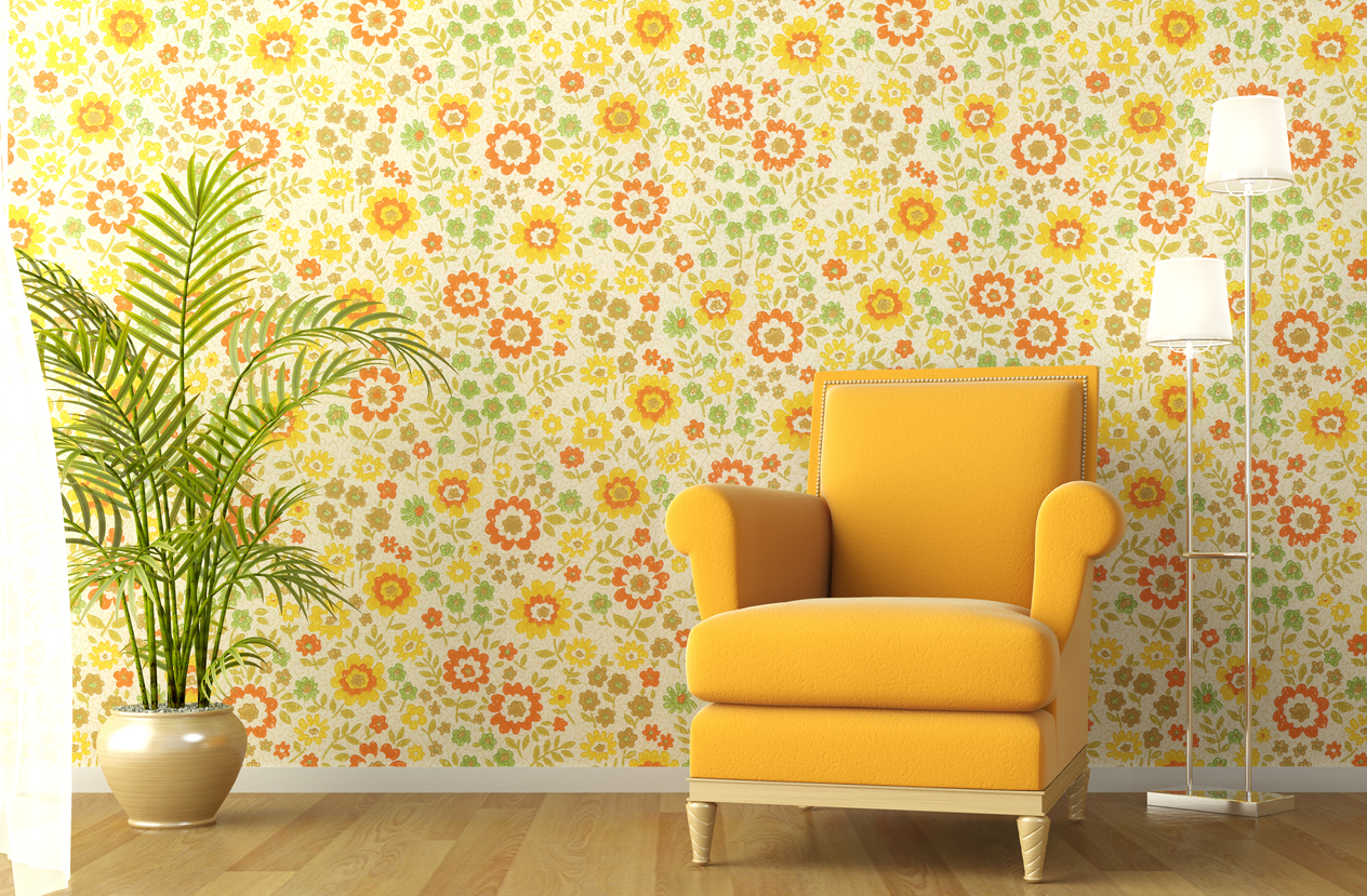
“A trend I am seeing evolve again is wallpaper. And not subtle prints. Big, bold prints,” says Denise Supplee of SparkRental.com. Those bold prints are trendy now, but you might hate the look in a few months. That means you’ll need to remove it. Although wallpaper is easier to switch out nowadays, it still takes some effort to remove. “While it has gone in and out of style more often than the bob haircut, it’s too difficult to change when you want to update or just change the look of a room,” says Rosalia.
3. Grays
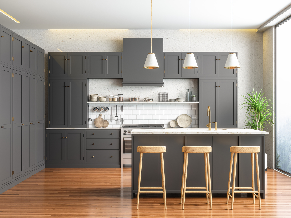
Grays have topped the trending color list for years. They’re the go-to neutrals most homeowners choose when they are tired of white walls. Shea Adair of eXp Realty thinks the color family is boring, and you won’t find it in his house. “It’s very common to see an entire house in a combination of white and gray, including cabinets and countertops,” says Adair. “I like more personality—earth tones and a diversity of colors throughout the house.”
RELATED: 5 Classic Wall and Trim Color Combinations—and 5 for Rule-Breakers Only
4. Bright Whites
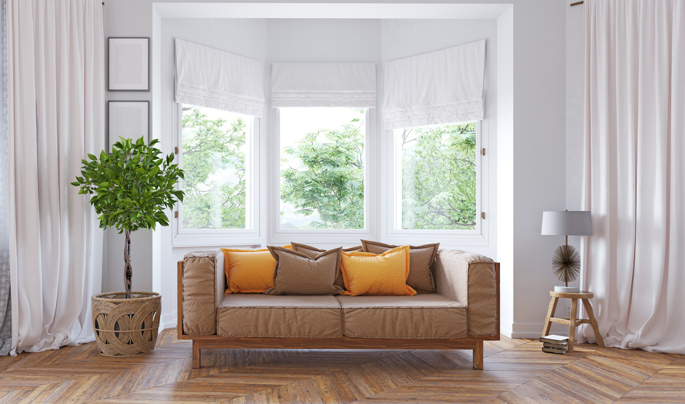
Like gray, white is a safe color that can imbue a space with a fresh, open feeling. “A big chunk of my clients love bright white features in a home they are looking to buy,” says Vicente Enriquez of The Enriquez Group. “For myself, I appreciate a property with accent walls or accent features. I think a different color and unique features bring character to a house.”
5. Open-Concept Floor Plans
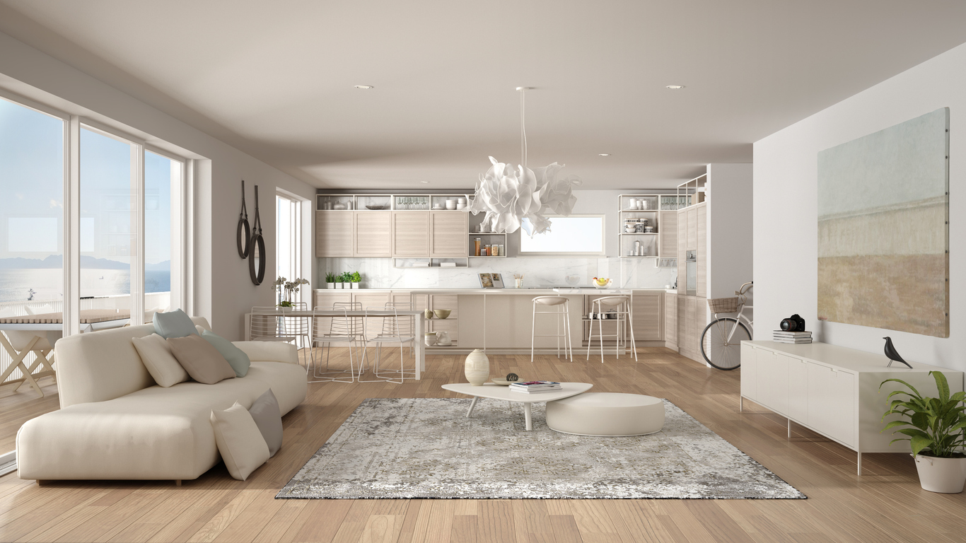
In an open-concept floor plan, barriers such as walls and doors that separate a home into distinct functional areas are removed, making the space feel larger. It turns out that some real estate agents aren’t into it. For instance, Zachary Staruch of The Pelican Team Real Estate doesn’t like open space in a master suite. “The open space provides a nice flow, but unless you and your partner are on the exact same sleeping schedules, someone always gets woken up late at night, early in the morning, or both,” says Staruch. He also thinks you should skip it in the kitchen/living area. “Open floor plans in the kitchen allow a nice flow for families and entertaining, and excellent light,” he explains, “but any cooking smells quickly permeate the entire home. Do you want your home to smell like a marina?”
6. Engineered Flooring
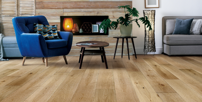
Engineered flooring is the way to go if you want the look of hardwood floors without the high price tag. “I see a lot of engineered flooring, and though they look flawless, in my opinion it isn’t very natural to a house,” says Adair. “I’m more a fan of natural hardwood” for the lived-in look, he says.
RELATED: What’s the Difference? Engineered Hardwood vs. Laminate Flooring
7. Vessel Sinks
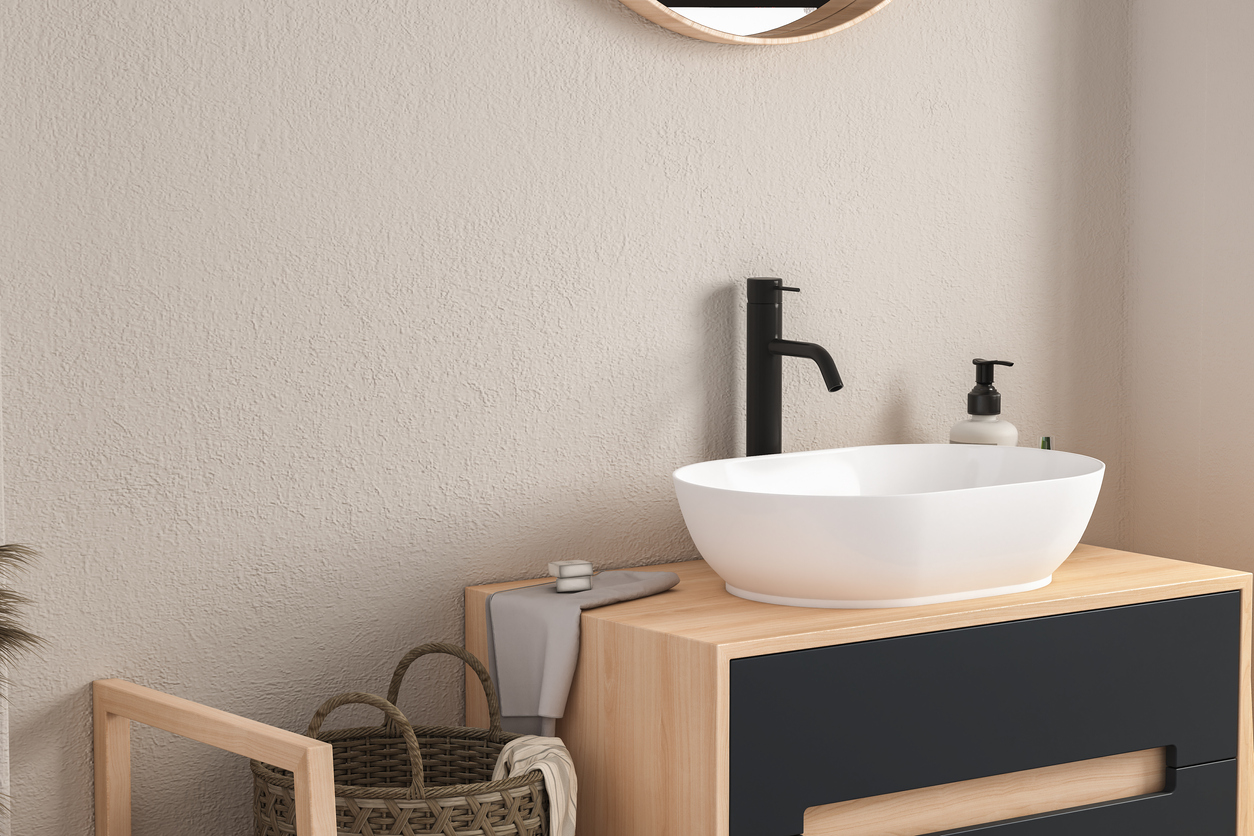
Also known as bowl sinks, vessel sinks are freestanding sinks that sit on top of the countertop or vanity. “Vessel sinks are in vogue with new buyers,” admits Brian Ma of Flushing Real Estate Group. But they are, in his opinion, “aesthetically offensive and functionally ridiculous. From a practical standpoint, these sinks are not easy to maintain and really only belong in chic boutique hotels, not ordinary residential properties.”
8. Permanent Pet Doors
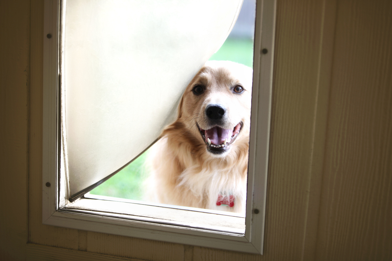
Adding a door so Fido can move freely in and out of the home may seem like a godsend for pet owners. However, Rosalia cringes when she sees one that’s been cut into a wall. “When installed through a wall, they create an insecure area for insects, animals, and other pests to enter through,” she explains. A pet door also “creates an escape for heat and air conditioning from your home and an area where moisture can get in and settle.”
9. Bidets
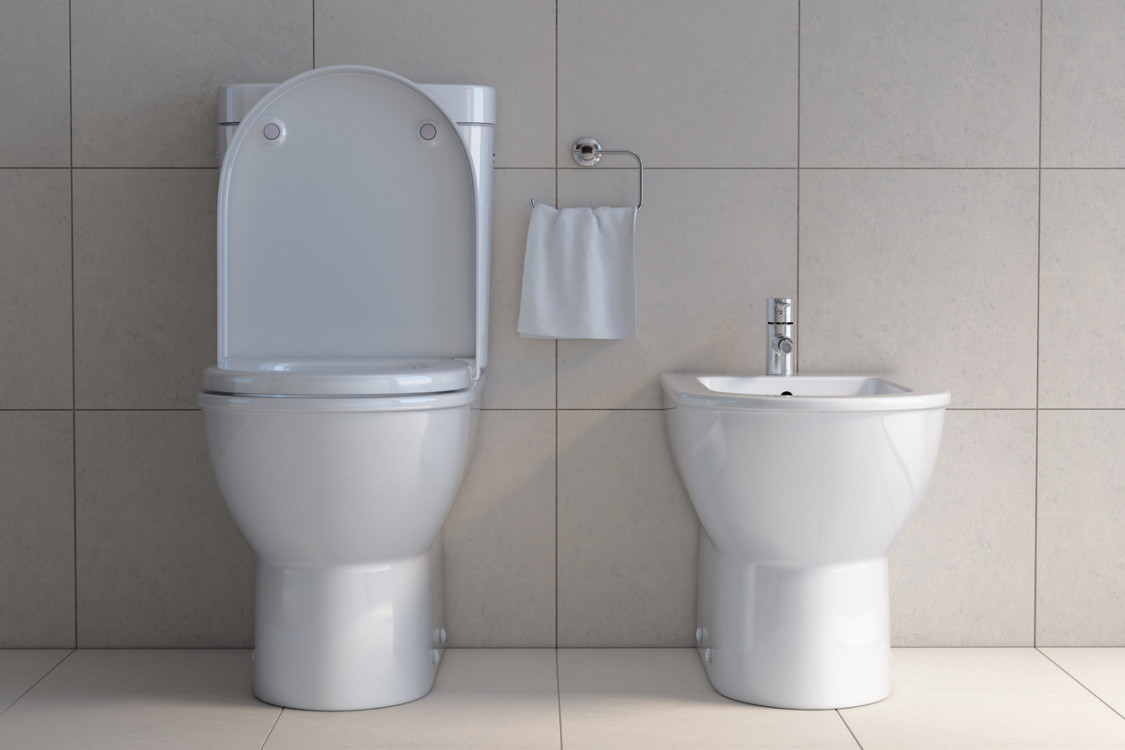
Bidets have been rising in popularity of late, but Rosalia says that you’ll never find one in her home. In fact, she recommends that you ignore the fad. “Unless this is something that you have become accustomed to or are intent on making a part of your lifestyle, it is a major space-taker and large expenditure for the extra plumbing,” she says.
10. Barn Doors
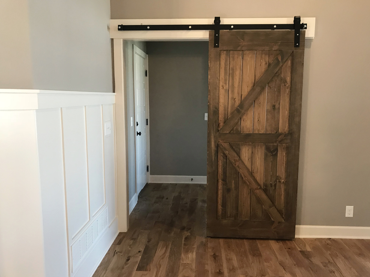
Chip and Joanna Gaines inspired many homeowners to crave a barn door in their home. Apparently, some real estate agents aren’t as keen on the modern farmhouse trend. “I would never want a barn door in my home. They’re slow to open and close and absolutely terrible at insulating sound. Unless someone just loves the look, I don’t get the appeal!” says James McGrath of Yoreevo.
11. Colorful Cabinets
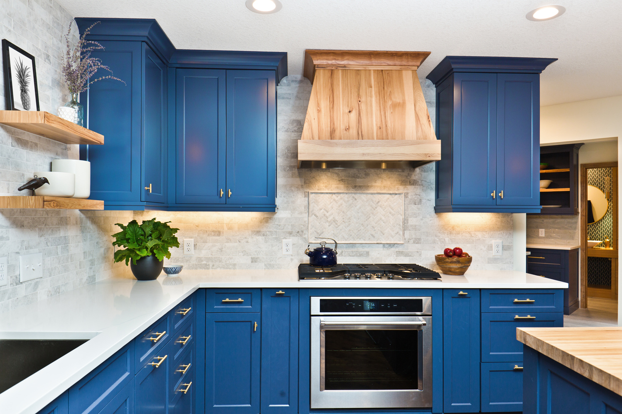
Colorful cabinets are in style, and in some cases, the more color, the better. Chris Gold of Chris Buys Homes says that both young and older home shoppers instantly gravitate toward bright kitchen cabinets and see them as a selling point. “Many people are painting (or buying) cabinets that are blue, burgundy, yellow, and more,” says Gold. “As an agent, I just think about how, when this trend passes, all of these cabinets will either have to be repainted or replaced.”
RELATED: The 14 Freshest Kitchen Cabinet Colors
12. Sliding Windows

Sliding windows are typical builder-grade home features. They are inexpensive and yet their clean and modern lines make them attractive to buyers. That said, Rosalia doesn’t care for them because they are hard to maintain. “Too much dirt gets lodged in the tracks, and then they won’t open or close correctly,” she says.
13. Refrigerators With Built-in Dispensers
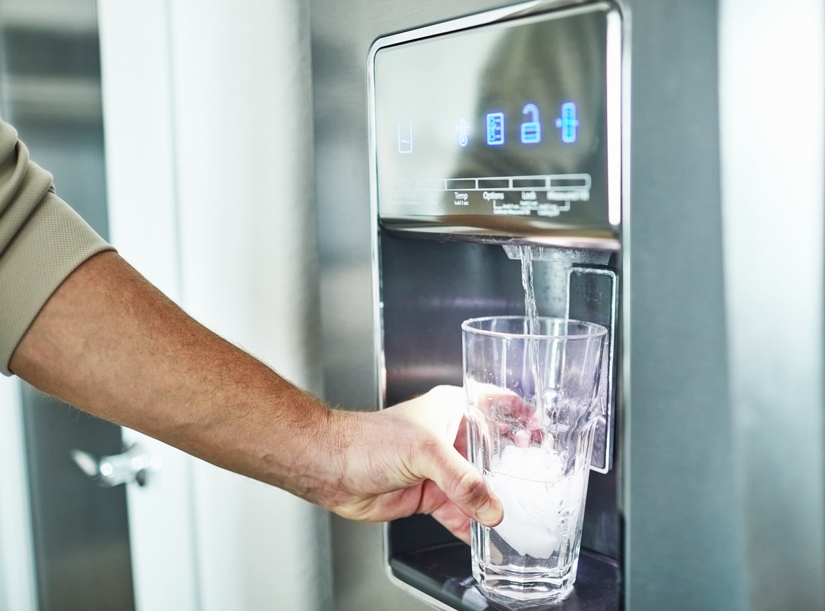
A refrigerator that dispenses water and ice is considered an upgrade on the basic appliance. However, Brandon Brown of BayBrook Realty says he has no plans to add one to his house. He thinks they are too much hassle. “I can’t stand refrigerators that have built-in water or ice dispensers,” says Brown. The reason for his dislike is simple: He hates the mess they leave on the floor when water and ice miss the cup and spill.
14. Cheap Furniture
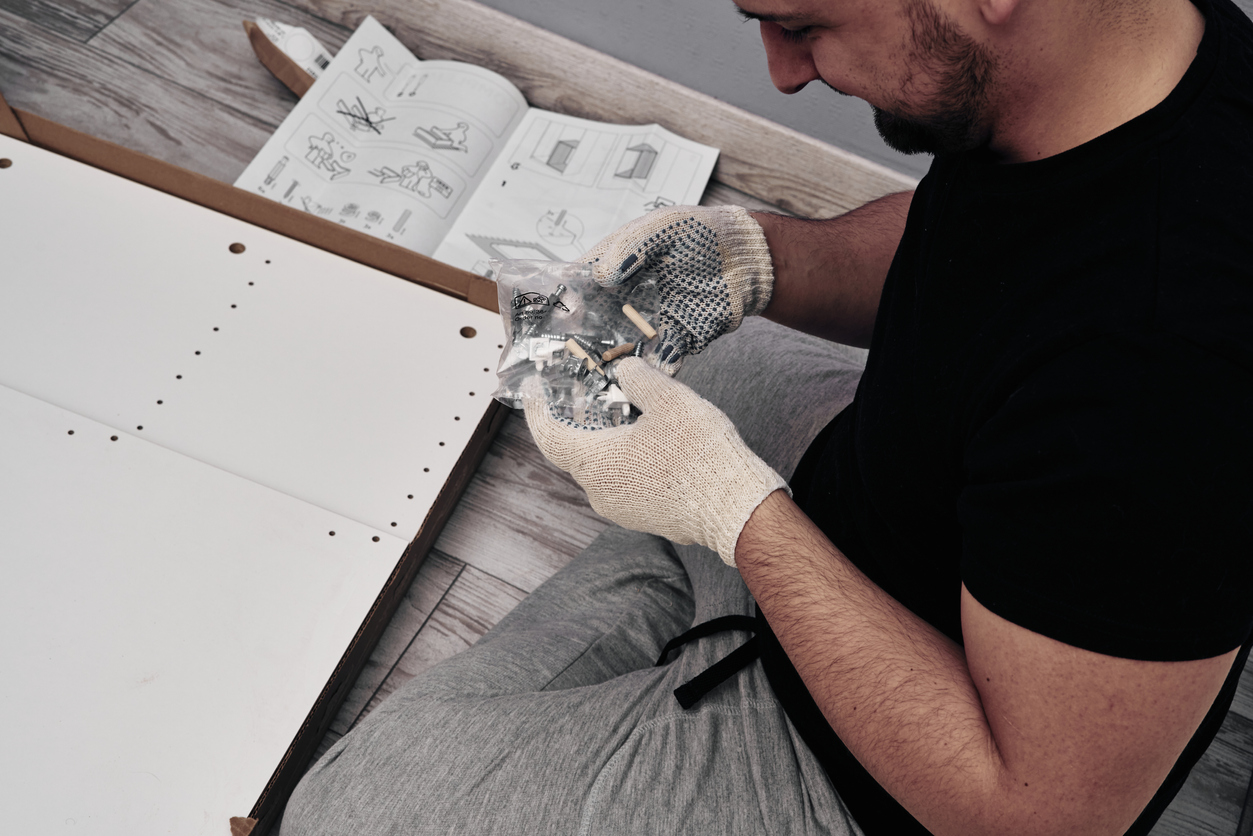
“Life is too short for fast furniture,” says chief real estate analyst Emile L’Eplattenier of TheClose.com. When home decor budgets are tight, it’s tempting to purchase “temporary” furniture from budget retailers. “It is rarely worth the money or hassle to get it into your home,” says L’Eplattenier. Getting a cheap sofa shipped from overseas isn’t worth the huge ecological footprint if you’ll only have to replace it in a few years. “There are so many other ways to get a much better ROI for your design budget,” he adds. “Auction houses, antique dealers, Craigslist, or patiently waiting for the pieces you really want to go on sale can actually save you money in the long run and will make your home look and feel better.”
RELATED: Editors’ Favorites: The Best Couches Under $1000 to Shop on a Budget
15. White Cabinets
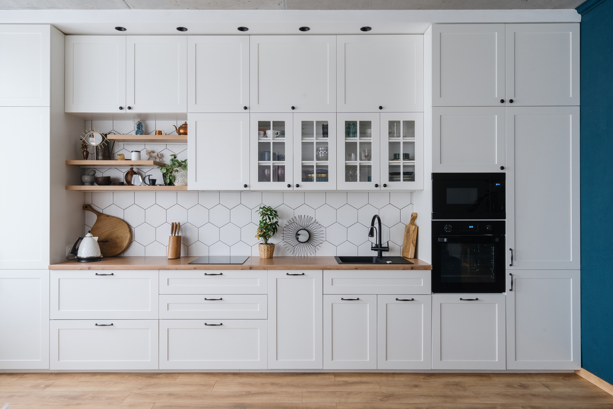
“With all the homes I see, I am over white cabinets in the kitchen,” says Kristina Morales of eXp Realty. Although white cabinets are a standard in new and remodeled homes, Morales thinks that they make a kitchen feel sterile. “If I were to purchase or renovate a home, I would avoid white cabinets and install dark cabinets,” says Morales.
16. Drop Ceilings
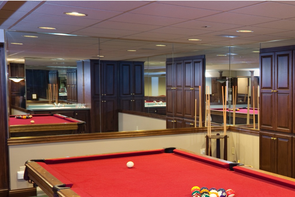
Drop ceilings or ceiling panels are staples in commercial buildings, and Tyne Kenny of My Maine House believes that’s where they should stay. “I’m at home, not at the doctor’s office,” says Kenny. “It’s my understanding that the major pro of having drop ceilings in your home, especially if you have a finished basement, is to easily access the plumbing.” But in Kenny’s estimation, their unattractiveness and commercial feel outweigh the pros of having a drop ceiling anywhere in the home.
17. Trendy Tiles
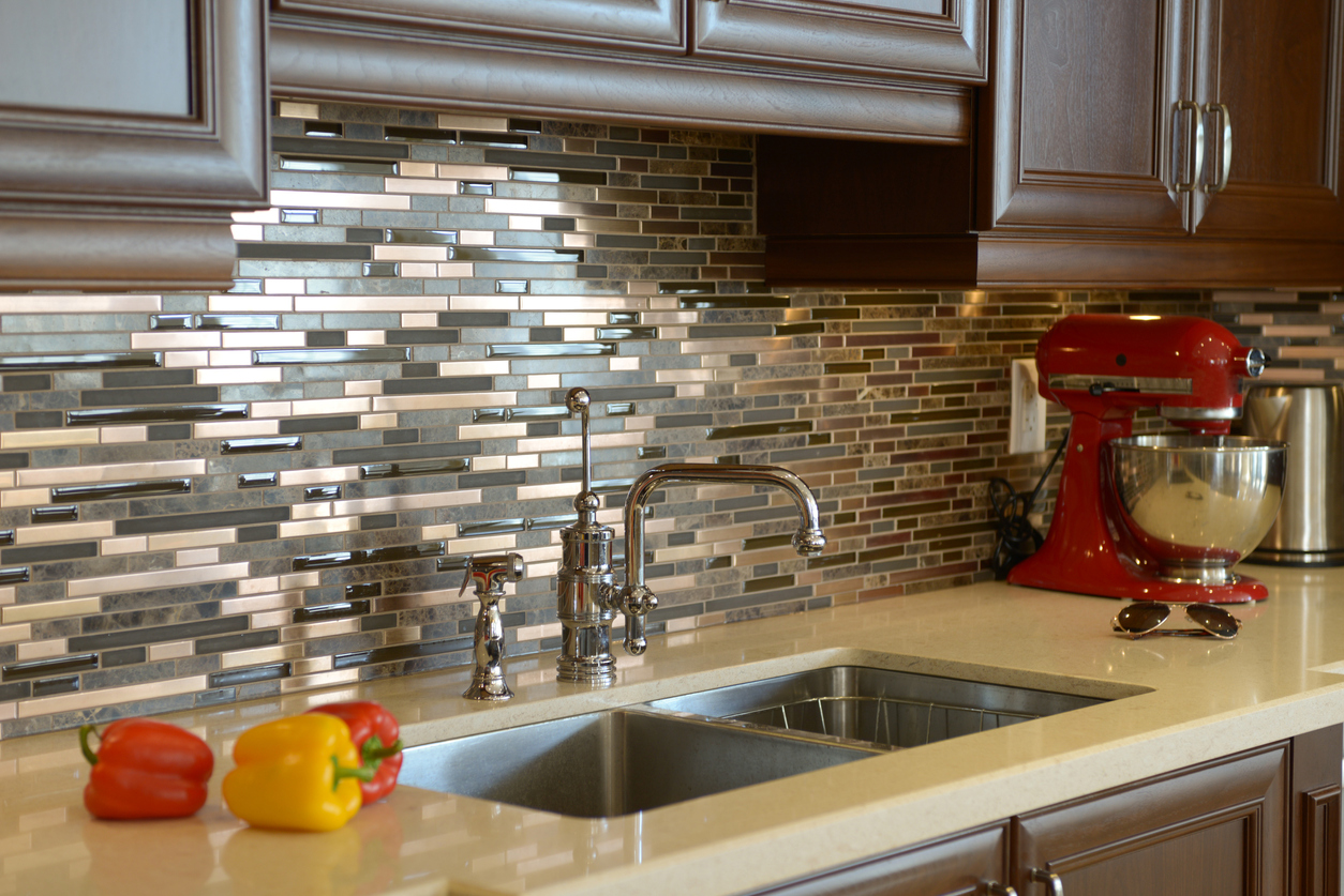
“Tile trends can become dated over time,” says Ann Slyh of The Sheehan Agency. “I always cringe when I see grapes, fruit, or roosters on backsplashes,” she notes. Slyh also says to avoid small, color-specific glass tiles or tiles with sparkles. “Changing tile can be a difficult process, especially where cabinets have been built around them,” says Slyh. “Stick to classics like subway tiles for a timeless look and the best resale potential.”
RELATED: The Simple and Mess-Free Way to Install Tile
18. Front Door Stairs
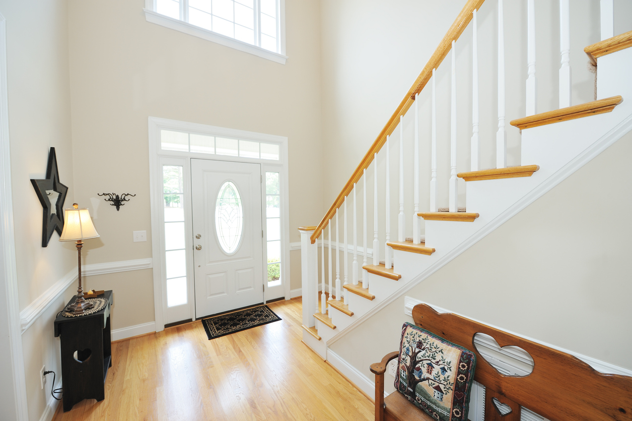
In many homes, the front door opens onto a staircase. Luke Ragauskas of Living Down South prefers a home where you step into an open space when you walk through the door. “I like to feel as though the house is welcoming me to an open area,” says Ragauskas. “When the first thing I see is stairs, it just turns me away.”
19. White Tiles
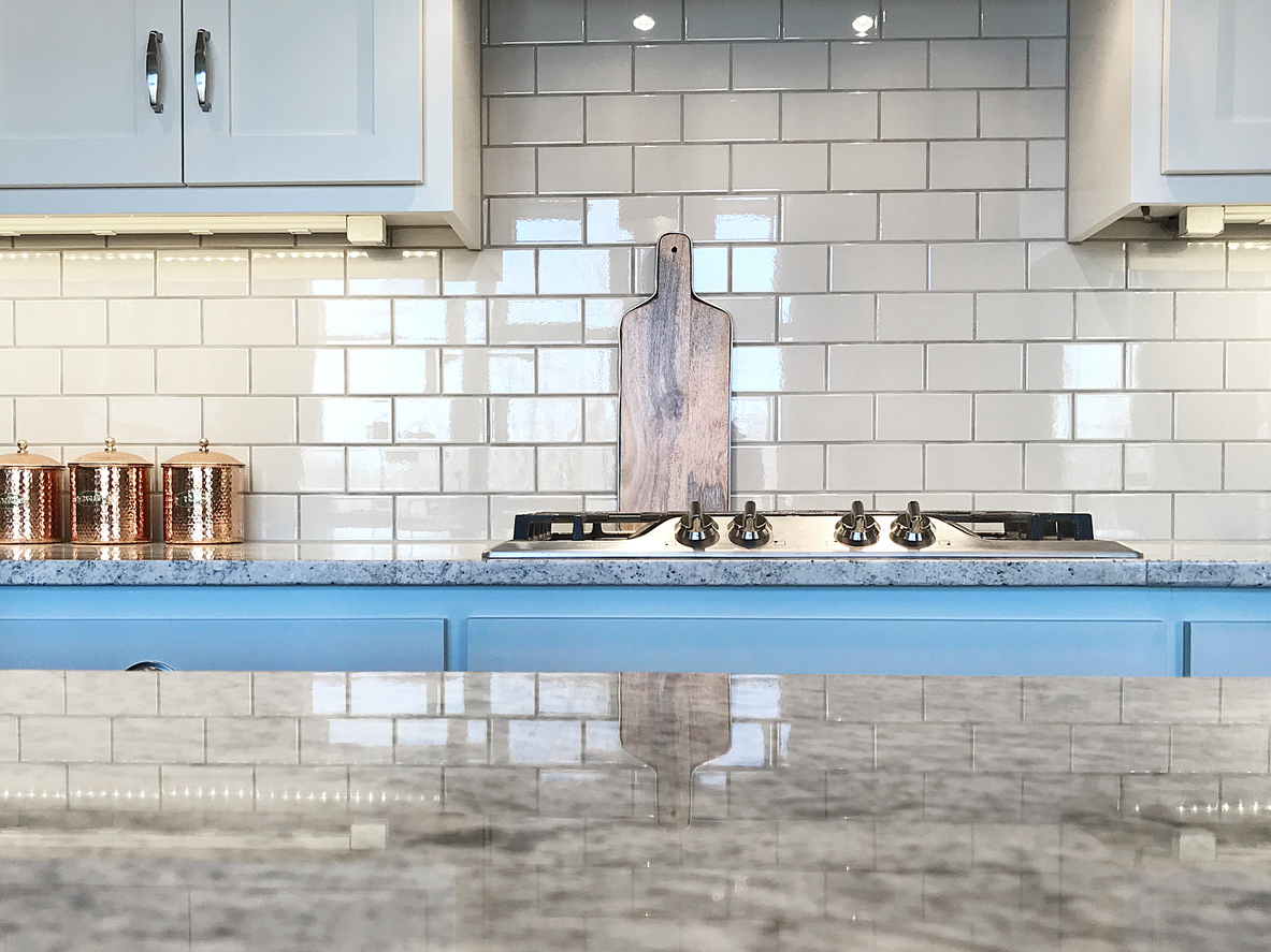
“One of the updates that I think stands out in a negative light is white tile backsplash that doesn’t match,” says Amy Taylor of Amy Cherry Taylor & Associates. Taylor says she often sees homes with a white tile backsplash in the kitchen that doesn’t match the cabinets or countertops, or the room’s style or vibe. “Everyone thinks that all buyers want to see the classic white tile, but that is not always the case,” says Taylor.
20. Formal Dining Space
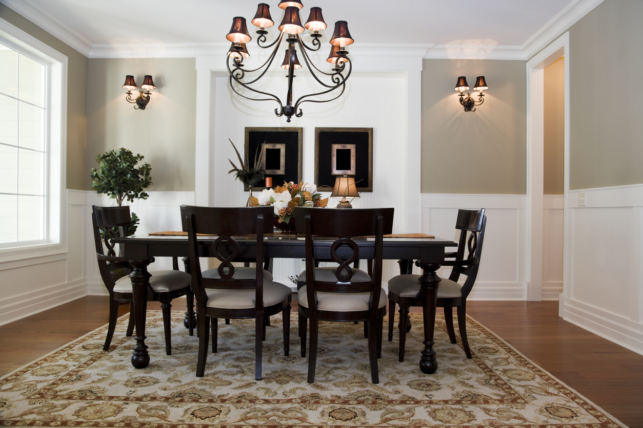
Marina Vaamonde of HouseCashin says it’s time to do away with formal dining spaces. With more people working from home nowadays, she says, “I would use that space as a second office.” Vaamonde notes that most of her clients do not use a formal dining space and says she prefers “a sunroom/morning room, and would place a larger table in that space.”
21. Chain-link Fences
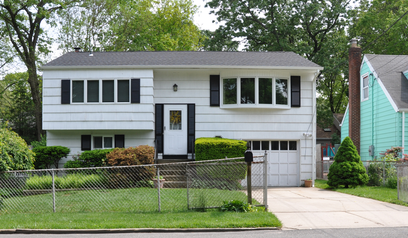
While a fence is key to making a yard more secure and private, Karyn Sederberg, agent with The Coffey Team, says chain-link fences are a no-go. “Chain-link fences are unsightly, and it’s nicer to have a wood, concrete, vinyl, or metal fence for better curb appeal,” Sederberg notes.
RELATED: 11 Living Fences That Look Better Than Chain Link
22. Whirlpool Bathtubs
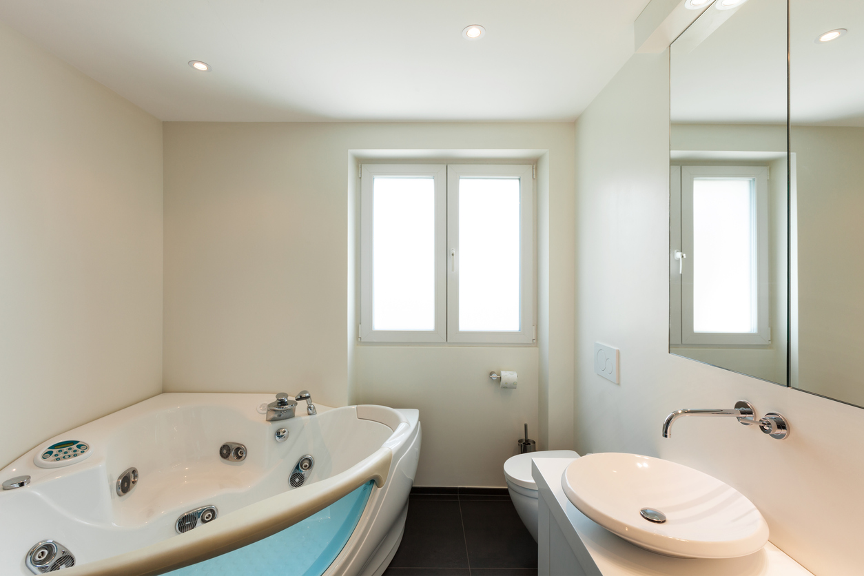
While a large whirlpool bathtub seems like a luxury, Craig Emmerich, an agent with Rowland & the Home Sales Team, says they waste precious space in bathrooms. Emmerich would rather see that square footage dedicated to a large walk-in shower because it will get more daily use. “In my experience, whirlpool tubs are rarely used,” Emmerich says. “Most people try them out once, then revert to taking showers.”
23. Popcorn Ceilings
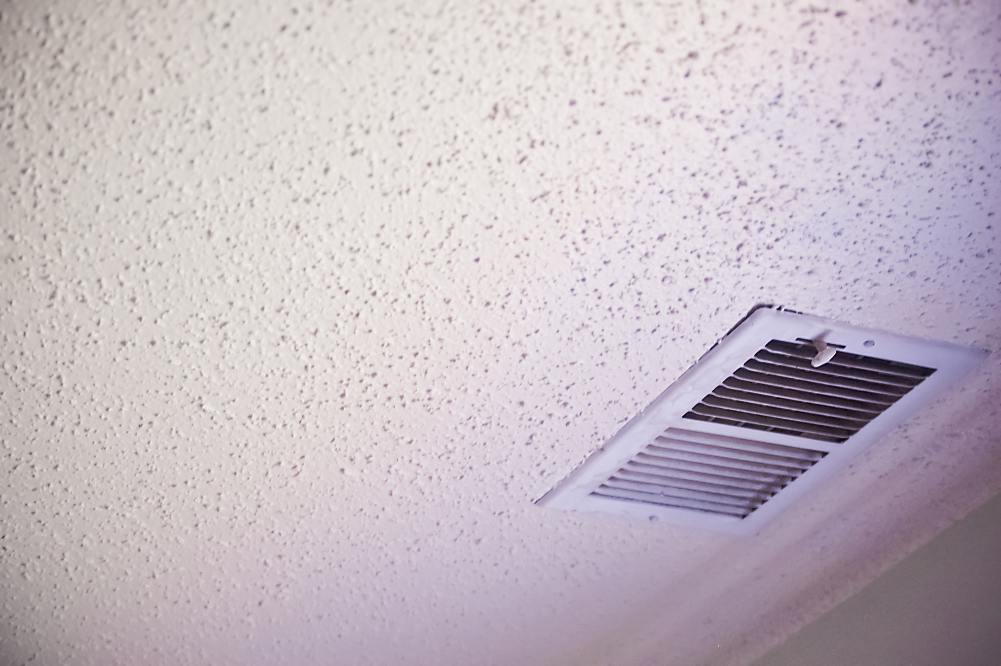
Sederberg says she’d also avoid popcorn ceilings because they date a home. “All buyers want flat ceilings, and it is a real pain to remove popcorn,” she says.
24. Built-in Shelving
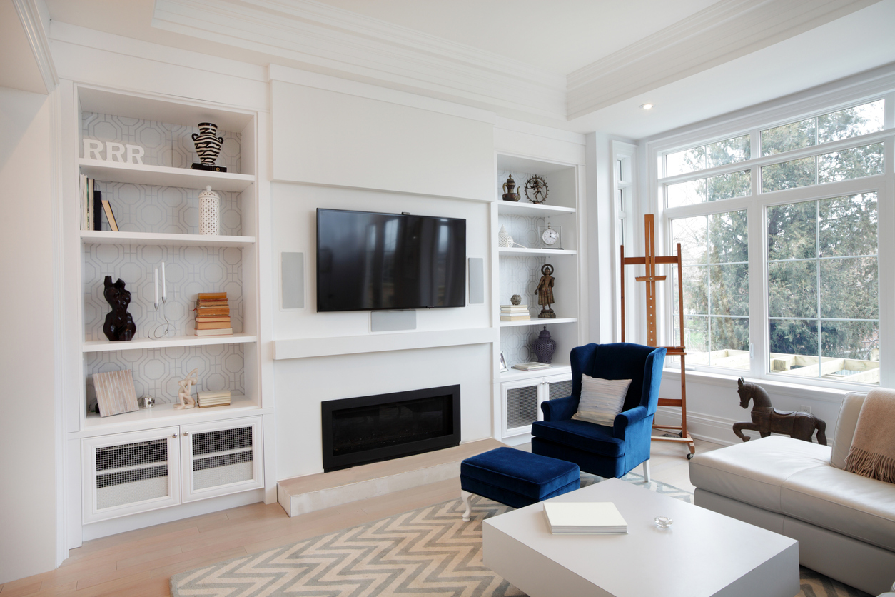
“Any kind of shelving that’s built into the walls is a big no for me,” says Michael Winkler, co-founder and chief strategist of Sell Home Today. Winkler says that this permanent storage solution may work for some people, but it limits a room’s capabilities should you sell the home. “While built-in shelving can make a room look well planned, the opposite might be true if you ever want to redecorate,” he says. “You don’t really have many options when it comes to moving the shelving itself.”
RELATED: How to DIY Built-In Shelves Like a Pro
25. Trash Compactors
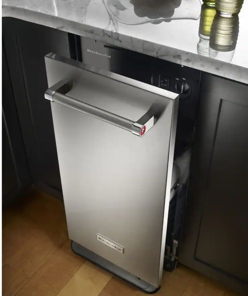
Although these contraptions were popular in the 1970s, Robert Taylor, founder of The Real Estate Solutions Guy, says they’re now merely space-stealers. “They just take up kitchen cabinet space and are prone to break down,” Taylor says. “In practically every home we see with one, the trash compactor isn’t used anymore.” Taylor adds that the space is better off being used as a pullout drawer for a trash can.
An earlier version of this article was published on June 30, 2020.

