We may earn revenue from the products available on this page and participate in affiliate programs. Learn More ›
Have you heard of the color of the year 2025? As a color expert who has helped pick a color of the year, I’ve heard many doubters say the announcement is just a marketing ploy to get us to buy more stuff for our homes. Color of the Year, or COTY, which is what designers and color experts call it, is much more than a way to merchandise home decor and building products. There’s actually a bigger meaning behind it.
Choosing a color of the year is a process that can take a few years, so design experts gather in all parts of the country and all over the world to propose colors they feel will capture that year’s mood as a physical representation. Everything from politics and current events to social movements and pop culture factor into the pick. They slowly narrow down those suggestions until they settle on the color of the year.
For 2025, Pantone announced Mocha Mousse (Pantone 17-1230) as their pick because it captures the “global mood of connection, comfort, and harmony.”
“I love the selection of Mocha Mousse for Pantone’s color of the year,” says Kim Lewis, founder of Austin, Texas-based Kim Lewis Designs. “This color is a new neutral that can pair endlessly, but also stand strongly on its own,” she says. “The tone is rich, subtle, sexy, and understated—earthy, calming, and deeply engaging. Mocha Mousse offers a level of effortless sophistication and chic luxury,” says Lewis.

Include Mocha Mousse in your home one of several ways.
If you love Mocha Mousse, go ahead and paint your living room walls that hue. However, if you’re tempted to infuse some of the chocolate comfort into your home without making a long-term or large-format commitment, instead consider accents and easy-to-swap-out home decor. Here are a few ideas for using the 2025 color of the year:
- Choose fabrics for curtains or tablecloths with the chocolate color in their pattern.
- Paint a fireplace surround in Mocha Mousse.
- Stain wood, like exposed rafters or beams, in a rich mocha color.
- Paint or stain the trim around windows or doors.
- Paint or stain a bathroom vanity.
- Include wall art that features pops of chocolate in the design.

Find home decor in the 2025 color of the year.
It’s easier to find home furnishings and accessories in the Pantone color pick for 2025, because many shops feature these items in their selections. The following are some home decor items with the Mocha Mousse hue.
- Area rug. Roll out the carpet with an accent like this solid area rug from Garland, available at Lowe’s, that’s made for busy families. It’s durable, and the subtle checkered pattern will infuse any room with a rich and soothing vibe.
- Floating shelves. Hang some art to add visual interest to an empty wall space with these brown rectangular floating shelves from Kate and Laurel.
- Mirror. Add a mirror to your entryway or swap out the mirror over a sink for this brown framed wall mirror from Kate and Laurel.
- Lamp. Swap out a table lamp for a more earthy mojo from this brown table lamp with a glowing fabric shade from StyleCraft Home Collection.
- Chair. Expand your seating with a chocolate faux leather chair that has a comfortable lean, like this midcentury chair from Joybase, available at Amazon.
Tip: If you’re looking around for other items for your home or wardrobe to match the vibe of Mocha Mousse, use the words “chocolate brown” in your search.
More “Color of the Year” picks from major brands.
While Pantone is the most talked about color of the year, paint brands, furniture brands, gardening brands, and building product companies also select their colors of the year. While the colors might vary, there’s a common throughline of moodiness and groundedness among the 2025 picks. And all of these hues can be used as neutrals, pairing well with many other colors that you may already love for your home.
Mapped Blue (429-5DB) by Dutch Boy Paints
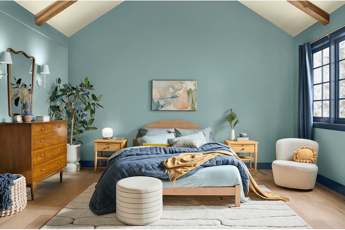
Mapped Blue is the 2025 color pick from Dutch Boy Paints. A gentle neutral, it’s a versatile color that is thoughtful and classic. The brand also created three palettes of colors that work with Mapped Blue, which makes it easier to develop a color scheme for a room or an entire home.
Violet by Minwax
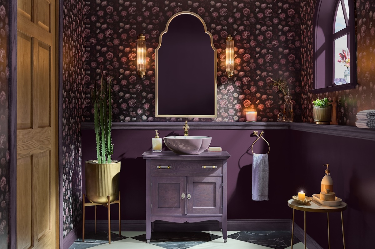
Minwax picked Violet as its color of the year for 2025. While it’s not a strict neutral, but is a bit more bold than traditional neutrals, it can be used as one in homes that are a little more moody with hues. The brand says they picked the stain because it’s a saturated and playful color that pairs well with others.
Raku (C2-549) by C2 Paint
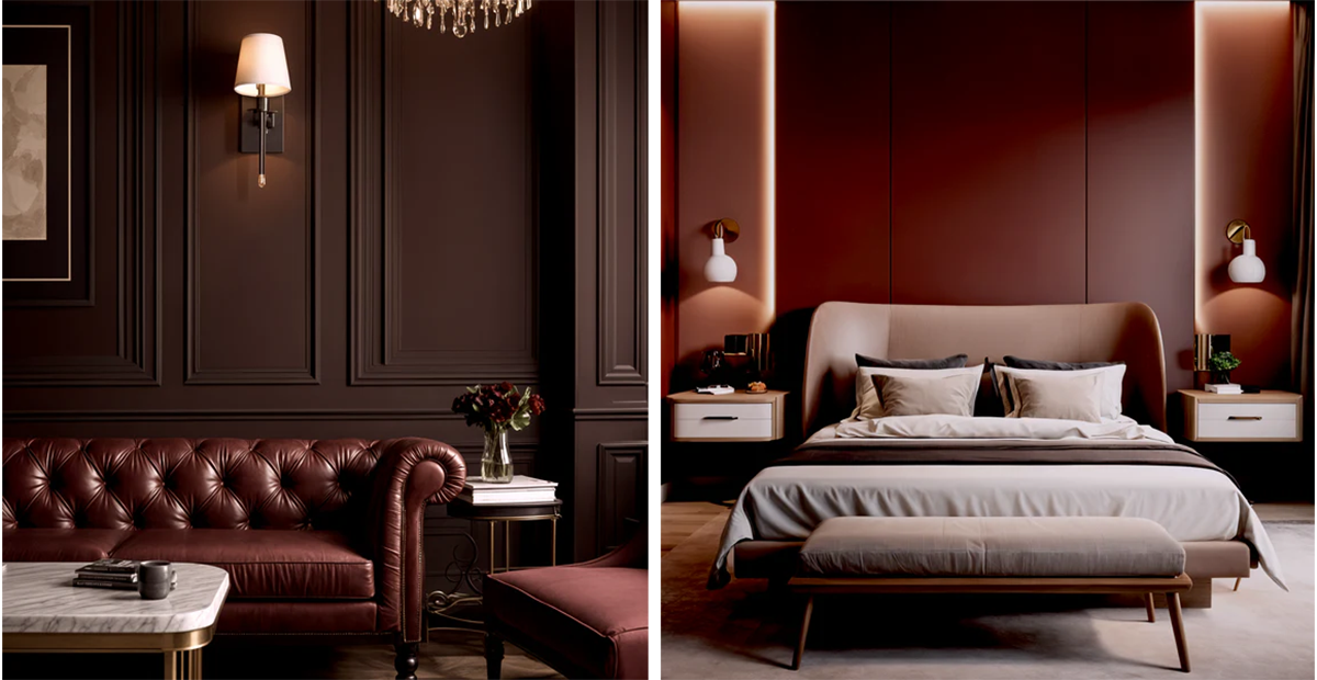
A color that is a reflection of ancient Japanese tea ceremonies, Raku is C2 Paint’s 2025 color of the year. As a harmonious blend of luxe modern vibe and a grounded traditional feel, the elegant hue is a rich neutral that can work well in nighttime hangout spaces like dining rooms, family rooms, and bedrooms.
Cinnamon Slate (2113-40) by Benjamin Moore


It’s not hard to spot the trend: Benjamin Moore’s Cinnamon Slate also makes a case for treating a velvety plum color as a neutral. It pairs well with antiqued wood tones, taupes, and charcoals to create a cozy space. Creamy white trim or color-blocking can keep this color from feeling too moody.
White Snow (SW 9541) by Sherwin-Williams

White Snow is a crisp white with a touch of warmth. Use it on all walls where you want bright and airy without being too cold, or incorporate it as a trim or ceiling color in rooms where a warmer hue is the star of the show.
But notably, this isn’t the only pick from Sherwin-Williams for its 2025 color, because the paint brand chose to create a capsule of colors to celebrate its 15th COTY anniversary. The other eight include Grounded (SW 6089), Sunbleached (SW 9585), Chartreuse (SW 0073), Bosc Pear (SW 6390), Rain Cloud (SW 9639), Clove (SW 9605), Malabar (SW 9110), and Mauve Finery (SW 6282). Like White Snow, all of the colors can be used as neutrals, and some—like chartreuse and mauve—are non-traditional neutrals.
Evening Blue by James Hardie

From James Hardie’s Statement Collection, Evening Blue practically pulls its hue from still lake waters at dusk—deep, moody, and yet calming. Maybe it’s the hint of a green undertone, but this siding shade connects well with nature without blending into your landscape. Plus, the gray that comes out in certain lights helps this striking blue into a non-boring neutral.
Hammered Black by Krylon
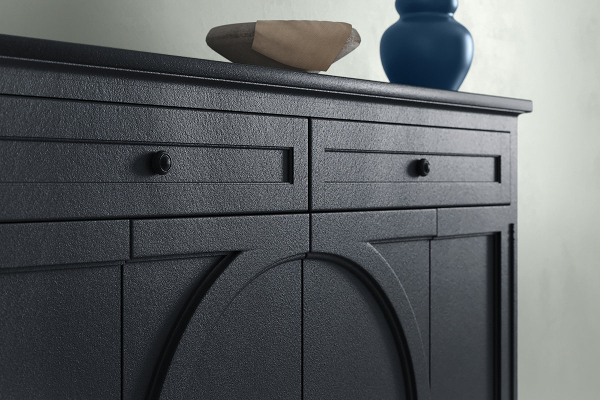
Krylon says it picked Hammered Black as its 2025 color of the year because it’s calm and grounding. This is the company’s first pick of a textured finish for the annual honor. Black is a timeless color that’s also a modern neutral, so it can make a space feel current without disrupting a low-key vibe.

