
We may earn revenue from the products available on this page and participate in affiliate programs. Learn More ›
Efficient and space-saving, galley kitchens are like a corridor of cooking with two rows of cabinets and appliances facing each other. They’re typically cost-effective to build and remodel thanks to their straightforward layout, as well. Despite those benefits, there’s a misconception that this narrow layout constrains design opportunities. And some worry that whatever color, layout, and material choices they make might only increase that feeling of physical constraint.
Thankfully, though, those apprehensions about this kitchen style aren’t worth the fuss: There are seemingly endless ways to design and personalize a galley kitchen. The below galley kitchen ideas can transform not only your kitchen, but the way you think about kitchen layouts overall.
1. Stick with a monochromatic light color scheme.
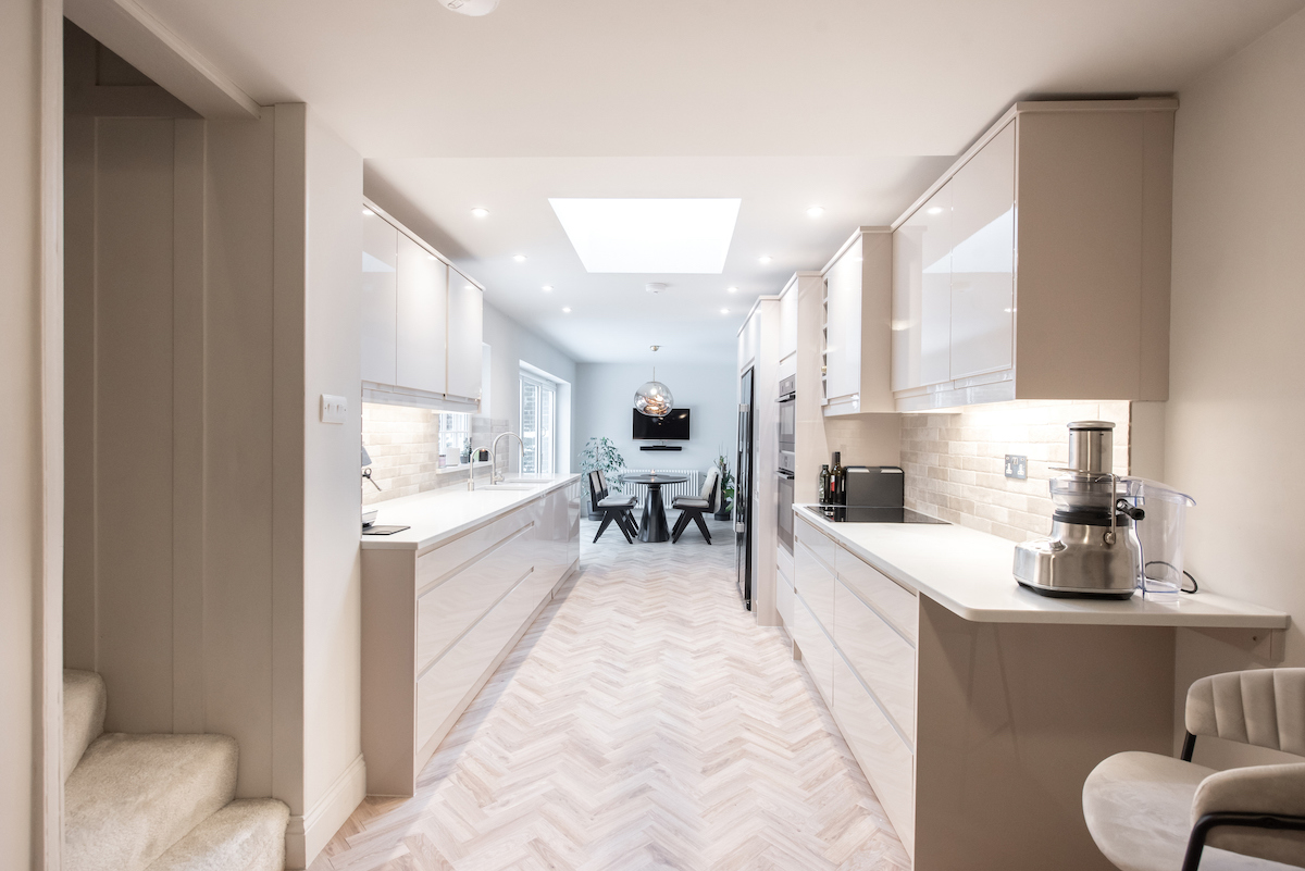
Galley kitchens aren’t known for being spacious, but that doesn’t mean they can’t be made to look and feel bigger. A great idea for galley kitchens is to visually expand the space by choosing a lighter hue and sticking with it for all of the surfaces.
“For a smaller footprint galley kitchen it would be best to keep the material finish selection on the lighter side, without a lot of different shades or bold patterns,” says Fran Isaacson, CKBR, NKBA, who is the owner and designer of Skippack, Pennsylvania-based Inspiration Kitchen and Bath.
“White/off white or a light stain color cabinet would be a beneficial option along with a countertop that does not have a lot of different colors mixed in or strong veining. Quartz counters have a lot of different lighter shades with little to zero pattern in them.”
2. Extend the countertop up the wall.
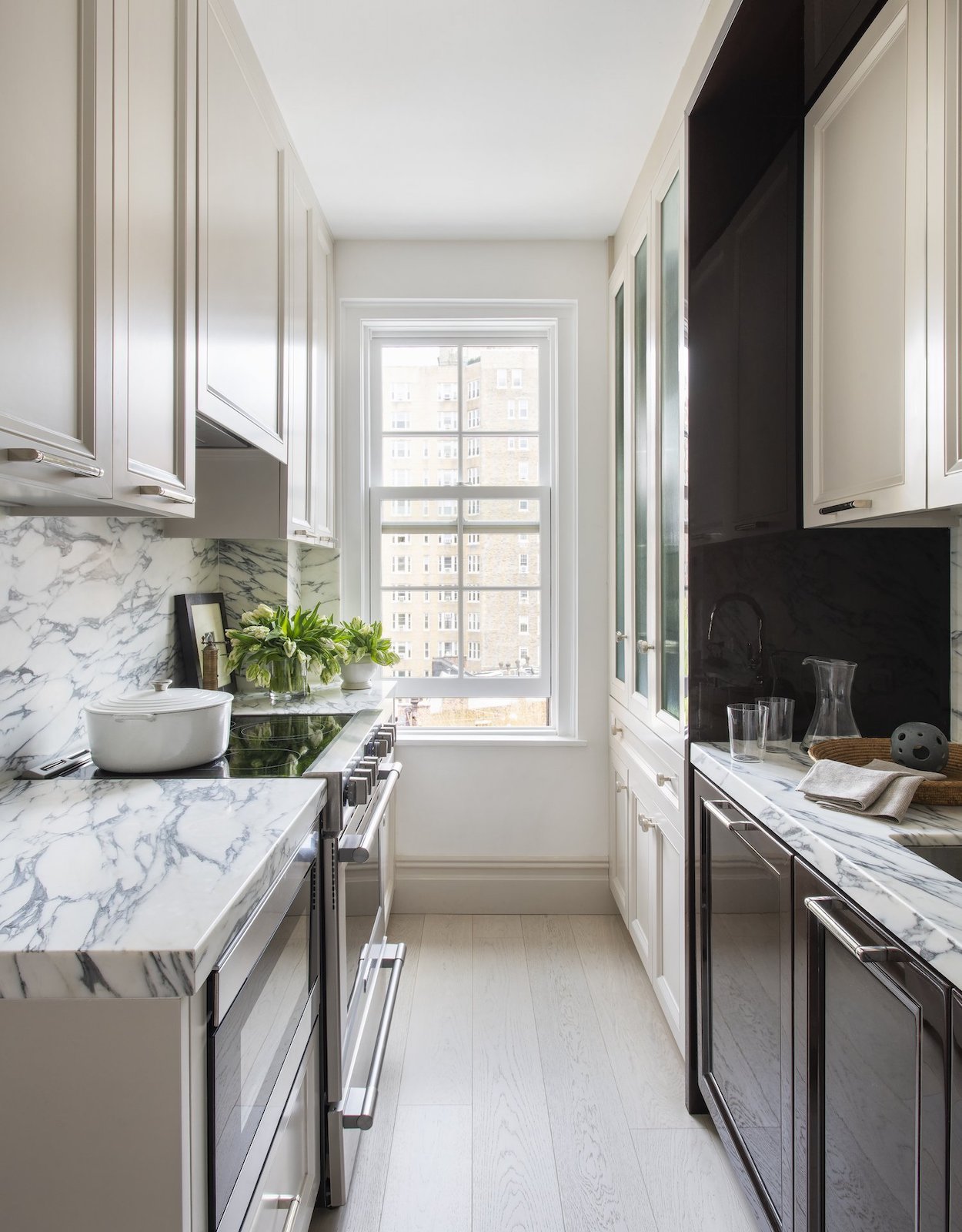
When trying to make a corridor kitchen feel larger, consider choosing a countertop material that can also work as the backsplash. By carrying the counter up the wall, there’s less visual interruption for the eye to get stuck on. The fewer breaks in material changes, the larger the room feels. Here, as a bonus, the solid surfacing becomes a focal point of the space, too.
3. Celebrate select cabinet interiors with color or light.
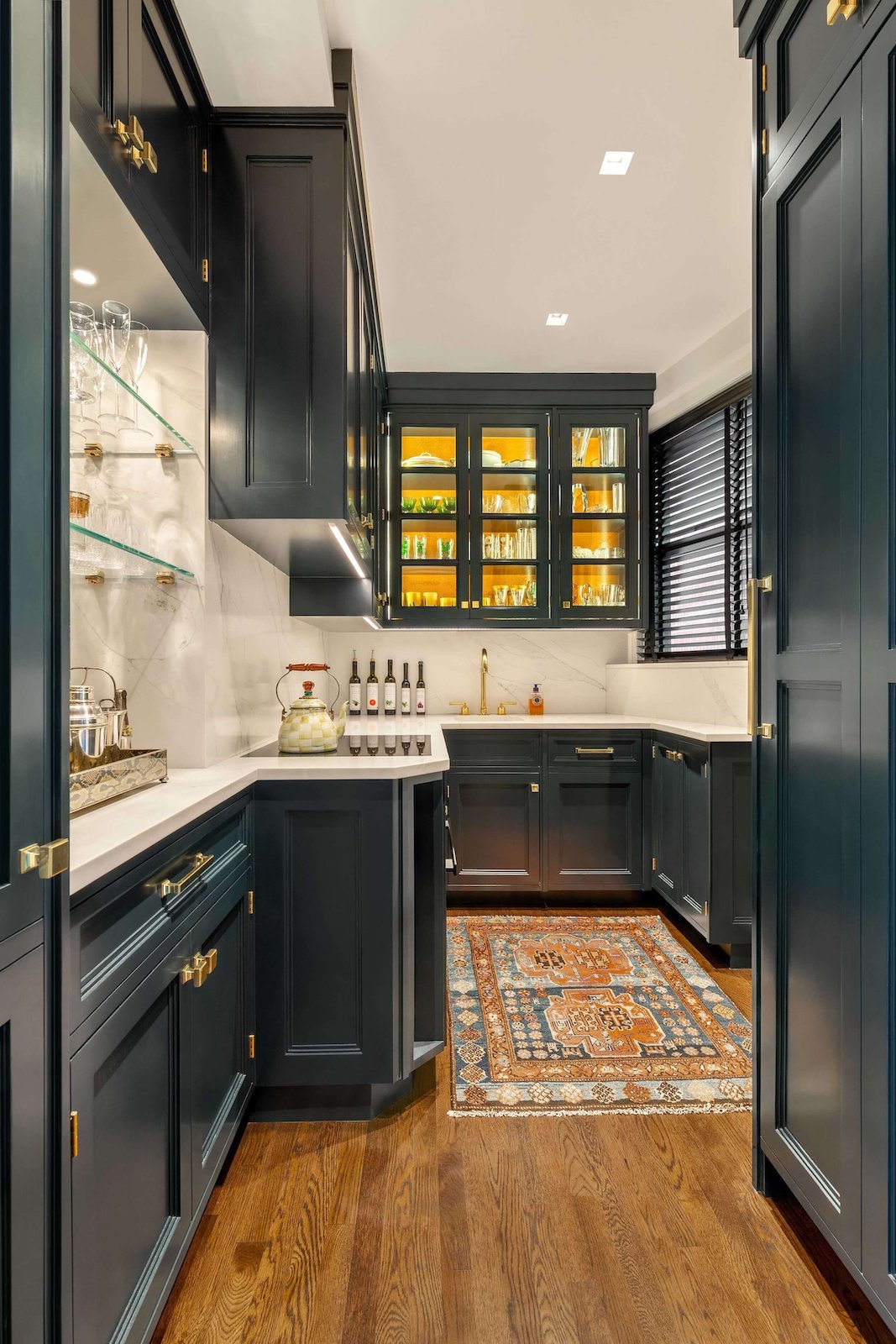
Bring a little extra life into a galley kitchen remodel with color or lighting. By emphasizing the interior of the cabinets in a warm hue, there’s a sense of greater depth. Not only does a pop up color or light help expand the sense of space, it also adds a welcoming feel to everyone who enters your kitchen. It’s not even necessary to hire an electrician or wire lights when you can pick up some LED puck lights or other DIY cabinet lighting.
4. Let in as much natural light as possible.
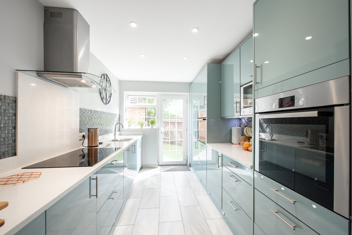
Making the most of natural light sources is another way to create a more inviting galley kitchen. Not only can natural light offer a sustainable way to light the space, it also offers views beyond the galley, making the room feel less cramped. In this kitchen, natural light from the door and window bounce off the reflective finishes of the cabinets and appliances, as well as off of the white counters, tile, and ceiling.
5. Add a subtle pop of color.

If you love a splash of color in small kitchens, consider adding your favorite hue to an architectural feature at the end of the galley. This galley kitchen layout includes a barn door in a milky, nearly neutral blue that blends well with the cream cabinets and natural wood tones. If you don’t have an architectural feature to highlight, countertop appliances or wall art with colors that inspire you can provide a similar effect.
6. Contrast cabinet and drawer colors.
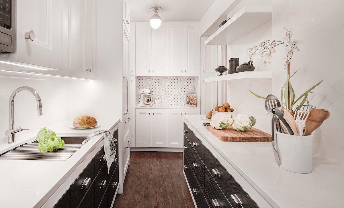
While many designers often suggest that whites and creams are reliable colors for galley kitchen designs, it doesn’t mean you can’t use other colors in your kitchen. Sometimes carefully placed color can help make the room feel even roomier than if it was just one color throughout. In this galley kitchen, the moody black drawer fronts line the pathway and make everything white feel much further away.
7. Create a focal point at the end of the galley.
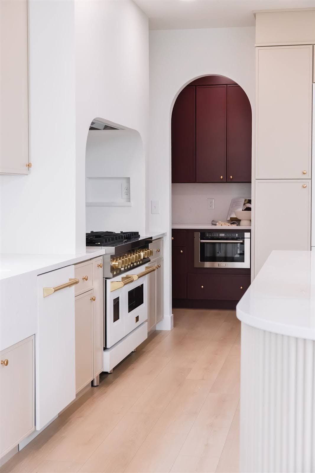
Narrow kitchen ideas don’t have to just focus on white either. This idea is for those who enjoy a bit more drama and bold colors. Consider creating a focal point at the end of the galley. “Even though space may be tight, don’t be afraid to add a pop of color to a single wall or even to one side of the cabinets to create visual interest,” says Lisbeth Parada, Color Marketing Manager at Dutch Boy Paints. In this mostly white kitchen, the rich maroon at the end of the galley shortens the visual field so that the room actually feels less like a galley and more like a spacious room. A lighter hue wouldn’t provide the same kind of effect.
8. Cover the floor with a tight pattern.
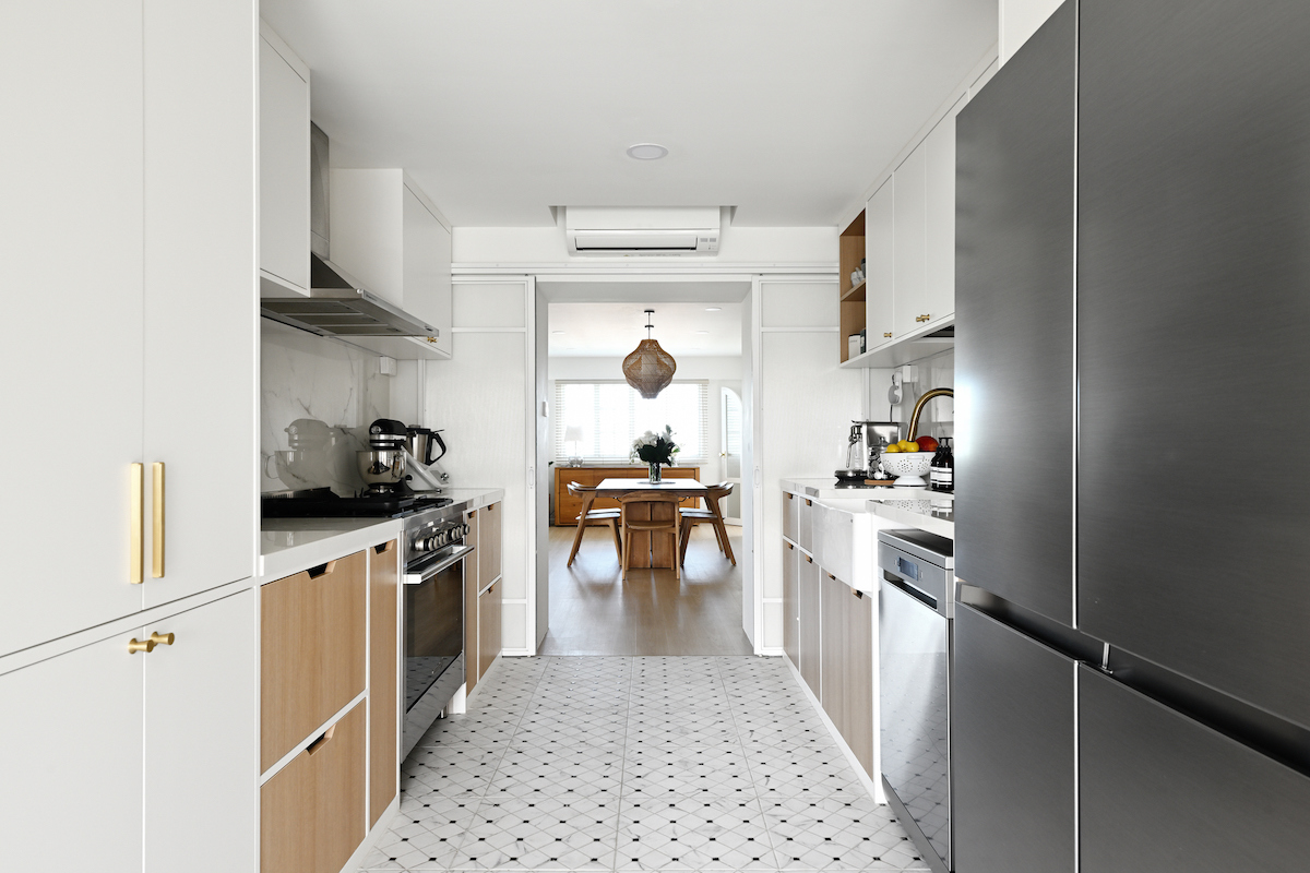
Clever ideas for small galley kitchens can also center on patterns. Designers usually consider classic small repetitive patterns in just two neutral hues, like a houndstooth or herringbone, a neutral. These patterns provide visual interest without overwhelming the rest of a design. In this kitchen, a gentle pattern on the floor provides a bit of personality, and it would help deemphasize spills or crumbs in a busy household, too.
9. Spotlight the backsplash and counter with undercabinet lighting.
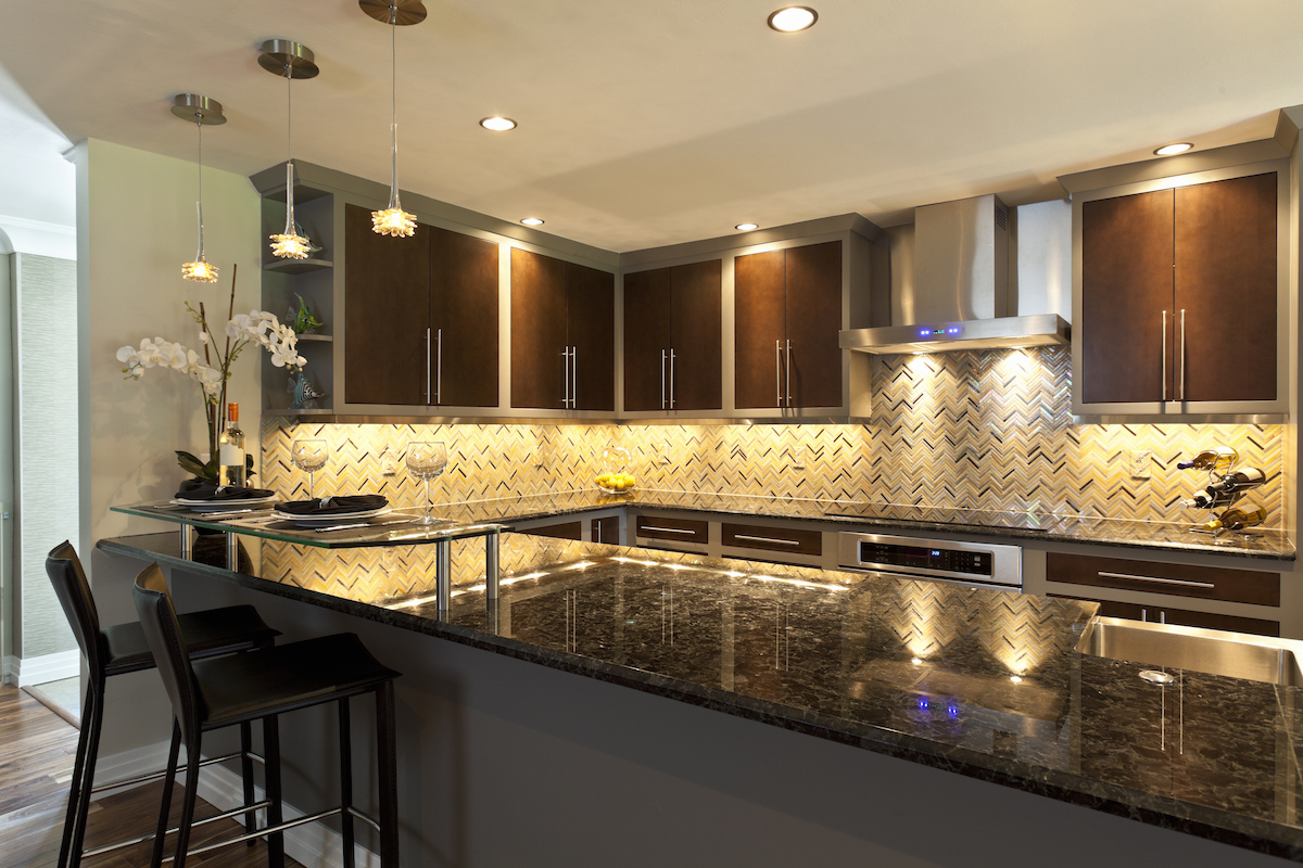
Galley kitchen lighting is an important consideration when designing the space. Layering lighting with overhead, pendant, and undercabinet lighting is an easy way to bring life into a galley kitchen. Of all of these, undercabinet lighting is the easiest to install, and it shines a literal spotlight on your counter material and backsplash patterns. Plus, the layers of lighting and upscale materials can create a night club vibe at home in your galley kitchen. Perfect for those who love to entertain regularly.
10. Replace upper cabinets with rows of open shelves.
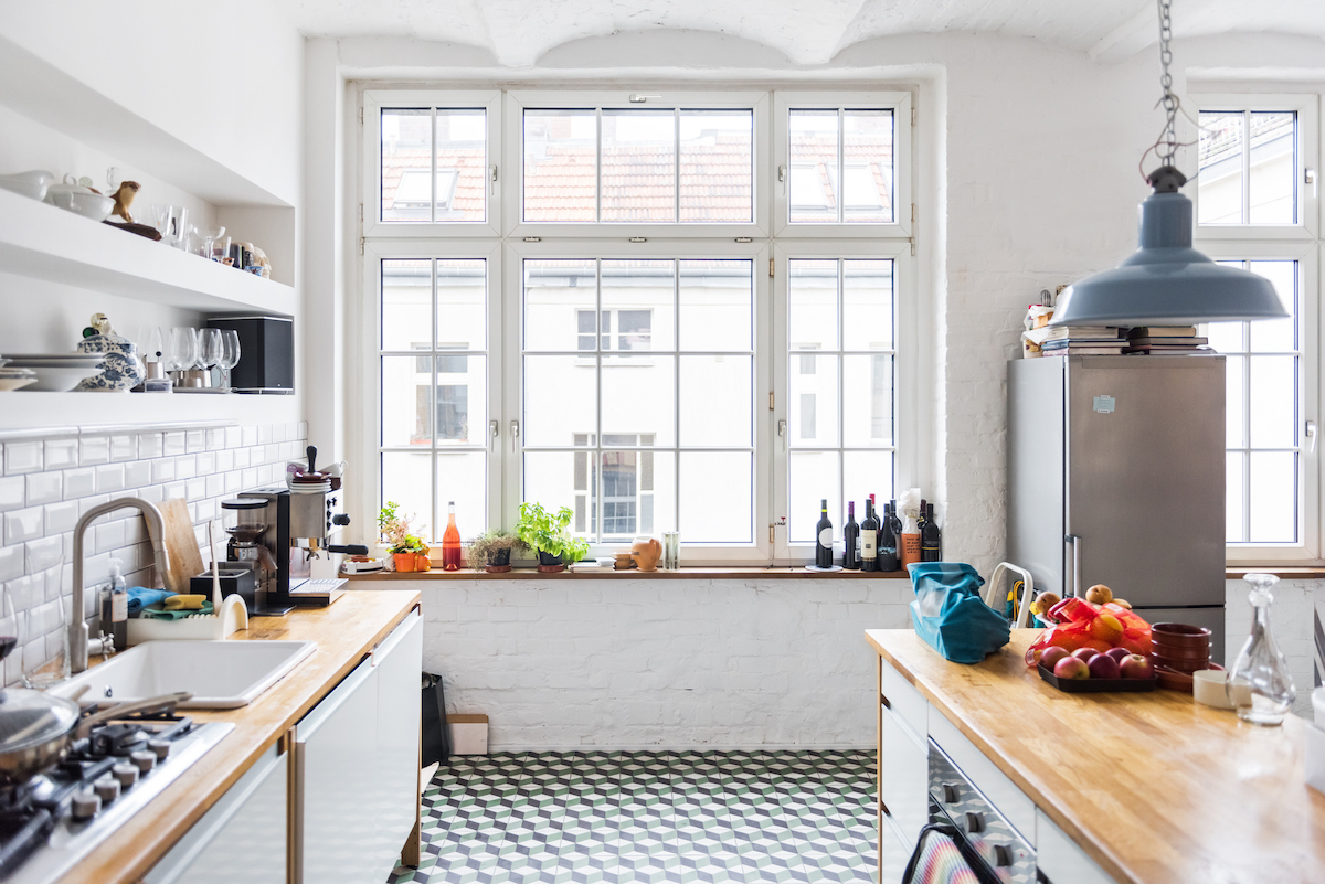
Cabinets facing each other down a long galley kitchen can be great for those who need the storage space, but it can tend to feel a bit cramped. While this kitchen isn’t a classic galley kitchen, as it has the benefit of an open space above the right row of bottom cabinets, it does show one design trick for making the space feel more open. Consider replacing some of the uppers with open shelving that extends the entire length above the countertop.
11. Pick appliances that are designed for small spaces.
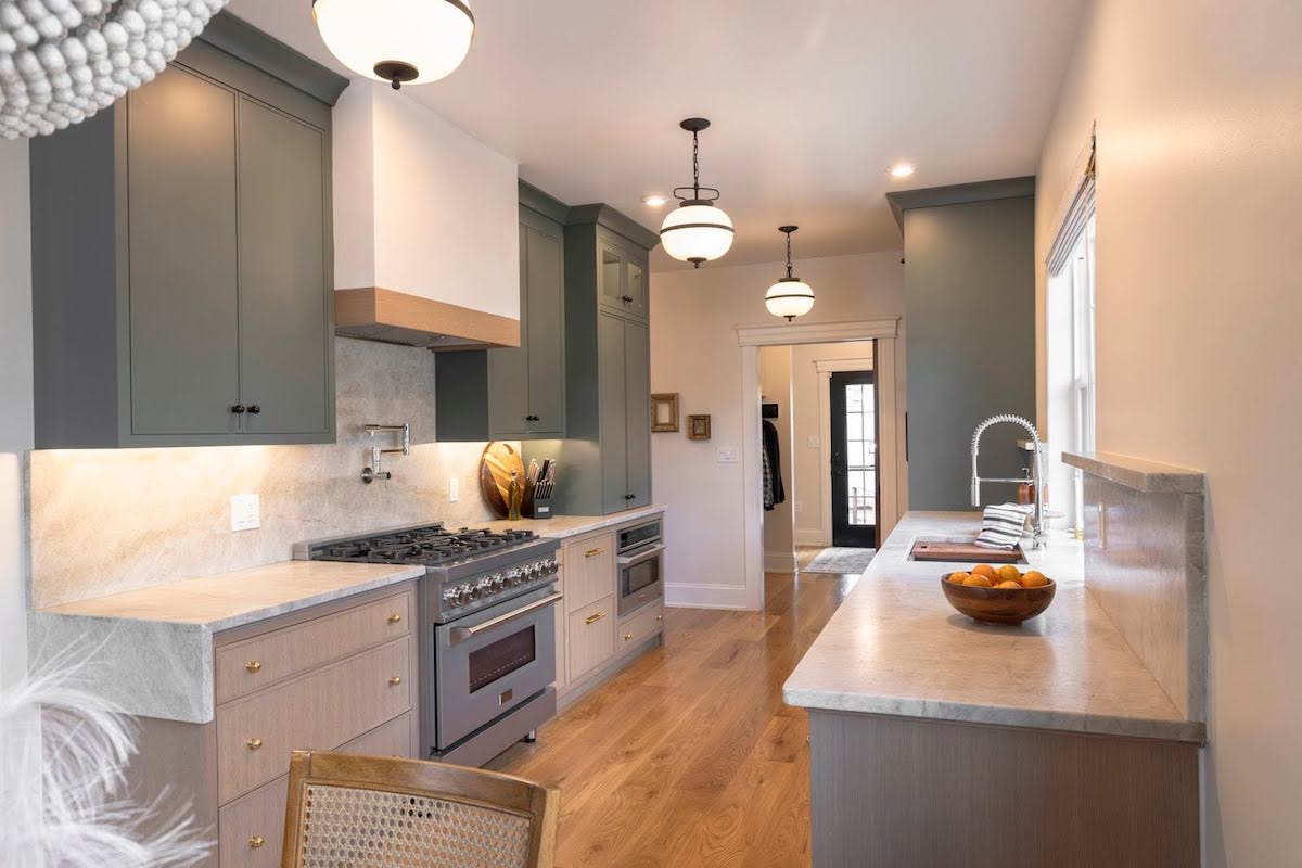
When planning the design of a galley kitchen, consider choosing appliances that are designed for small spaces. By using slimmer profiles and appliances that fit inside the lower cabinet spaces more easily, the entire scale of the kitchen transforms. This kitchen includes appliances from Zline’s Studio Collection that includes ranges, dishwashers, cooktops, and more.
12. Blend flooring with vertical surfaces.
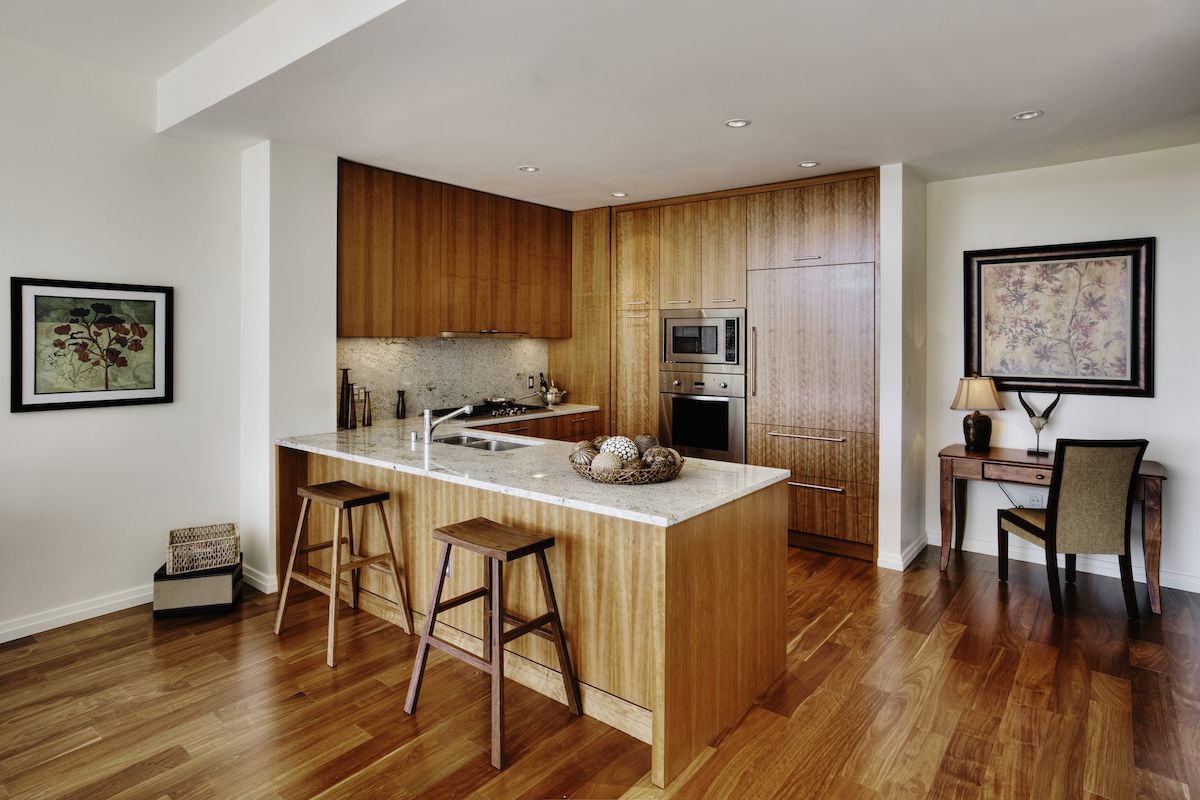
Not every kitchen needs to make a major statement. By choosing similar finishes on the floor and cabinets, you can create a little jewel box galley kitchen set within the larger white space like this one. Just keep in mind that the direction of most of the planks is the same. By contrasting the direction, it could create visual disharmony.
13. Emphasize the floor with an eye-catching pattern.
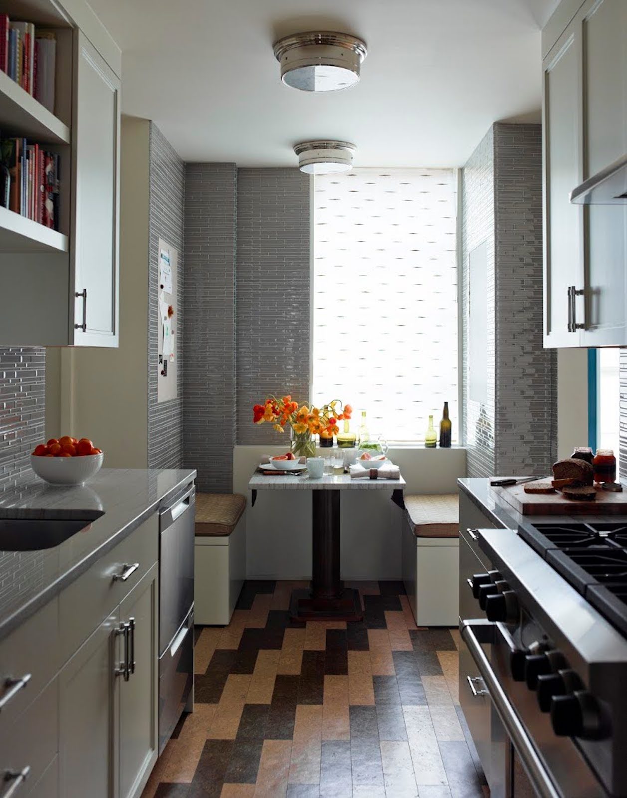
For those who are more design adventurous, a bold flooring choice can transform the feel of a kitchen. While a singular bold color like red could enliven the space, a pattern that seems to extend beyond the room (like this one) can make the room feel like more than the sum of its square footage. If you already have a plank floor, consider staining or painting some of it to create a similar look.
14. Lay down a bold runner for added dimension.
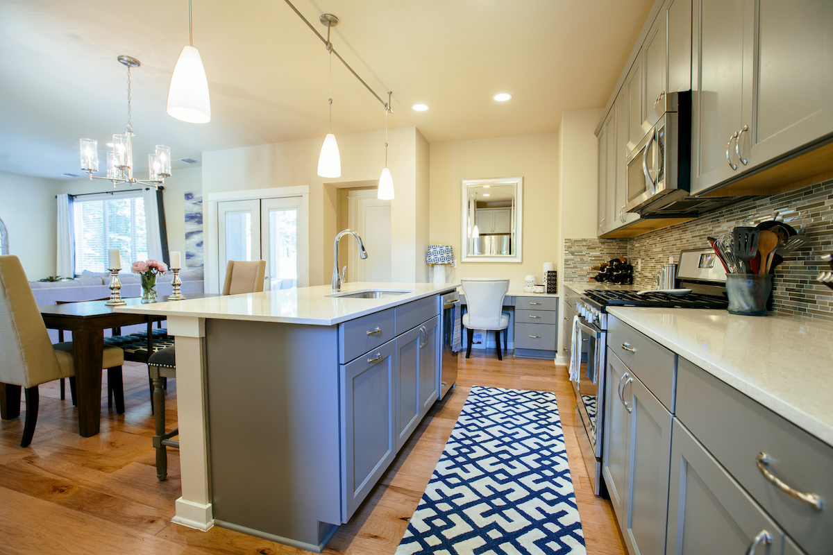
If your galley kitchen with an island is feeling bland—but you aren’t confident about painting or swapping out permanent features like cabinets—maybe try something less permanent. Adding a pop of pattern in a runner rug adds personality and fun. Plus, you can try out different colors and styles without having to invest a ton of time updating the space.
15. Use just one color on the upper half of the walls.

The more colors, textures, and patterns you introduce, the busier the room feels. By keeping the vertical spaces minimal and in just one hue, it helps to make the room feel larger. Floor-to-ceiling kitchen cabinets with flat fronts blend in with the flat walls when they are in the same color, too.
16. Establish a rhythm with the lower cabinets.
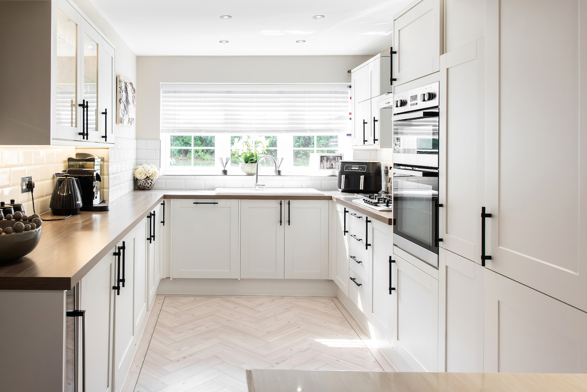
While you can keep all of the appliances in the lower half of the walls, you can also choose to keep them in the middle part of the walls. Here, the bottom cabinets are consistently the same color with the same pulls, so they blend nicely to create a calm vibe. Even though there are several small appliances in this kitchen, they are all positioned at the same level as the faucet, keeping the upper cabinets in the same profile, color, and finish as the lower cabinets.
