We may earn revenue from the products available on this page and participate in affiliate programs. Learn More ›
Yesterday’s Yellow

For years, Mimi was obsessed with remodeling the kitchen in her sister’s late 1970s mobile home. After drawing out a plan at least 10 times, the fearless DIYer and Blue Roof Cabin blogger finally started demolition. The monumental overhaul included taking out the curved peninsula, moving cabinets, building an island, and, of course, installing new countertops.
Today's Taste
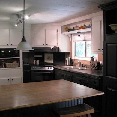
Central to the kitchen renovation is the 63” x 40” island that Mimi fabricated from a hodgepodge of sources, including a Habitat store where she scored free cabinets, another Habitat where she found really reasonable oak doors, and Home Depot for beadboard. The classic lines of the new island and commanding pantry, coupled with a black-and-white color scheme, equal a kitchen with lasting appeal.
Panel Pandemic
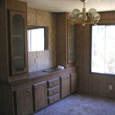
When interior designer Charmaine Manley and her husband, Mark, decided to move to High Desert, Oregon, they knew they would have to make compromises. Although “living in a trailer with fake paneling… held absolutely no appeal,” the Manleys bought a 1980 double-wide—then proceeded to gut the entire space. Four months later, the couple had a home that made them proud.
Breathing Room
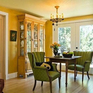
Removing the paneling and carpet brightened the space immediately, and the addition of Sheetrock, bamboo flooring, sunny yellow paint, and French doors gave the house a much more traditional vibe. Throughout the project, Charmaine kept the layout light and cost down, reusing as many materials as possible and furnishing wisely—and inexpensively. Garage sale chairs now float around an antique table (a first anniversary present), and the hutch was a Craigslist score.
Muted Mess
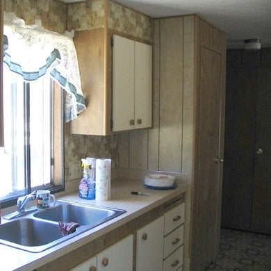
The Manleys wanted not only to spruce up the kitchen’s appearance, but also to add space and functionality, including a laundry room. The layout change required tearing down walls, extending the footprint by three feet, and adding support columns. Mark’s engineering prowess came in handy as the DIYing couple reframed windows and tackled issues with load-bearing walls.
Kitchen Basics
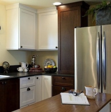
The new kitchen is a simple symphony of neutrals. Charmaine chose eco-friendly materials whenever possible; some of her green choices included sustainable PaperStone countertops and Yolo no-VOC paint.
Related: 29 Best Paint Colors for a Kitchen You’ll Never Want to Leave
Dark Nights
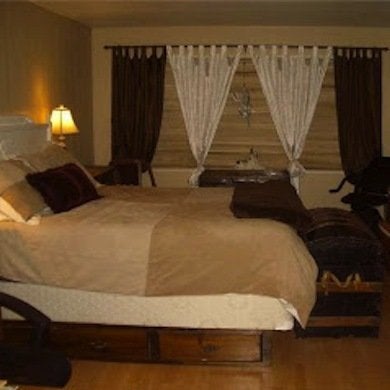
Kristy and George live in British Columbia, Canada, and often blog about the renovation of their 1970s 11′ x 60′ mobile home at 4 the Love of Wood. Since they moved into the house six years ago, the interior has undergone several style revisions. Given Kristy’s passion for repurposing and rebuilding—and her love of finishing furniture in many shades of white—she knew it was again time to change up their decor, including the look of this sedate bedroom.
White Out
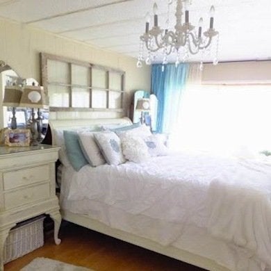
By whitewashing the bedroom, Kristy tempered its formality and rejuvenated its spirit. She was able to adapt most of the room’s dark wood furniture to her new light aesthetic by painting it. Smartly placed mirrors, such as the trifold vanity mirrors on the nightstand, play a part in keeping the space light and airy.
Related: 13 Ways Decorating With Mirrors Can Transform Your Space
Kitchen Blahs
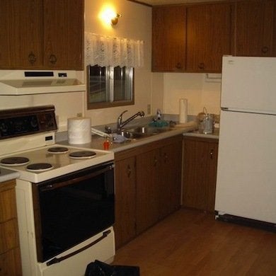
The kitchen was in decent shape—the appliances worked and the countertops were in good condition, as was the wood laminate floor. But in order to make the room feel more personal, Kristy and George embarked on a project to cheer up the space, add function, and introduce a few pretty details.
Crafty Kitchen
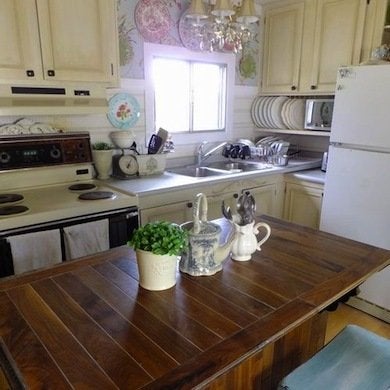
Kristy and George refinished the kitchen cabinets with latex paint before they moved in and then contintued to fine-tune them after. The kitchen island, created from a vintage cabinet turned upside down, was one of Kristy’s major DIY projects. After cleaning up the old piece, she painted it, fortified flimsy parts with wood, and turned a pair of craft store bookends into corbels.
Lackluster Laundry
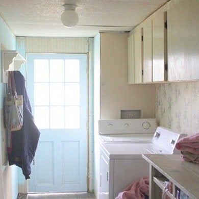
Gina Luker has been remodeling a 1993 Clayton double-wide for 10 years. The structure was originally a “hot mess” that featured hunter green and mauve as its flagship colors. Gina, DIY gal and blogger at The Shabby Creek Cottage, has worked hard with a modest budget to transform it into a quirky, cozy farmhouse-style home. In early 2012, she finally crossed “laundry room” off her to-do list.
Awash in Style
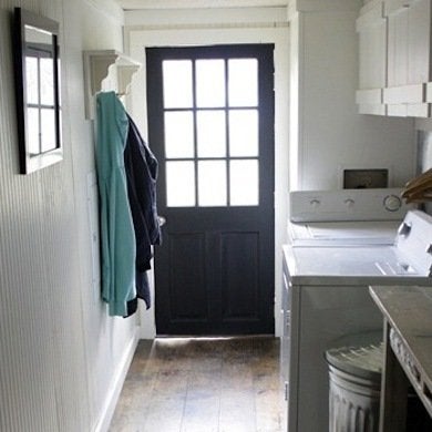
Once the long, narrow space was refreshed with linen-colored paint, a contrasting black door added a big dose of oomph. Industrial elements such as corrugated metal used as a wall covering and a galvanized can used as a clothes hamper helped turn a dowdy area into a space with purpose and style.
Bad Bath
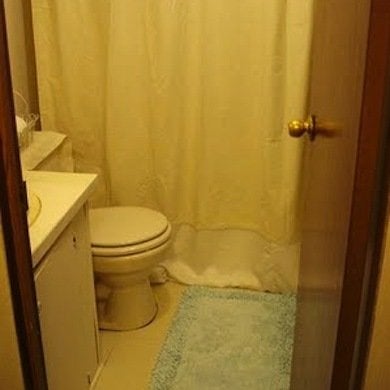
A guest bathroom remodel lingered in Gina Luker’s mind for four years. The sad 25-square-foot space was “cramped and dark and just icky.” When the time was right, Gina and her husband gutted the space and removed flooring, walls, and fixtures. Although they moved fixtures around, keeping their $600 budget in mind, they avoided relocating plumbing lines.
Bask-Worthy Bath
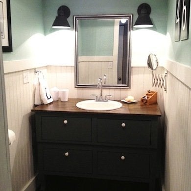
The bathroom remodel required a completely different layout. Although no square footage was added, the perfect-fit wood vanity, lengthwise plank flooring, and misty blue walls make the room appear bigger. Some of Gina and Mitch’s cost-saving materials include flooring made from plywood planks, a $5 sink from Habitat, and reasonably priced light fixtures from Home Depot.
Bedroom Blues
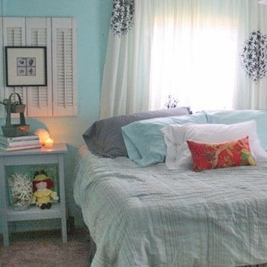
In 2009, Gina Luker was smitten with coastal style, so she painted the walls of the master bedroom in a watery blue, gathered up some decorative accessories, and created a comfortable enough end-of-day crash pad. Four years later, Gina set her sights on a more refined style, explaining that the seashore shades were her “attempt at making do.”
Plank Perfection
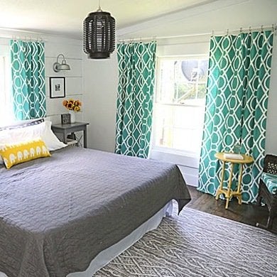
Gina’s bedroom makeover melds her present affinity for modern farmhouse style with a bit of lightheartedness. Gina counts the plank wall as one of her most satisfying DIY projects. Using tutorials from a few fellow blogging pals, Gina injected a bit of her own aesthetic, defining the chinks in between planks with an underlying coat of dark gray paint.
RV Rescue
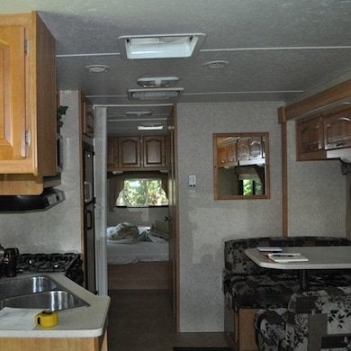
Outfitted in a murky melange of neutrals, this 2007 Forest River Sunseeker looked shabby and dated. When an NYC marketing firm leased the vehicle for a summer media tour, they promised to reinvigorate it. Thanks to a mix of materials as hardworking as they were glamorous, the RV went from drab to fab.
RV N-V
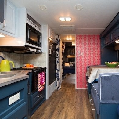
With an imaginary Connecticut gypsy as muse, the redesigned interior strikes a balance between classic prep and funky bohemian. The pink-and-navy color scheme plays out in a variety of fabrics such as mohair, velvet, and corduroy-like Crypton; spunky patterns like ikat and starbursts add visual excitement. Rustic-looking wood laminate floors afford a great foundation for layering the mix.
Everything You Need for a Lush and Healthy Lawn
Keeping your grass green and your plants thriving doesn’t just take a green thumb—it starts with the right tools and supplies.
