We may earn revenue from the products available on this page and participate in affiliate programs. Learn More ›
The Grace of Gray
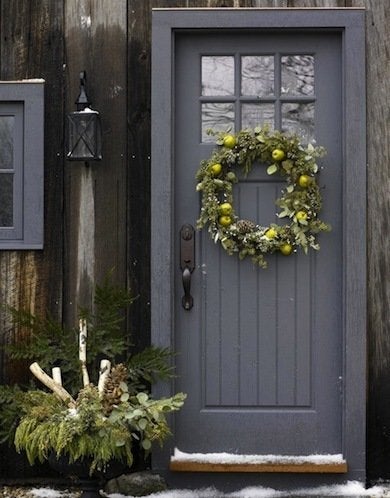
Courtesy of New England Home by Michael Partenio
Gray is such an easy neutral to live with. It doesn’t pack a punch but rather has a quiet strength that is much sleeker and more current than nondescript beige. A gray door has a way of balancing a bright exterior and lending just the right amount of steely modernity to more traditional structures.
Recommended color: Antique Tin by Behr
Like Twilight
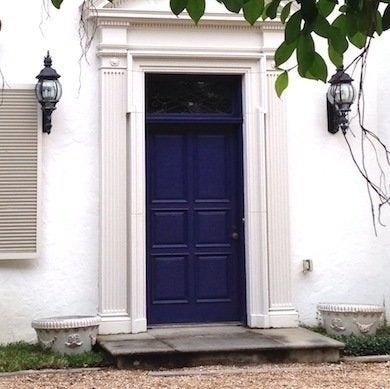
Jane Dagmi
A more complex and mesmerizing version of a basic blue, a deep purplish blue makes a front door as swank as a vintage velvet smoking jacket. This dramatically dark jewel tone is a nuanced shade that shifts in response to the light, going from brilliant to sultry in the course of a day.
Recommended color: Wild Iris by Kelly-Moore Paints
Top It Off
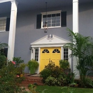
Courtesy of Louise Green
Los Angeles hat designer Louise Green knows a thing or two about colorful accents, so when it came time to paint the door of her 1960s home, the fashionista chose a spunky color that would shed some of the dwelling’s architectural conservatism.
Recommended color: American Cheese by Benjamin Moore
Likable Lime
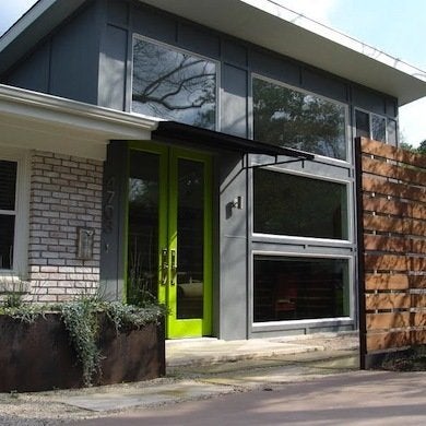
Courtesy Steve Zagorski Architect
When Austin, Texas-based architect Steve Zagorski chose the color for a client’s front entrance, he picked citrus green for “contrast, contradiction, and juxtaposition.” Lime, an unexpected, standout color in a mostly bland neighborhood, felt particularly lively against the gray-clad exterior, and Zagorski says it reflects the “true nature of its colorful inhabitants.”
Recommended color: Snow Cone Green by Benjamin Moore
Teal Appeal
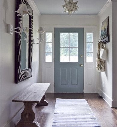
According to Atlanta-area designer Julie Holloway at Milk and Honey Home, a soft teal door is “traditional but not boring.” This shade, which echoes calm skies, complements most house styles and is as historic and timeless as it is cool, eclectic, and often acceptable to homeowner associations.
Recommended color: Stratton Blue by Benjamin Moore
Juicy Bright
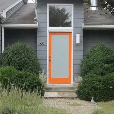
Jane Dagmi
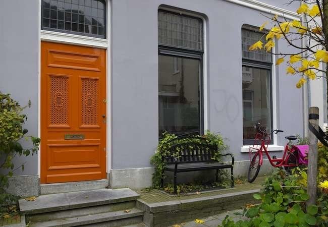
While traveling through The Netherlands, Nick Bewsey and Nelson Zayas of the Blue Raccoon in Lambertville, N.J., were repeatedly enchanted by Amsterdam’s orange doors, sporting a shade known as Queen’s Orange. “Upon coming home, we decided to paint our door the closest orange we could find,” says Bewsey. Paired with deep gray siding and white trim, the tangy shade makes a bold, warm welcome.
Recommended color: Invigorate by Sherwin-Williams
No-Fail Black

DecorPad
Just like the little black dress, a black-painted front door in satin or gloss is elegant and classic. Black mingles well with shingles, stone, and brick, but it is most striking when paired with white. As Mary Lawlor, manager of color marketing at Kelly-Moore Paints, says, “A front door painted in gloss black with white trim never goes out of style.”
Recommended color: Stiletto by Kelly-Moore Paints
Turquoise Gem
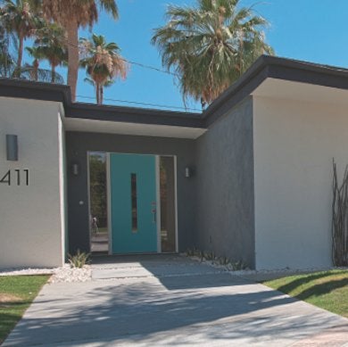
Courtesy of Crestview Doors
During the renovation of a Palm Springs mid-century house, design firm H3K chose a new door with a vintage vibe, then had it painted a cheerful blue. Surrounded by neutral architectural materials and vivid nature, the attention-grabbing turquoise door played a major role in the visual transformation.
Recommended color: Fountain by Sherwin-Williams
White Welcome
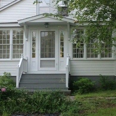
Courtesy Ted Kennedy Watson
If the trim and body of a house are dark, then a white door really pops. A white-on-white house, however, has a peaceful energy. The all-white Hawthorne, a cottage in upstate New York, looks pristine among lush greenery and falling leaves and becomes one with the snow in winter.
Recommended color: Simply White by Benjamin Moore
Ready for Red
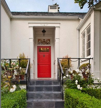
Jeneration Interiors
With a mostly monochromatic color scheme inside the house, designer Jennifer Dyer of Jeneration Interiors in Los Angeles saw the front door as an opportunity for color. While citing the historic appeal of red as well as its positive feng shui vibe, in the end Dyer says she uses this hue because “more than anything, I just like the color.”
Recommended color: Vermilion by Benjamin Moore

A DIYer’s Guide to Replacing Flooring
Update the look and feel of any room by replacing old, worn-out flooring. These products and straightforward steps make it easy enough for any handy homeowner to do.
