We may earn revenue from the products available on this page and participate in affiliate programs. Learn More ›
Dress Up Walls
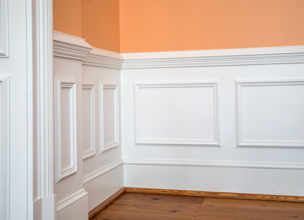
Nothing dresses up naked walls like wainscoting, an umbrella term for any type of decorative wall paneling that occupies the lower portion of a wall. Originally all wainscoting was high-quality oak; it may have developed as part of wagon construction, and started to gain popularity in 16th-century England to keep out the cold and stave off moisture-related damage. Today, wainscoting is primarily used to add interest and allure to an interior living space.
Wainscoting can be either pre-made or custom-built, and made from a variety of materials. If you are considering using wainscoting in your home, the following inspired wall paneling ideas may help you make the best choice for your decor. Check out these 19 wow-worthy ways to use this adaptable, versatile wall surfacing.
Build with Beadboard
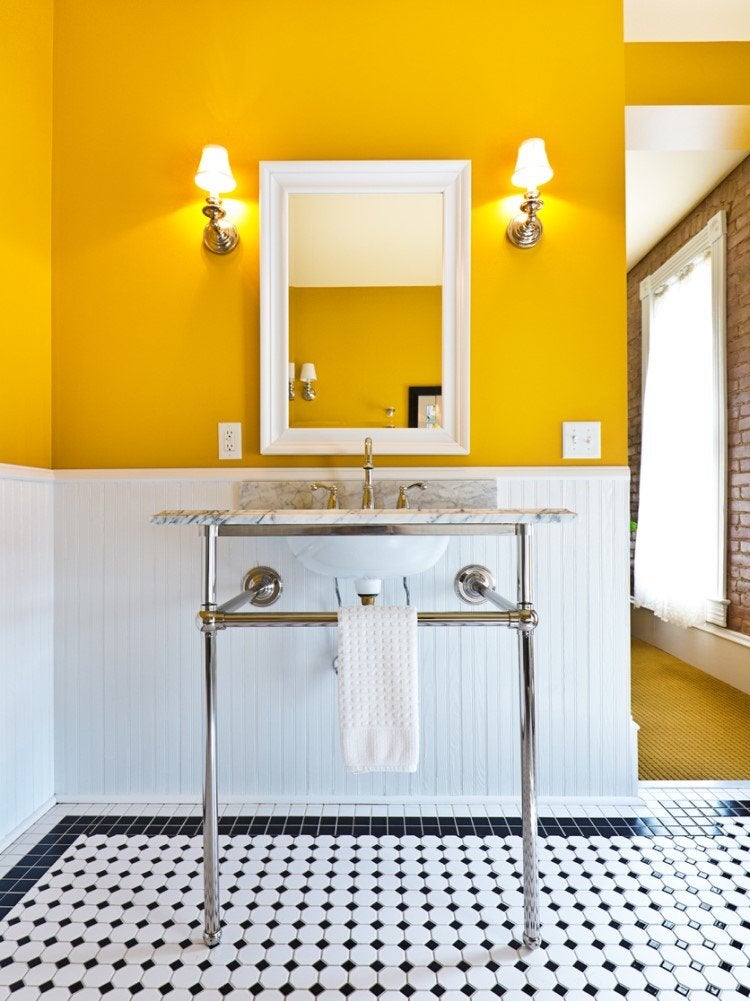
Experience New England living with this traditional wainscoting style common in Cape Cod-style houses. Featuring thin vertical wooden strips that interlock in a tongue-and-groove system with the tongue (protruding edge) of one strip fitting into the groove (slot) of another, beadboard makes such smaller spaces as breakfast nooks and bathrooms room look taller. The milk-white beadboard in this bath was built up to a few inches above the countertop to double as a backsplash and draw the eye toward the cheery mustard paint and twin gold sconces.
RELATED: Better Your Builder-Grade Home with 12 Old-House Details
Add Elegance with Raised Paneling
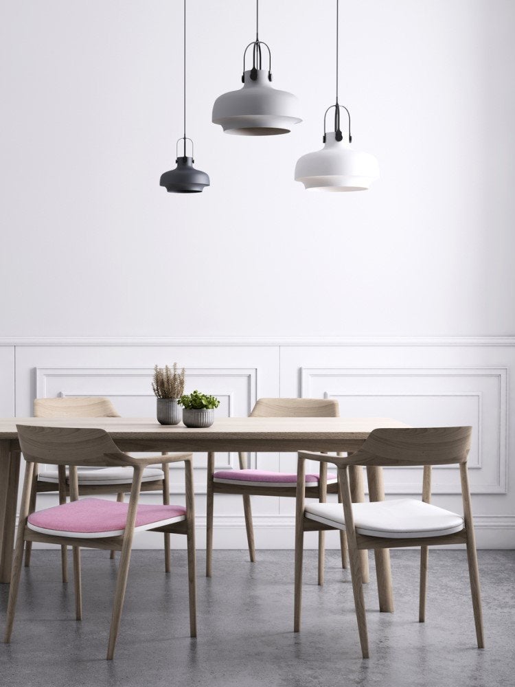
A hit in 17th-century Colonial and Queen Anne-style homes, this traditional wainscoting option sports individual beveled square or rectangular wood (or MDF) panels. The panels are divided by thin vertical strips and finished with an upper horizontal rail of molding. This formal look suits living rooms, dining rooms, and other spaces where guests gather. White raised paneling lends depth to this dining room while maintaining its crisp, clean aura.
Create Clean Lines with Board and Batten
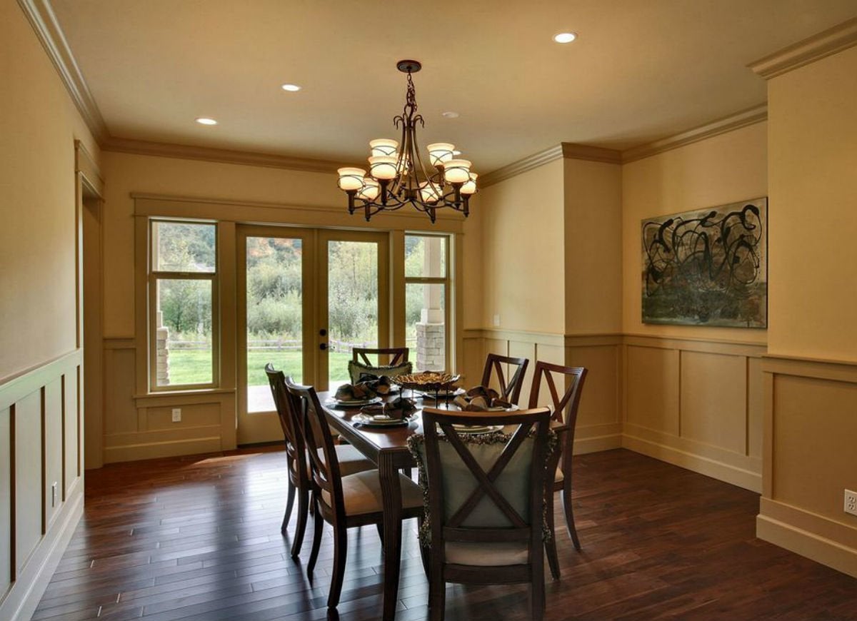
Zillow home in Kirkland, WA
First used on the siding of barns, board and batten consists of alternating wide wood or MDF panels and narrow wooden strips between upper and lower horizontal rails of molding. It beautifully blends traditional and modern elements in transitional spaces, from kitchens to mud rooms. The old world-inspired flax board-and-batten wainscoting, wooden table, and chandelier in this formal dining room lend it warmth and make the modern art appear as a true novelty.
Put Up Picture Frame Molding
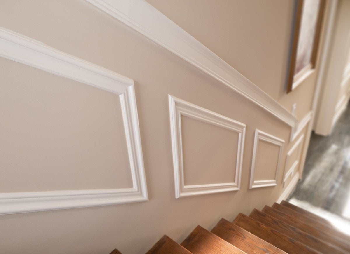
Picture frame molding gets its name from its early use as a divider for wall-mounted framed portraits. It usually consists of a series of frame-like units made of individual strips of beveled wood or MDF molding joined into a square or rectangle. While square picture frame moldings evoke a traditional look that suits formal dining or living rooms, the rectangular white moldings in this stairway exude modernity.
Appreciate the Original Beauty
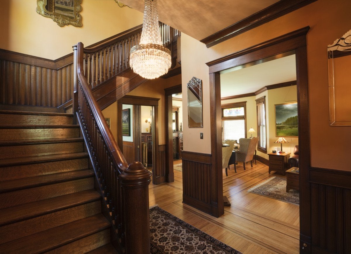
When it comes to color options, you can paint wood or MDF wainscoting in any hue of your choosing, or let it go bare to reveal its original beauty. Stained wainscoting is particularly desirable in traditional entryways and hallways with a yesteryear look, which the natural patina of the wainscoting only enhances. Paired with ornate mirrors and grand chandeliers, dark and dramatic woodgrain makes entering this Victorian-style foyer feel like stepping into another era.
RELATED: 10 Vintage Decorating Ideas We Were Wrong to Abandon
Select Soft Neutrals
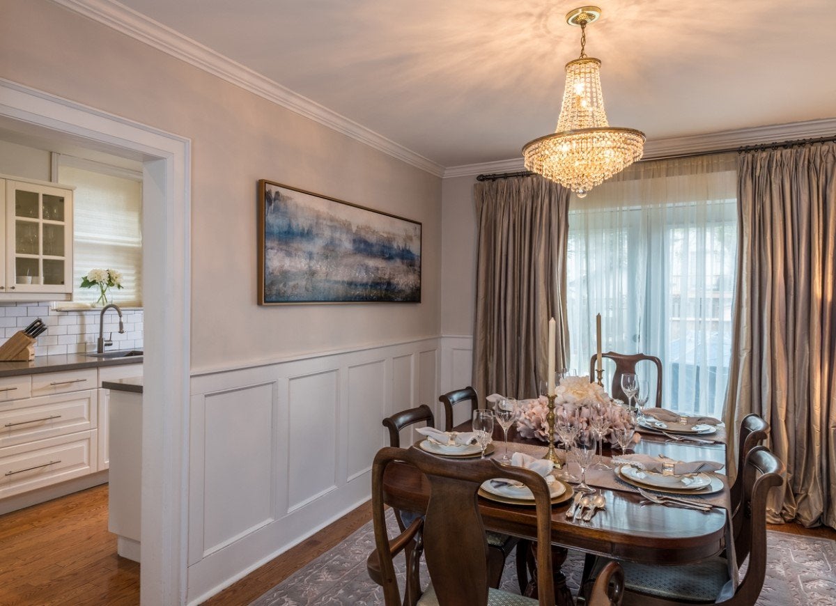
Neutral color schemes, boring? As if! Forever fresh wainscoting hues like white and cream actually draw the eye to more daring design elements in traditional, transitional, or modern rooms across the home. Just be sure to choose an equally subdued wall paint color and wainscoting style so as not to overpower the space. Here, white recessed (sunken) paneling and low-key cream-colored walls serve as an elegant backdrop to a vintage table lit by a glitzy chandelier.
Go Bold
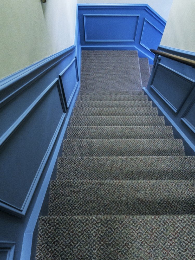
Is your hallway, mudroom, or reading room not getting the attention it deserves? Eye-popping wainscoting colors from fire-engine red to magenta inject fun and modern flair into what were once purely functional spaces. Electric blue recessed (sunken) paneling is an energizing and welcome sight amidst the gray carpeting that lines this winding staircase.
Whiten and Brighten
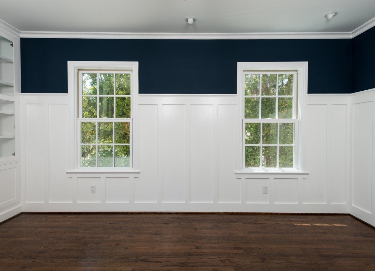
If you fall in love with a dark wall color but worry about turning your room into a cave, paint the wainscoting below with a bright white. This crisp classic will brighten any room that might otherwise get too cozy; just run it one-third of the way up on the wall for a pop or two-thirds to make the room extra airy. The white board-and-batten wainscoting in this multipurpose room shifts the gaze of guests to the painted accent above it—a velvety navy—and consequently highlights the high ceilings as well.
Match the Walls

Choosing a wainscoting color that coordinates with your walls is a simple but often overlooked technique for achieving visual cohesion in living, family, and dining rooms with furniture and decor of diverse styles that you want to tie together. Despite the distinctive abstract wall art, industrial lighting, and contemporary table in this dining room and bar, the room maintains a unified look thanks to the slate-colored raised paneling and matching walls.
Target Your Color
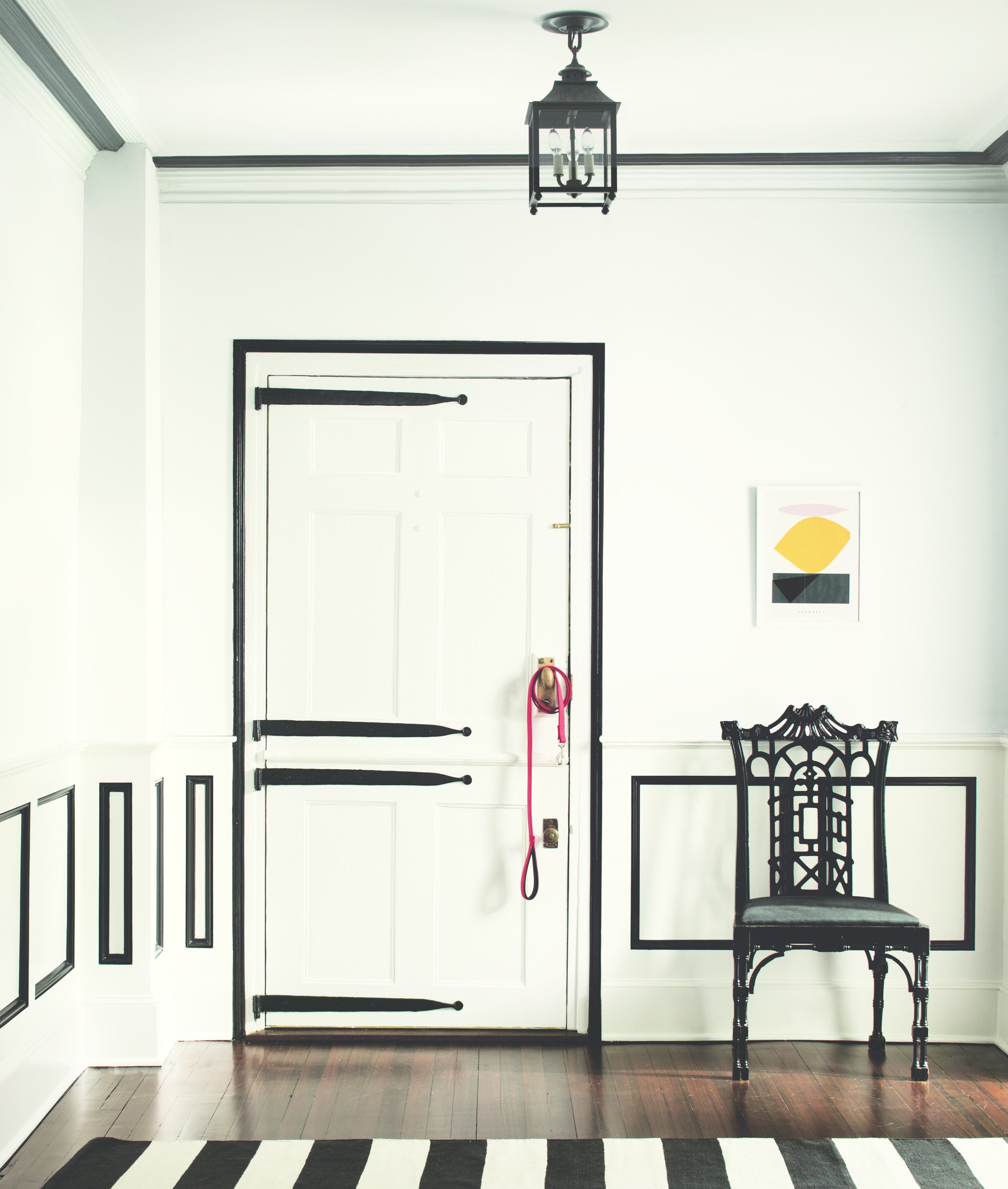
Whether the rails of board and batten or the indentations of recessed paneling, many wainscoting features worth admiring may not be noticeable unless you’re up close. One way to emphasize them is to apply color only to the architectural details you wish to emphasize and leave the rest of the room white. In this modern sitting room, the homeowners applied black paint only to the indentations in the recessed paneling and along the perimeter of the door and ceiling to set them apart. The wonderfully eccentric black-and-white theme spills over onto the floor with a black Art Deco-style chair and striped rug.
Take Wainscoting to New Heights
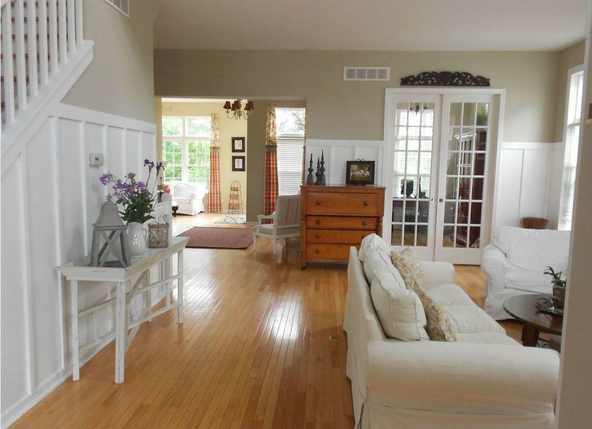
Zillow home in Howell, MI
From dressers to tables, many furniture pieces might be of the same height as wainscoting and would therefore cover it up if positioned in front of it. One solution for traditional, transitional, or modern rooms is to increase the height of your wainscoting. These homeowners raised the height of their family room’s board-and-batten wainscoting to roughly two-thirds of the height of the wall, allowing it to peek out above an antique dresser positioned a few inches in the foreground. Even better? The taller wainscoting covers stains, dents, and other blemishes at the midline of the wall.
Camouflage Wall Cabinets
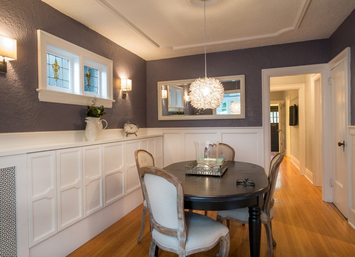
Have a set of cabinets on one wall that makes bare surrounding walls stick out? Consider installing wainscoting on the other walls to avoid the lopsided look and achieve a more cohesive and modern dining room, game room, or den. These homeowners cleverly installed white recessed paneling against a blue-gray dining room wall at the same height as an adjacent set of custom white cabinets for a beautifully balanced effect. From afar, the wainscoting looks like a cabinet unto itself!
Remember that Less is More
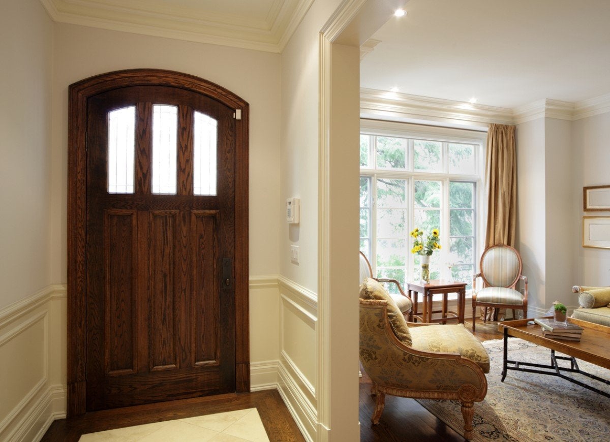
Fort wainscoting to have maximum impact, only install it in select areas, which lets it make a stronger statement than overdoing it all over the house. Empty alcoves, uninviting hallways and entryways, and rooms with minimal furniture all make great candidates for wainscoting. Take a page from these homeowners, who installed cream-colored raised paneling to lend oomph to an empty traditional entryway but left the walls bare in an adjacent living room that was already well furnished.
Safeguard Stairways
Zillow home in Los Angeles, CA
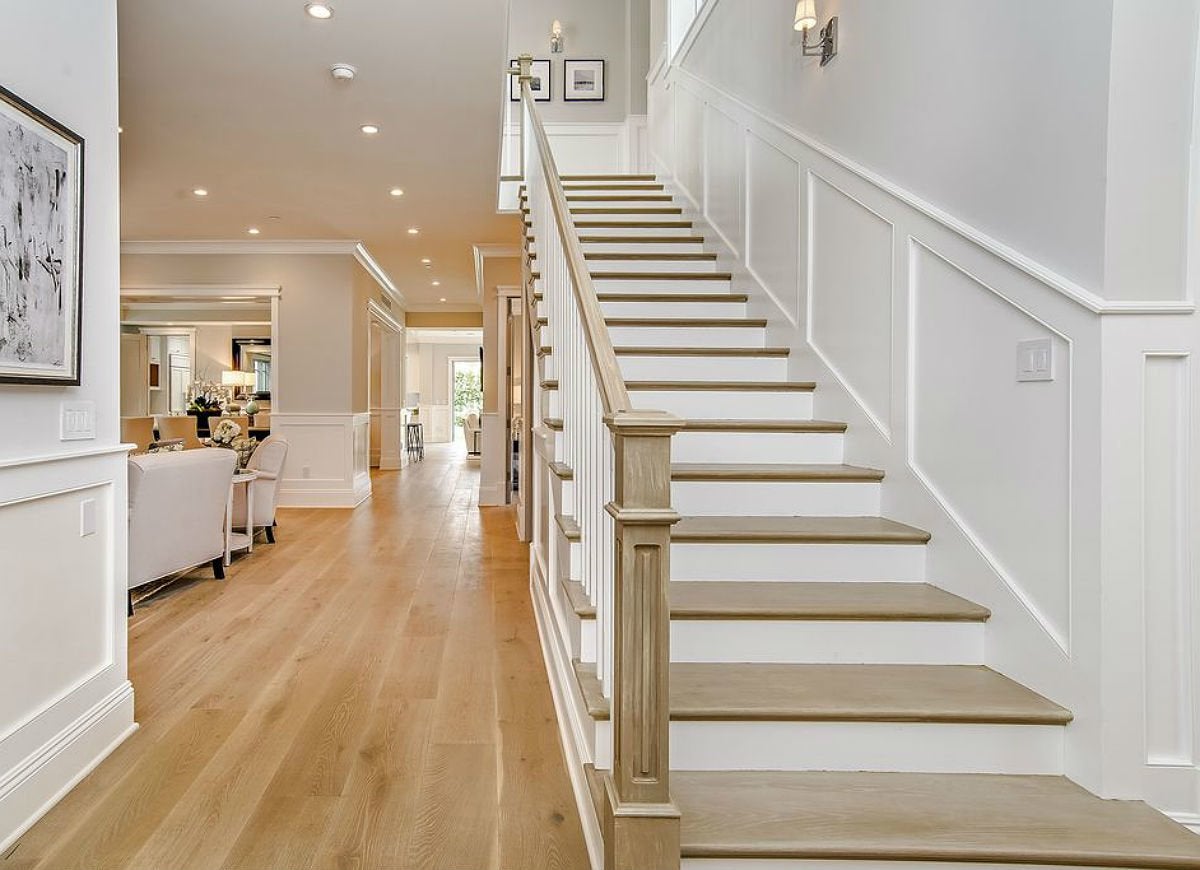
As a wall covering, wainscoting can do as much to protect your walls as it can to enhance their beauty, especially when it’s installed in entryways, hallways, and other high traffic spaces that get banged up on the daily. Here, white board-and-batten wainscoting in the stairway staves off wall scuff marks from heavy appliances or equipment the homeowners might carry upstairs.
Don't Shy Away from Angled Rooflines
Zillow home in Bainbridge Island, WA
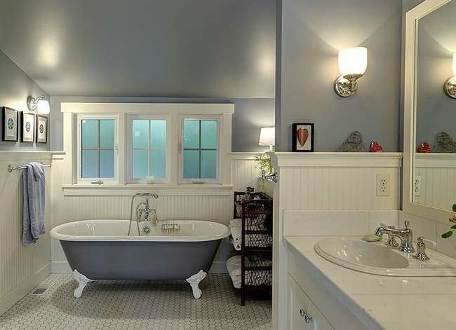
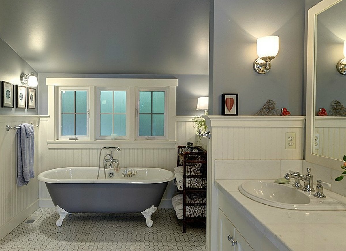
When planning wainscoting in a room on the top floor, its height may feel taller in the section with a lower ceiling than elsewhere in the room due to the slope of the roof. Generally speaking, wainscoting will span one-third of the tallest wall and go all the way around the room. Mark this height on every wall, including shorter ones located under the eaves, before you install it to see that you’re happy with the placement and make adjustments as needed. Keep in mind that you’ll also cut the wainscoting where a wall feature impedes you, like these homeowners who worked around the central windows in their cottage-chic design.
Paired with Paper
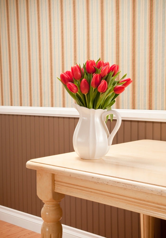
Create a custom look for a classic country-styled room by pairing painted beadboard with patterned wallpaper. This rich-colored beadboard is outlined by bright white baseboard and chair rail for a polished appeal. The striped wallpaper mimics the lines of the beadboard below, but creates a less formal feel from its multicolor stripes set in a repeating pattern. Paired with an oversized floral wallpaper, a dark-painted beadboard can provide a more modern flair.
Corner Curves
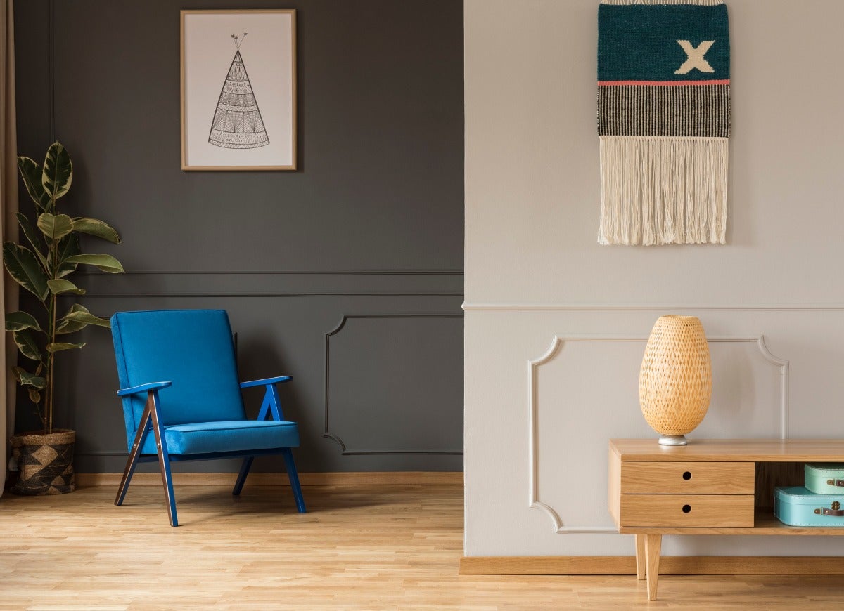
Not all wainscoting is rectangular. A radius corner detail breaks up the straight lines of the rest of the wall’s components, and brings graceful character to the room. This example of radius corner molding has a delicate and thin profile, further adding to the lightness of the wainscoting. Painted in the same color as the rest of the wall, the shadow lines define the lines of the molding and provide a textural backdrop to the rest of the space.
Top to Bottom
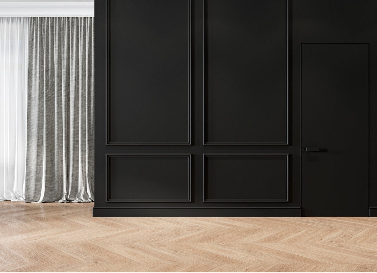
While wainscoting typically covers about one-third of a wall, sometimes it makes sense to extend paneling from floor to ceiling. Using the raised panel mojo of traditional wainscoting, this example demonstrates how to use these elements to increase the feeling of height in a space. The lower trim’s long sides of the rectangle extend left to right, and the top trim’s long sides extend down to up. Painting the entire wall the same color also helps make the space seem more expansive.
Create it With Paint
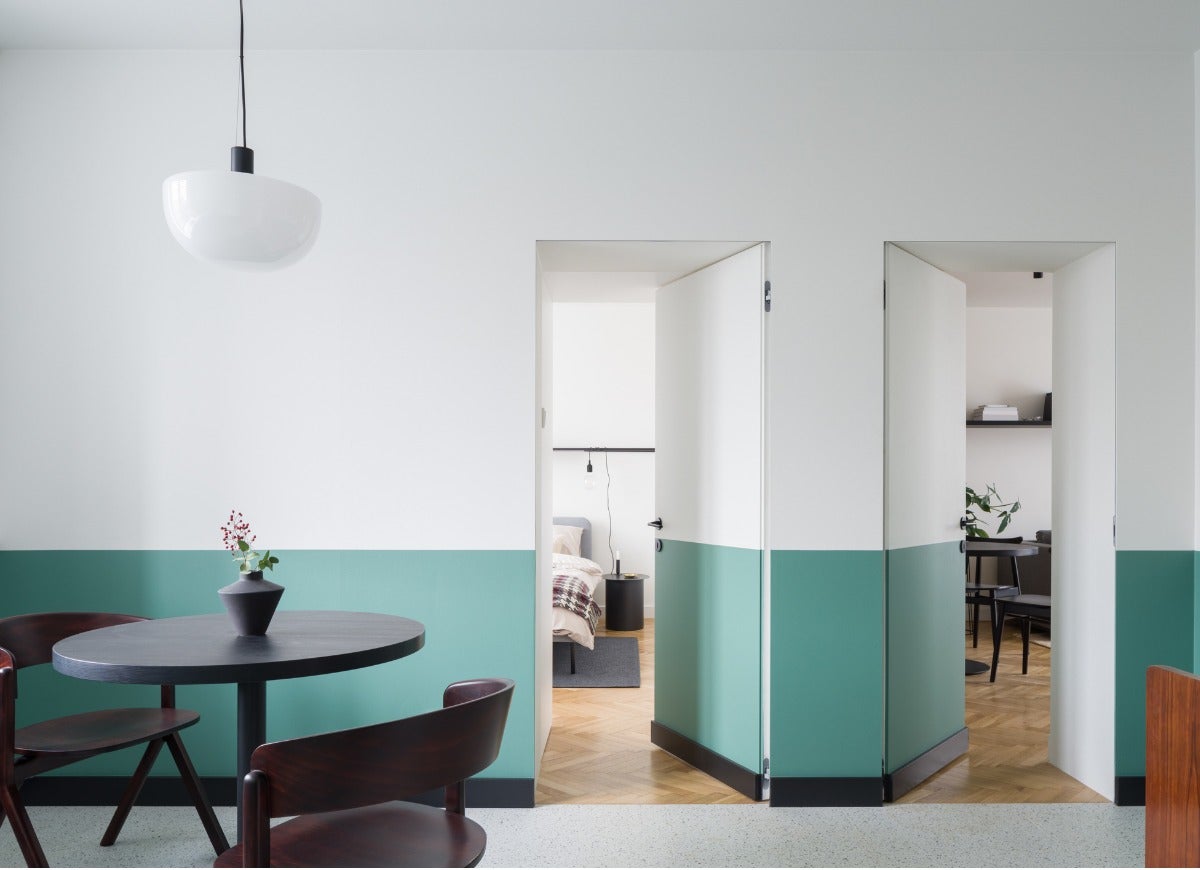
If there’s no budget for wainscoting but you like the look and want it for a room in your home, paint can help. This isn’t a time to use subtle color choices for both the top and bottom parts of the walls. In order for the paint to look purposeful, and not a color-matching accident, try a color that is very different from the paint on the top portion of the wall. This also is a budget-friendly way to try out the wainscoting feel, before committing to the actual panels or trim.

Save Energy While Staying Cozy
Today’s energy-efficient space heaters warm individual rooms, so users needn’t heat unoccupied areas of the house. We tested the most popular space heaters on the market to find out which ones performed the best.

