We may earn revenue from the products available on this page and participate in affiliate programs. Learn More ›
Anything but Vanilla
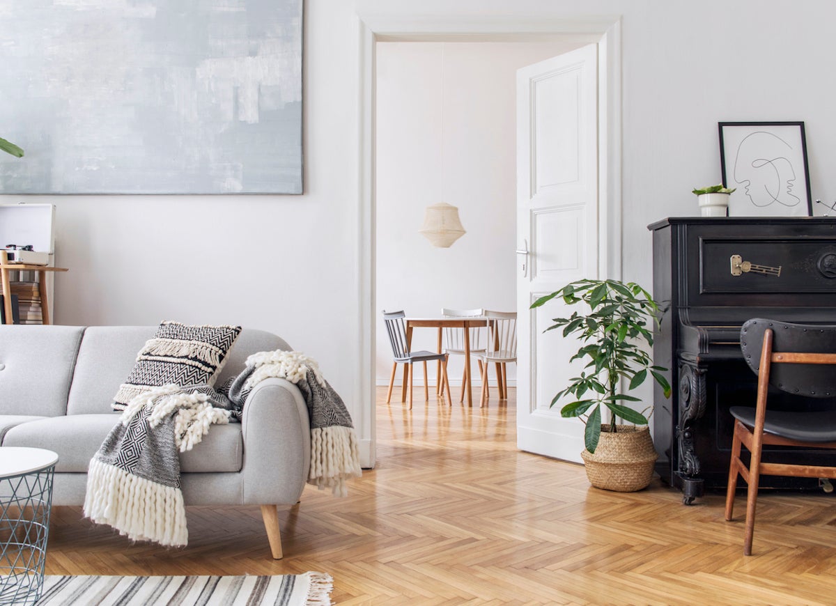
In the world of food, people often use vanilla as a descriptor for something plain. But in reality, vanilla bean is anything but boring. The same goes for paint. While white is indeed an absence of color, many white paints contain subtle infusions of color. Picking the right shade of white does wonders for a space. But which whites are the best? We surveyed several design pros to find out their go-to shades of white.
Related: 7 Things You Need to Know Before Painting Your Walls White
Sherwin-Williams Extra White
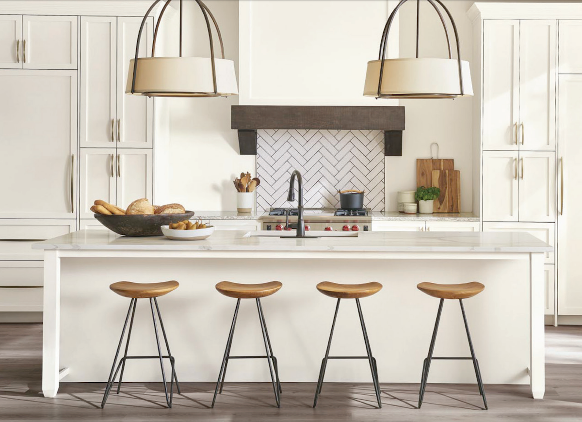
Nikki Levy, whose South African background inspires her design aesthetic, is the creative director of Nikki Levy Interiors. Her team often uses Sherwin-Williams Extra White because of its lack of undertone. The no-nonsense neutral is perfect for spaces where a crisp, fresh design is the goal. It works in plenty of rooms, even ones filled with warm-toned furnishings. However, Levy cautions, “Just remember, put samples up first! Paint color is an art and not a science.”
The Best of Benjamin Moore
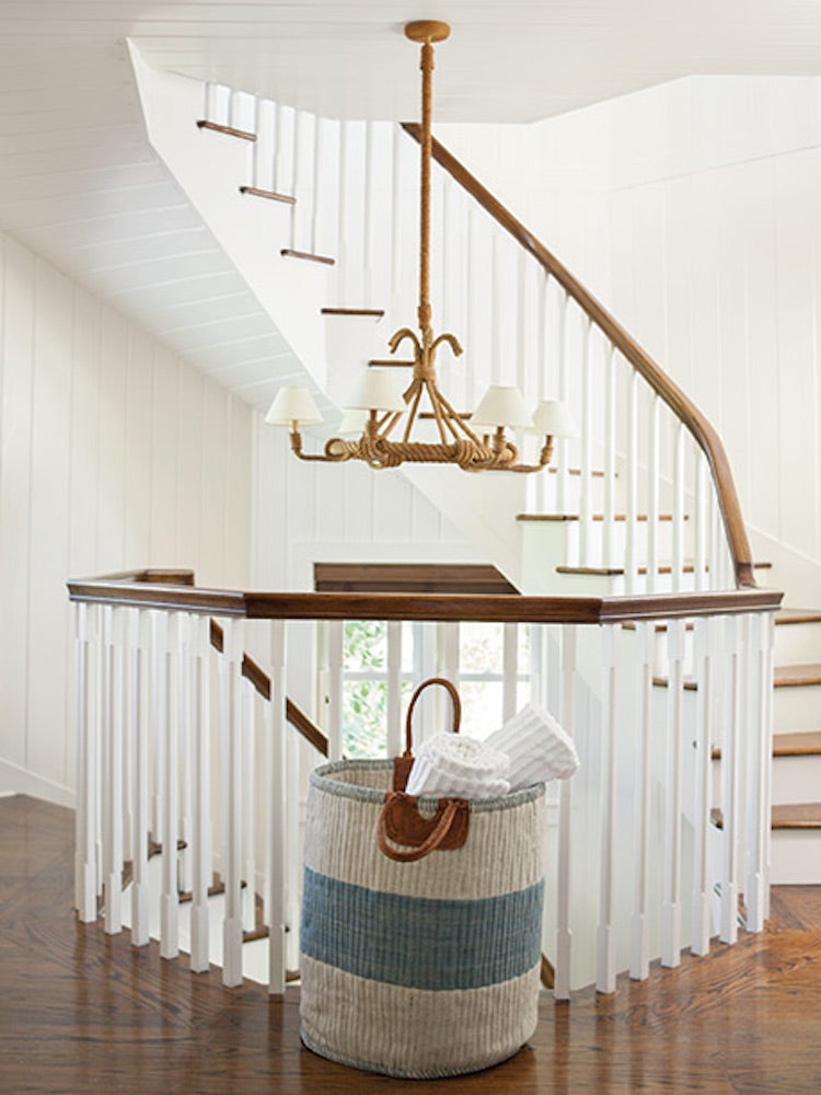
Larina Kase picks white shades according to her clients’ style, with the help of a design quiz that helps her home in on the right hue. “Light levels and floor color” are important considerations when choosing white shades, explains Kase, “A floor with honey-warm tones can reflect and make the walls look more yellow than desired.” While the perfect pick takes a bit of artistic detective work, she favors white paints from Benjamin Moore, including Super White, Chantilly Lace, White Dove (pictured here), Decorator’s White, Vanilla Milkshake, and Steam.
Greige
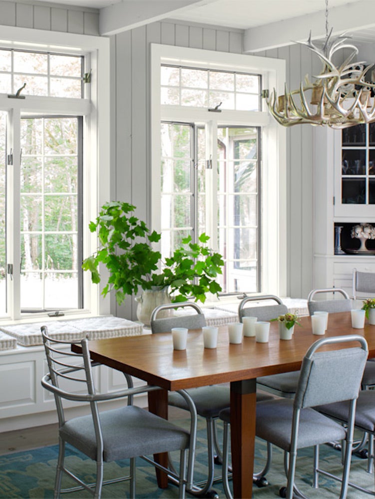
Roy Kim of Roy Kim Design tells it like it is: “The most useful paint color in any interior design is white.” His favorite white hues are those he calls “greige.” These are whites with a warm, subtle grey essence. He explains that choosing the ideal shade of white involves a bit of color balancing. In a room full of mahogany or cherry wood, painters might want to stay away from whites with green undertones to avoid intensifying the red tones in the room. In this scenario, he suggests going greige.
Benjamin Moore Super White
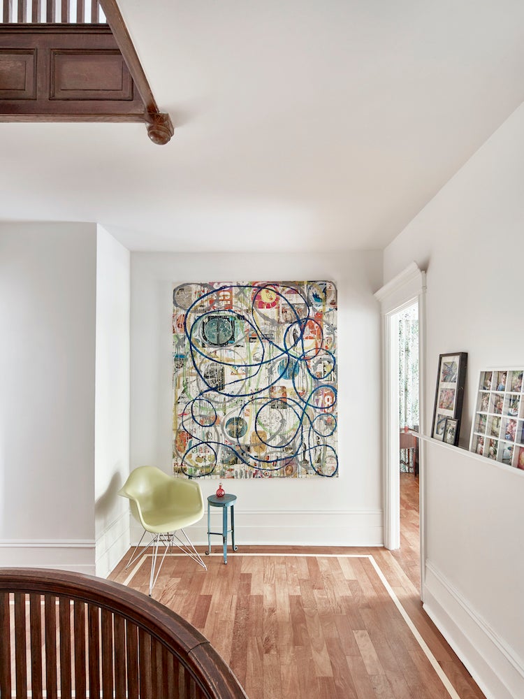
JMorris Design
Jennifer J. Morris, Principal at JMorris Design, loves the simple, clean quality of Super White from Benjamin Moore. She loves that the color works well with both cool and warm tones. “It’s my go-to from kids rooms to hallways where you need the walls to play nice with other colors and spaces.”
Sherwin-Williams Favorites

Tori Aston; Carla Aston
Carla Aston of Aston Design Studios loves Sherwin-Williams Aesthetic White so much that she chose it for her own home. She explains that she uses the paint color in many of her designs because the paint’s taupe tone pairs well with travertine floors. Sherwin-Williams Alabaster is her frequent pick for situations that require a light warm white. “[It] has enough warmth not to look harsh.” For trim work on cool gray walls, she opts for Sherwin-Williams Extra White. “It makes those grays look really sharp.”
Benjamin Moore Decorator’s White
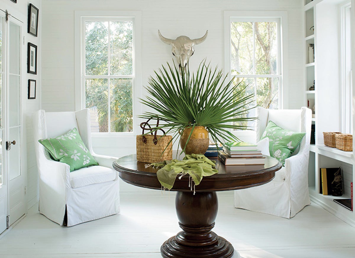
Kate Reggev is a practicing architect based in New York whose go-to white paint is Benjamin Moore Decorator’s White. “It never feels cold or harsh like some of the pure whites,” she says. “It’s fresh, clean, and goes really well with a range of other colors, like grays and blues.” For non-pros struggling to find the right white paint, Reggev suggests testing the color first. “Nothing beats getting an actual paint sample and testing it out!”
White Cliffs by Portola Paints & Glazes
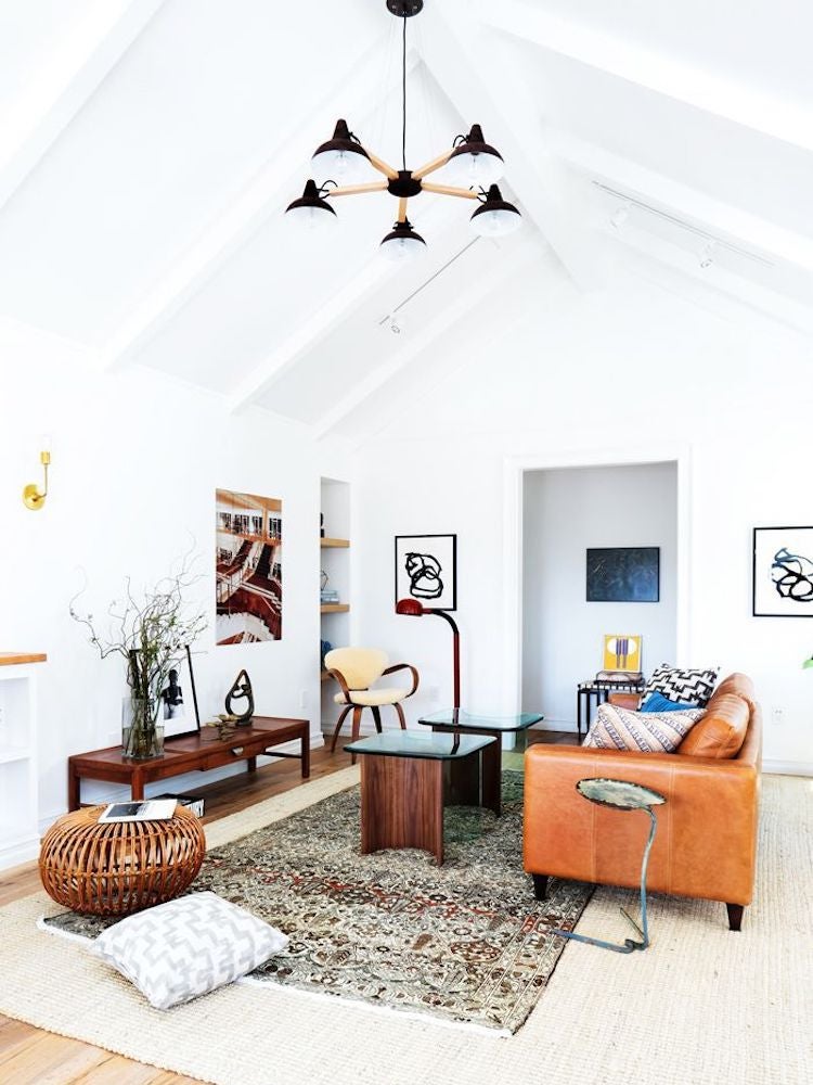
Tessa Neustadt; Stefani Stein
Stefani Stein, an interior designer based in Los Angeles, favors a relaxed and refined aesthetic, which may inform her white paint color pick, White Cliffs by Portola Paints & Glazes. “It is bright and crisp with just the slightest touch of warmth,” she says.
Benjamin Moore Simply White
Erin Kunkel for Lonny; Lauren Nelson
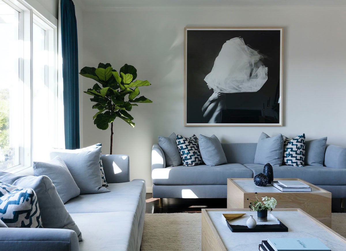
The pros at Lauren Nelson Design prefer to go neutral when dealing with minimalist spaces. It’s why one of their favorite whites is Benjamin Moore Simply White. The paint color is clean and bright without being too harsh. The team explains that it’s a particularly good fit for dark rooms that don’t get much natural light.
Farrow & Ball Schoolhouse White
Kate Charlotte; Cortney Bishop
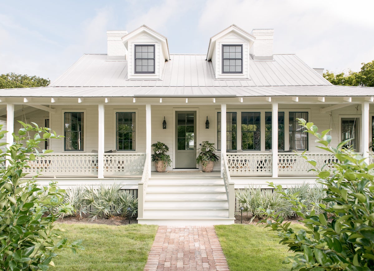
When asked about her top white paint picks, Cortney Bishop, a Charleston-based designer, shared that her recent go-to color is Schoolhouse White from Farrow & Ball. “It’s an old-school white that seems familiar and cozy,” she says, adding that the hue is plenty bright enough to make an impact. Her other top-rated white is Benjamin Moore White Dove. She bills it as a perfect option for those looking to paint most of their home white. It’s a serene hue that strikes a delicate balance between cool and warm.
Fresh Paint Picks
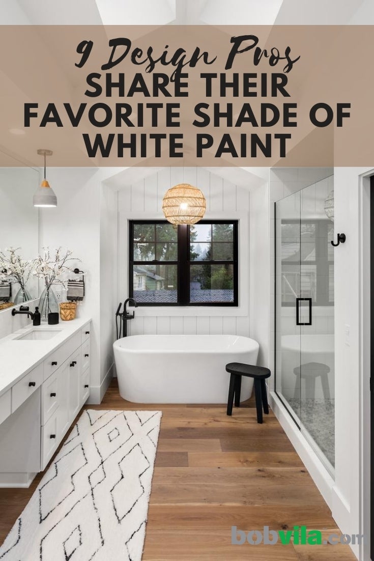
Choosing white paint is anything but simple. Let the pros help you out!

Everything You Need for a Lush and Healthy Lawn
Keeping your grass green and your plants thriving doesn’t just take a green thumb—it starts with the right tools and supplies.
