We may earn revenue from the products available on this page and participate in affiliate programs. Learn More ›
Island Fever
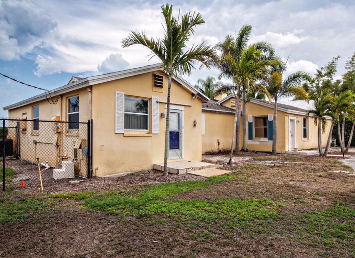
Peeling exterior paint, too-small white shutters, and a dead lawn made this Miami pad look like a no-man’s-land. Plus, without even a patio, the house lacked a designated spot for the homeowners to sit outside and soak up the Florida sun.
Tropical Paradise
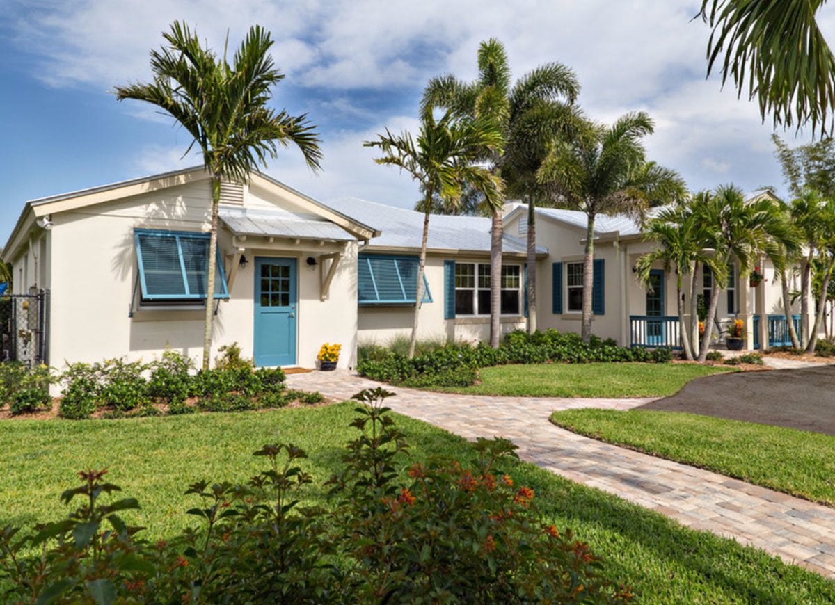
GM Construction responded to the monumental challenge of making over these run-down digs by devising a Key West-inspired design. The transformed cottage channels the beauty of the islands with crisp white paint and breezy blue shutters. Homeowners and guests alike can mix and mingle on the covered patio, an addition that’s enclosed by a blue fence and surrounded by lush yet low-maintenance landscaping.
Weary in White
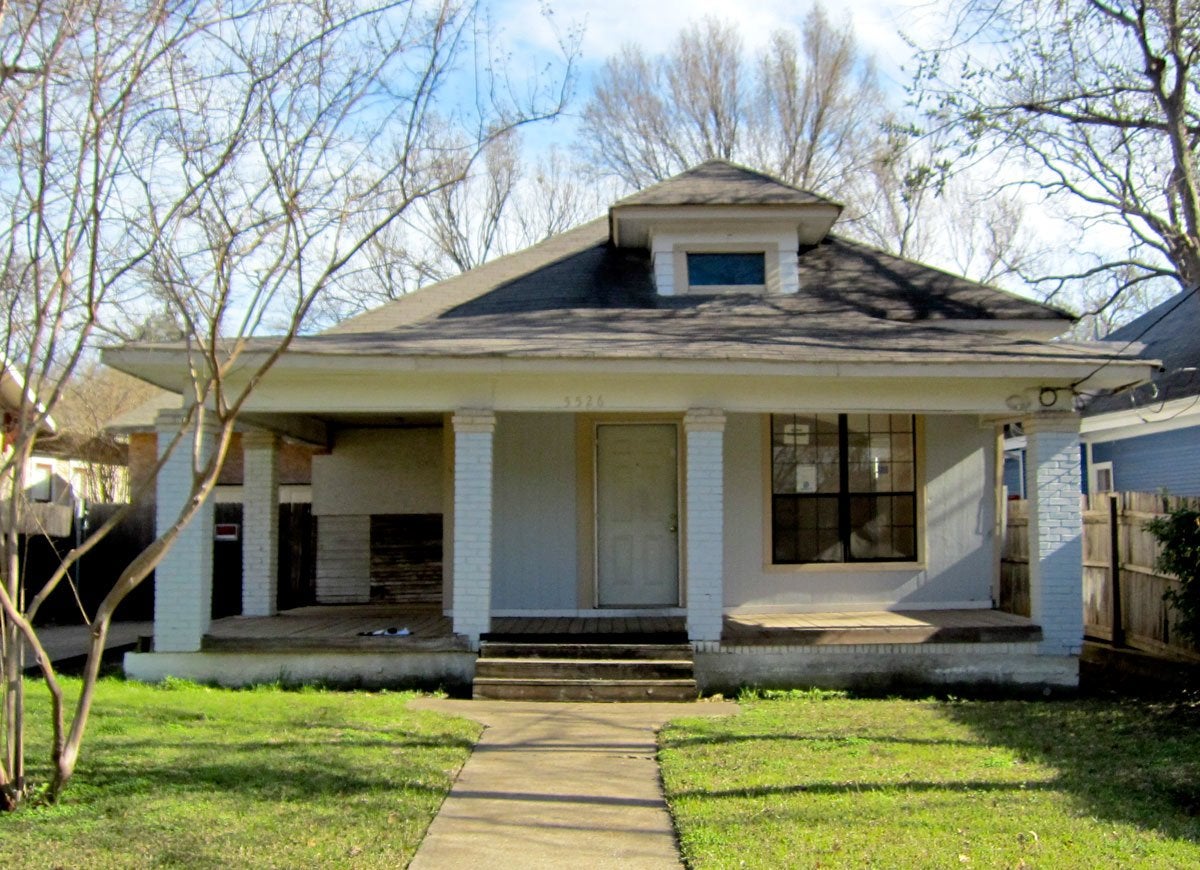
As evidenced by the faded white exterior and austere brick pillars, dated door trim, and weathered veranda floor, time had clearly taken its toll on this historic home in Dallas. With more weeds than grass, the forlorn lawn utterly demolished what little curb appeal was left.
Related: 12 Easy and Inexpensive Ways to Upgrade Your Home’s Exterior
Glammed Up in Gray
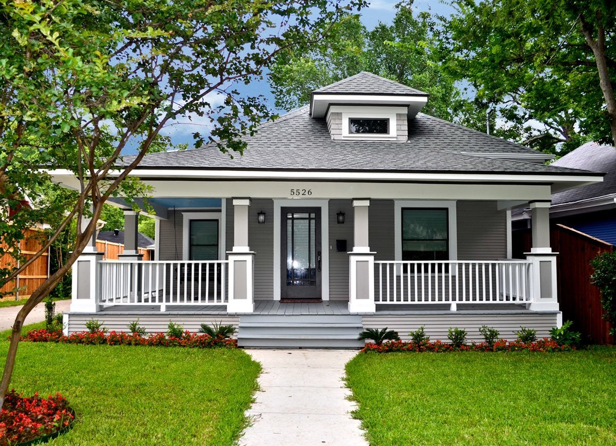
While Creative Architects gave a nod to the history of the house by largely preserving its charming architectural details, the firm did not shy away from making major exterior changes to boost curb appeal. Slate-colored paint pops against the sharp white trim; complementary hues unify the veranda’s flooring, fencing, and pillars; and a luxurious turf with thriving trees and annuals provides the finishing touch that creates a truly photogenic property.
Drafty and Dated
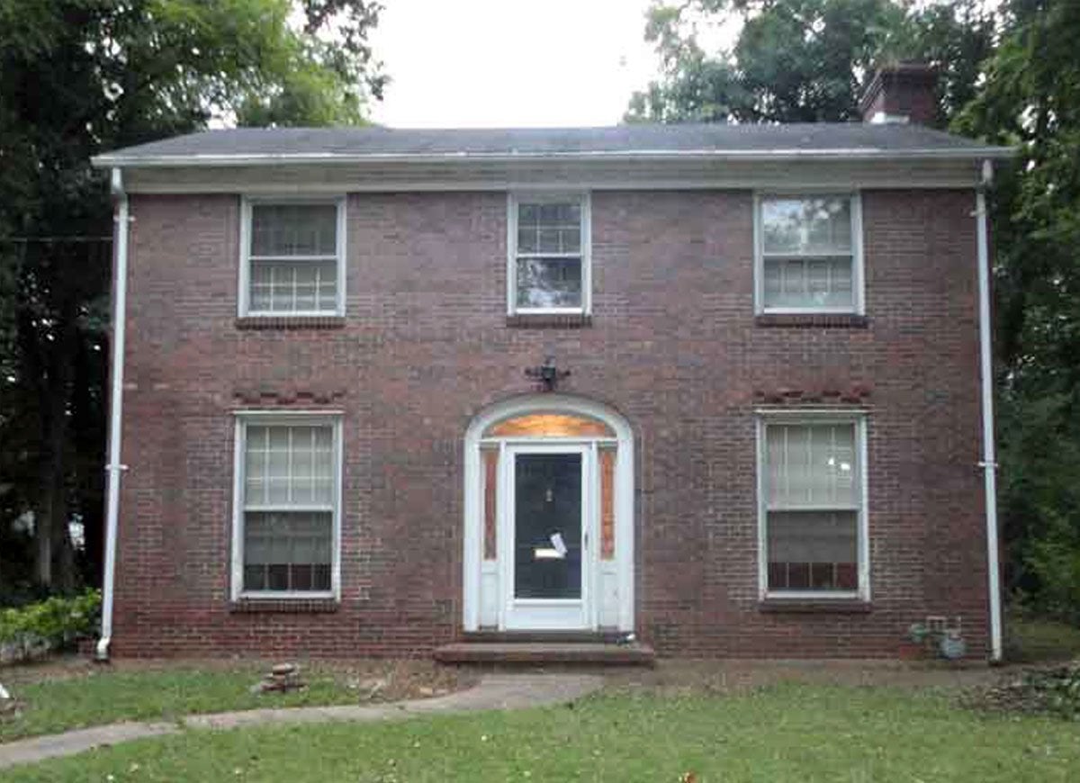
Not long after moving into this historic brick house in Kentucky, the new owner was forced to confront the occasionally ugly realities of living in an old house. Devoid of both landscaping or lively color, the imposing home looked cold and unwelcoming, and draft-prone windows made the dated structure not only unappealing, but also downright uncomfortable.
Related: 16 American Towns Every Old-House Lover Needs to See
Efficient and Elegant
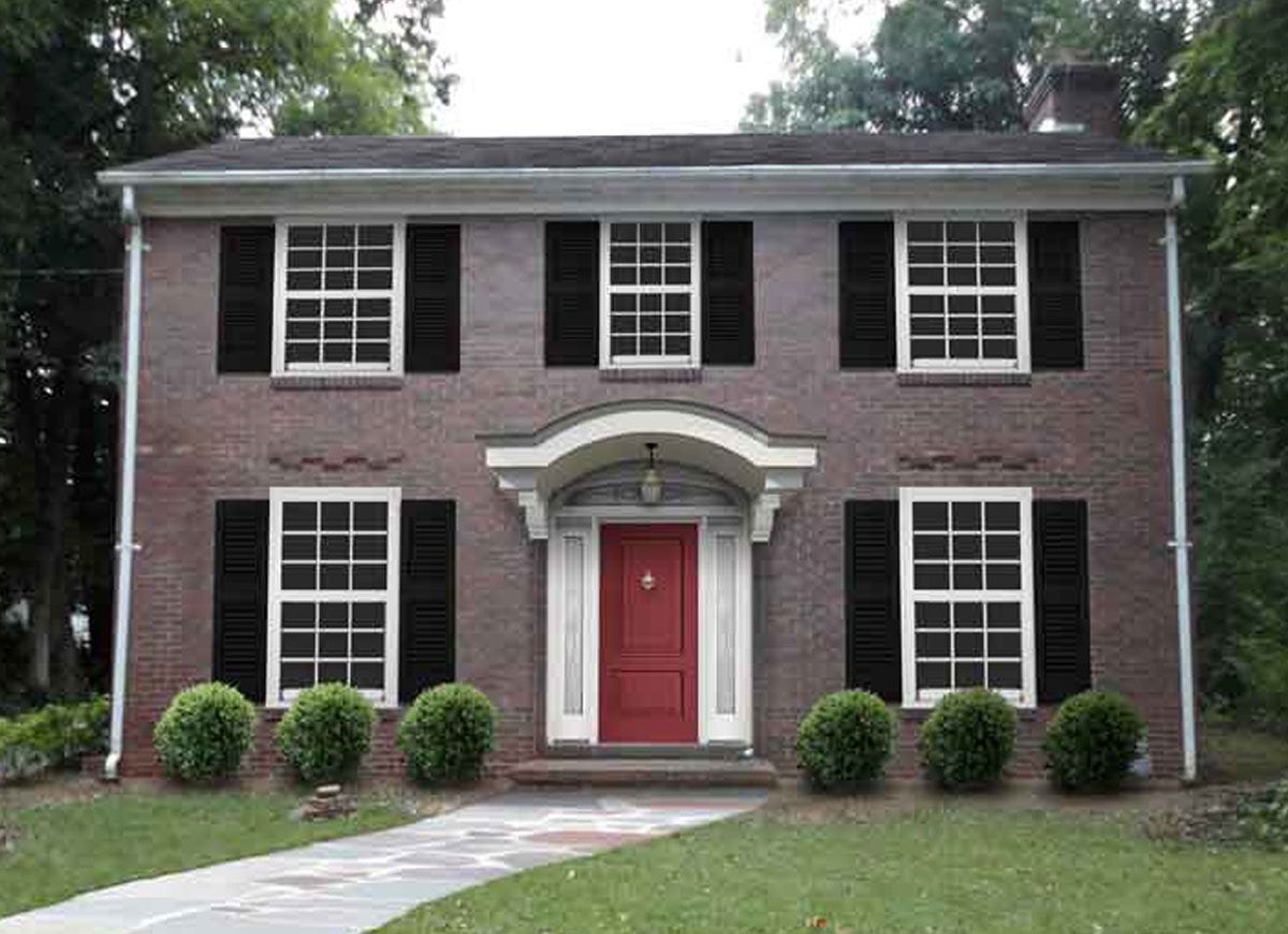
Determined to improve the ugly abode rather than move again, owner Holly Roarke enlisted the help of Kate Smith of both Sensational Color and DaVinci Roofscapes to initiate a series of improvements that ultimately upped the comfort and visual appeal of the home. The modern slate roof, new energy-efficient windows with white colonial grids, and a bold red door with sidelights and an ornate transom give a much-needed modern refresh to a classic.
History Under Wraps
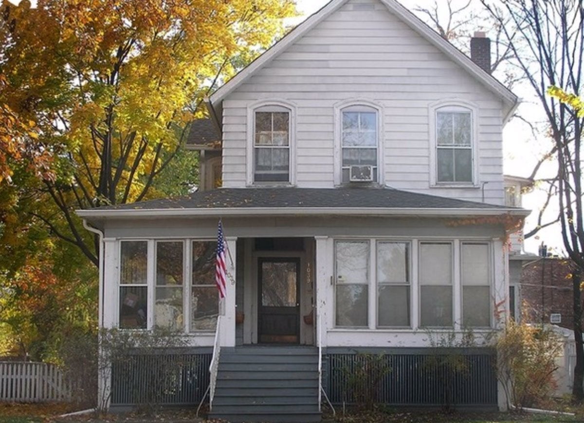
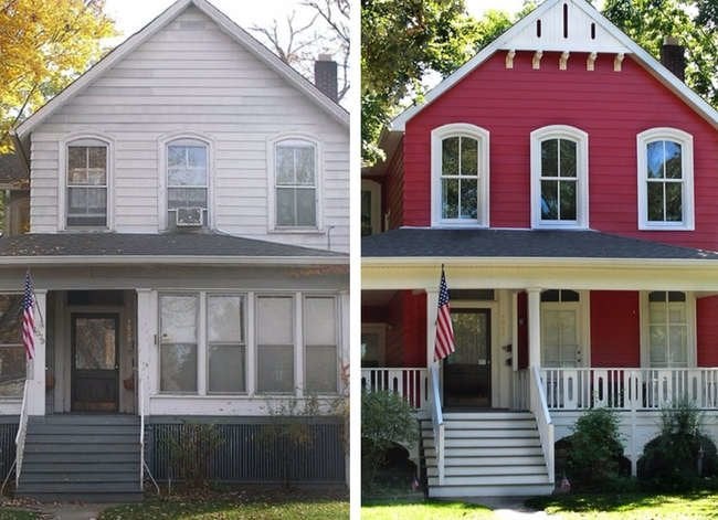
Outdated old-house features weren’t doing this Victorian farmhouse any favors. Washed-out white exterior paint, sad arched windows, and an enclosed wraparound porch all conspired to subtract space and style from the Chicago residence.
Related: 7 No-Fail Exterior Paint Colors
Modern Victorian
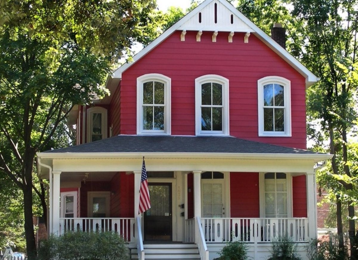
Seeking to restore the neglected relic to its former glory, Van Cleave Architecture + Design painted the exterior of the abode in a stunning shade of red, installed modern replacement windows and gable decorations, and opened up the wraparound porch to create a welcoming approach. The result? A dramatic dwelling as steeped in beauty as it is in Victorian tradition.
Dead on Arrival
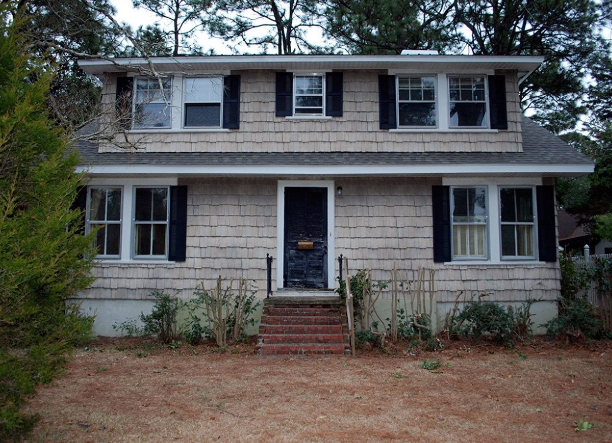
From the discolored and sagging gray siding to the broken windows, this Indiana home bore few traces of its former Midwestern charm. The shriveled shrubbery and withered lawn only confirmed that this was a residence in ruin.
Related: 12 Easy and Inexpensive Ways to Upgrade Your Home’s Exterior
Thriving in Blue and Gold
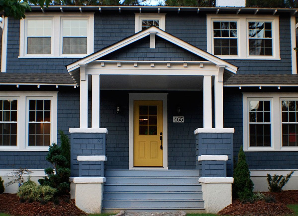
Not willing to give up on the home, Betsy and Sarah of The Estate of Things enlisted a group of committed contractors to replace the exterior siding and paint it a crisp navy blue, install a cheery gold front door, and create space for a new porch. With the addition of sky blue flooring, and a lush, manicured lawn, the postcard-worthy porch makes for the perfect spot to bask in the warmth of Indiana summers.
Spanish Without a Mission
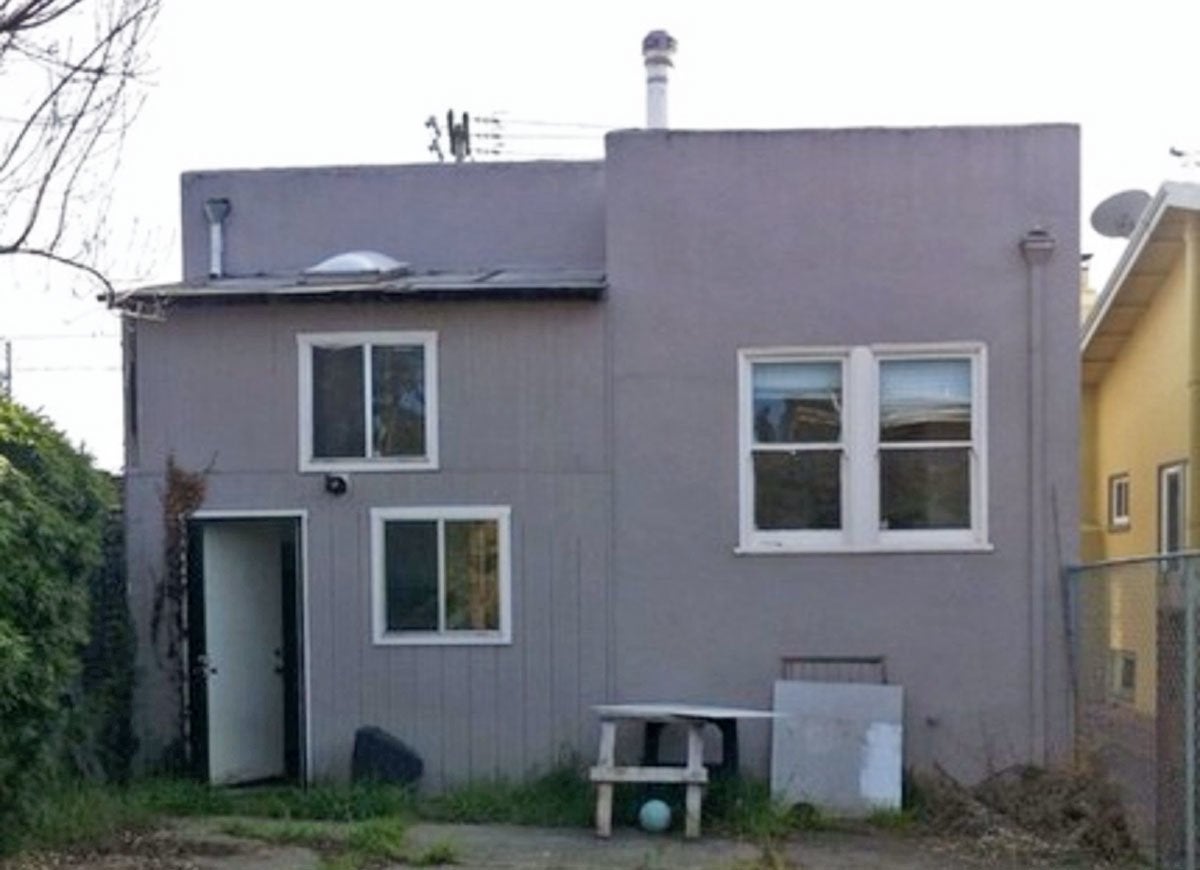
While the predominantly flat roof and stucco exterior of this San Francisco dwelling paid homage to the region’s Spanish-style homes of old, without the necessary maintenance and lacking a few key design flourishes, the subtle features were all but lost. The three lonely, unadorned windows and the absence of a prominent entryway made the bare-bones exterior feel both boring and unwelcoming.
Striking Split-Level
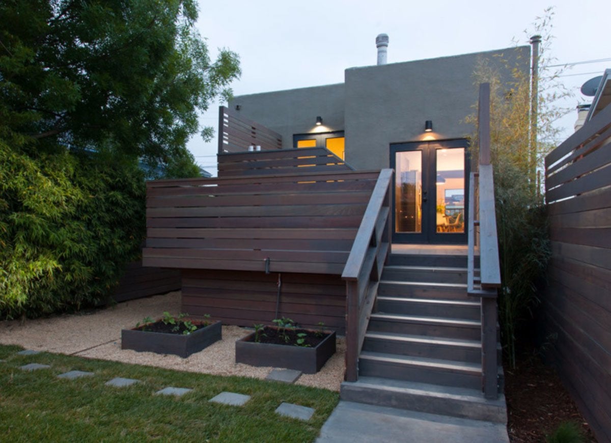
Baran Studio Architecture capitalized on the home’s sprawling yard to introduce a wraparound porch with a slatted fence that allows access from multiple points of the split-level residence. In the evening, sconces highlight the entry, and glass-paneled double doors reveal welcoming indoor illumination, while garden beds and square pavers on the pristine turf below add yet more visual interest.
Nonstarter Starter Home
laurelberninteriors.com and Nancy Keyes
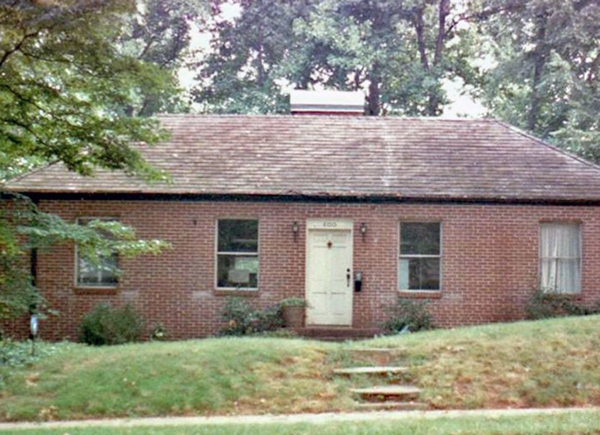
This home’s lack of a fence made privacy a luxury that the homeowners constantly longed for—but could never enjoy. Fading brick, a weathered roof, and a haphazard stepping-stone path all vied for the title of most outdated feature of this starter home.
Lifetime of Luxury
laurelberninteriors.com and Nancy Keyes
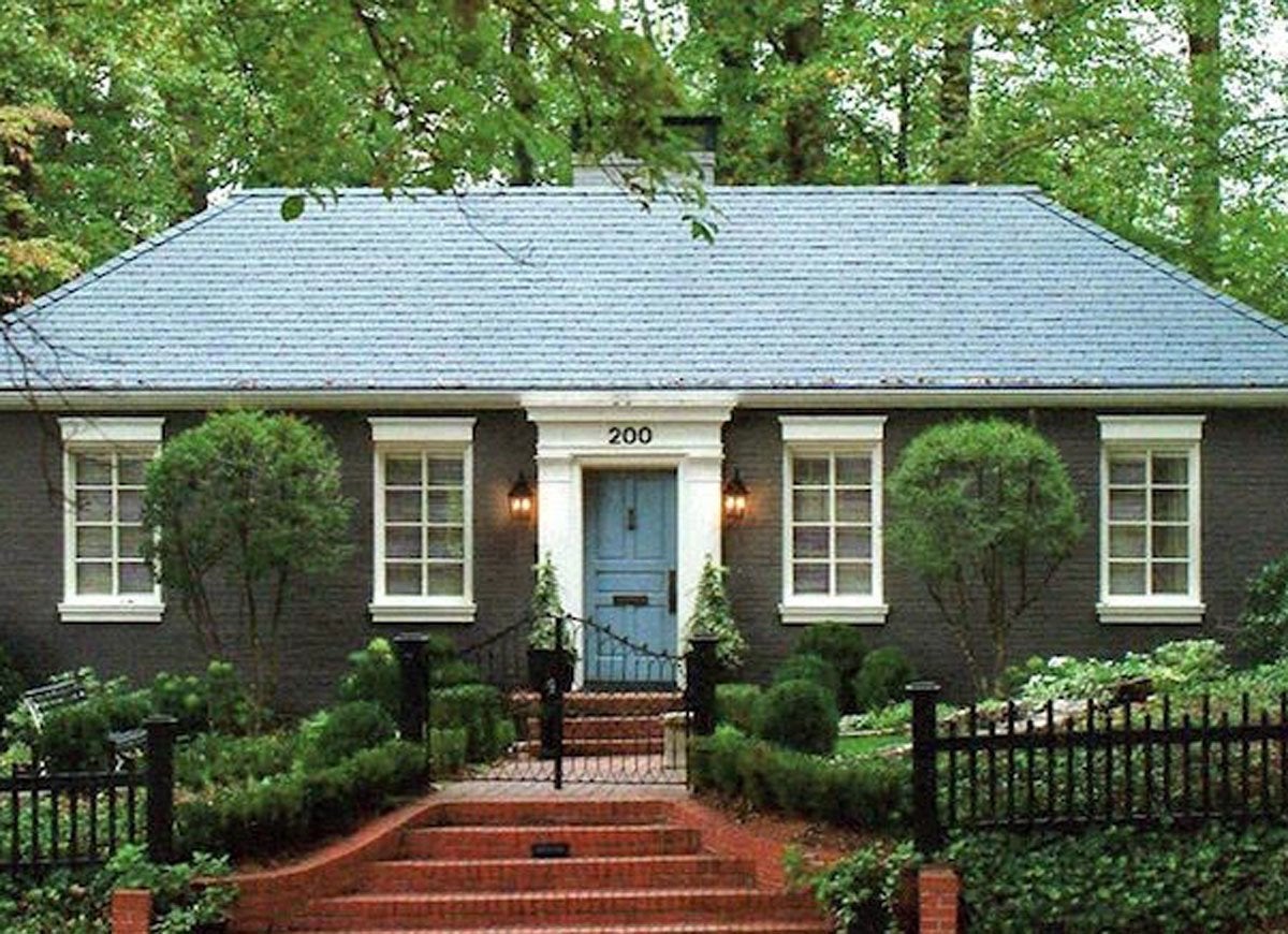
A few coats of forest green paint on the exterior, a new roof, a bright blue door, crisp white windows with substantial trim, and matching molding above the door each did their part to roll back the years on the aging home. But it was the fanciful iron fence, red brick pathway, and well-considered landscaping that transformed the dreary dwelling into a regal residence.
Retro Rooftops
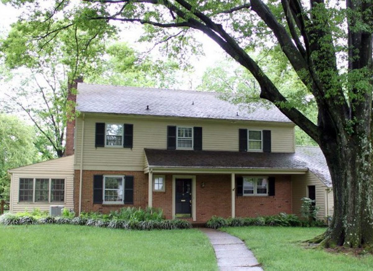
Bearing an uncomfortable split-design siding of fading beige and brick, this retro two-story home, born in the sixties, was well past its heyday. The portico only exacerbated the exterior’s problems by covering three-quarters of the facade with a visually heavy black roof that prevented natural light from entering the windows on the ground floor.
Timeless Two-Story
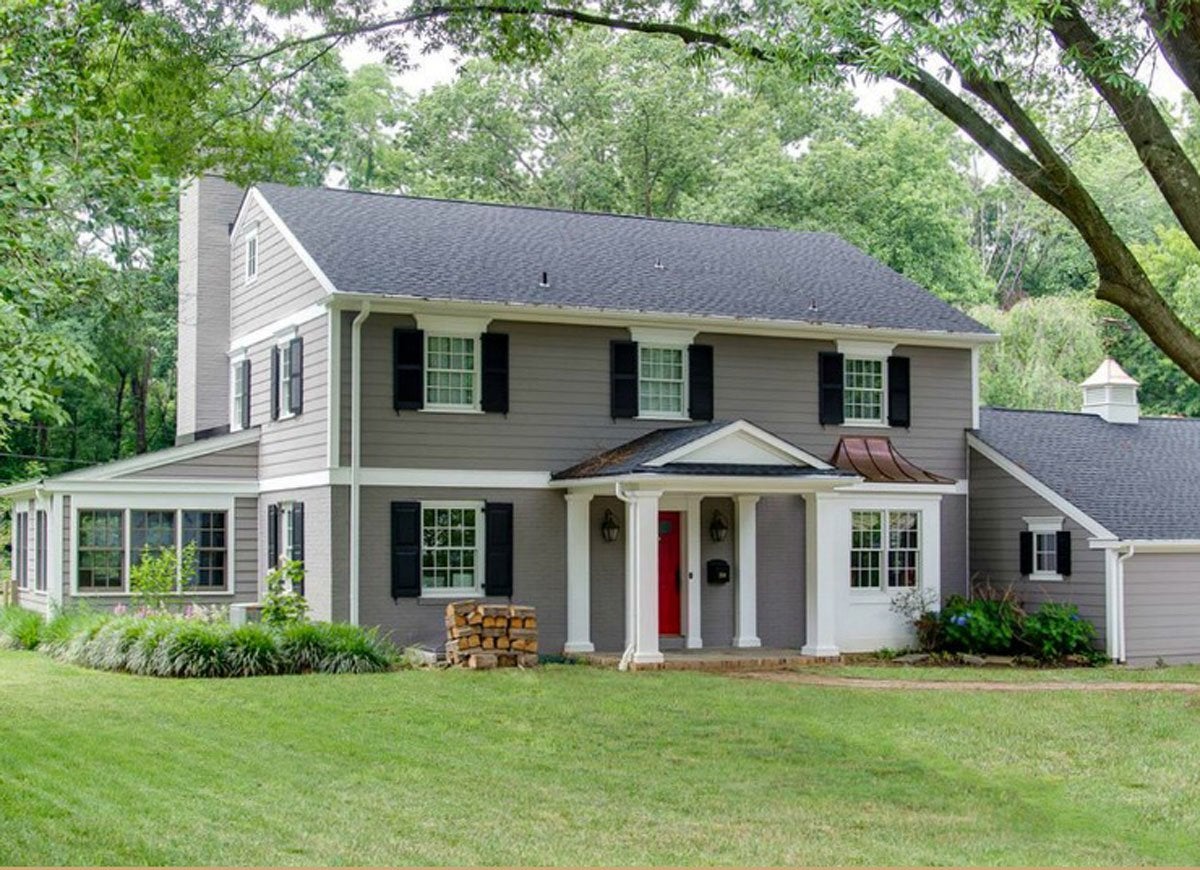
Cushing Custom Homes pulled out all the stops to revamp the frumpy Delaware dwelling, installing new siding, windows, and a energizing red front door. The addition of Colonial-style features, from the cupola on the garage roof to the dramatic front porch supported by traditional columns, lends antique intrigue to the updated home.
Stony Exterior
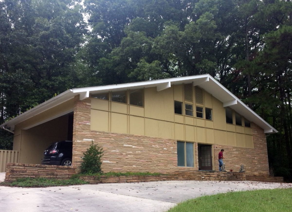
Washed-out brown brick and an empty expanse of beige paneling made a bland impression at this Raleigh-area residence. The sparse shrubbery and the absence of a prominent entryway diminished whatever good qualities the subtle brick siding had to offer.
Midcentury Modern Marvel
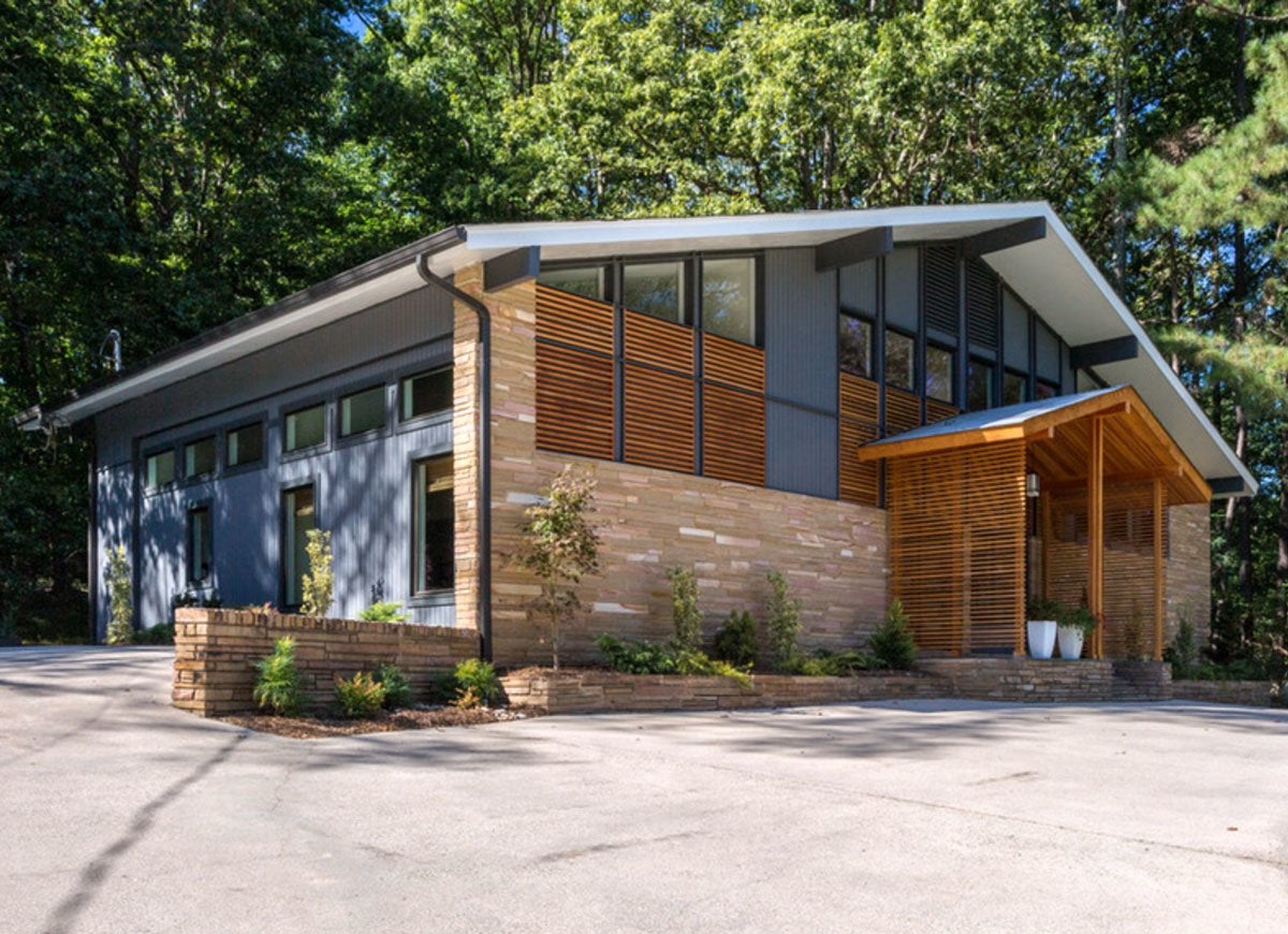
Installed below the windows and flanking the new front porch, fiery orange wood grates, constructed of fir, deck out the facade in striking color and texture. To further liven up this mind-blowing midcentury modern-inspired makeover, designer Barnett Adler added pops of blue in strategic places on the front of the home and the garage door.

Everything You Need for a Lush and Healthy Lawn
Keeping your grass green and your plants thriving doesn’t just take a green thumb—it starts with the right tools and supplies.
