

We may earn revenue from the products available on this page and participate in affiliate programs. Learn More ›
Color of the Year
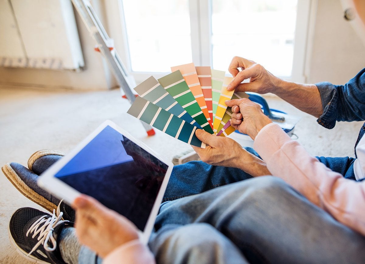
Ever since Pantone began announcing a color of the year (COTY) in 1999, the practice has caught fire. Today, more and more brands have been forecasting and promoting their own unique COTY shades. Is there a science behind their selection process? Keep reading to find out how they do it.
They Observe Culture

Behr
“Our color marketing team reviews trends in fashion, architecture, design, pop culture, travel, and many other areas, all of which help inspire the color forecast we ultimately land on,” says Erika Woelfel, vice president of color and creative services at Behr. “Each color of the year tells a story that’s tied to micro and macro trends we’re seeing.”
They Travel the World

Representatives from Benjamin Moore spend “months researching and traveling around the world.…Then the next step is bringing that information back and determining what the common threads are between these different disciplines and areas of the world,” explains Andrea Magno, a color and design expert at the company.
They Surf Pinterest
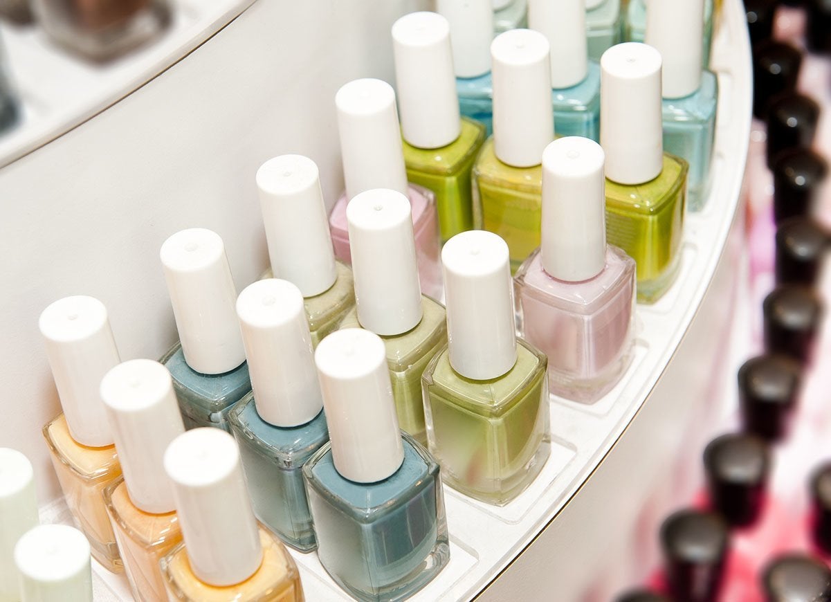
The internet is a huge source of information and inspiration for COTY nominees. “We look at Pinterest to see what people are looking at for paint projects, and in the cosmetics industry there’s always a slew of fresh nail polish colors each season,” shares Behr’s Erika Woelfel.
They Talk…a Lot

Choosing a color of the year often sparks intense debate, according to Sue Wadden, director of color marketing for Sherwin-Williams: “We get together and talk about our findings and pinpoint standout colors. It’s a really intense and fun process.”
Timing Matters

Paint brands time their COTY announcement very precisely. Benjamin Moore releases its choice in October, when the New York Fall Design Market is in full swing. Sherwin-Williams builds anticipation all year long by sharing a Colormix Forecast in the spring, from which a single COTY is chosen later in the year.
It’s Personal

For Ashley Banbury, senior color designer at Pratt & Lambert, the COTY process is personal: “Ultimately, what differentiates me from other color designers is my own lens, through which I interpret what I see. I craft a story around color and determine ways to integrate that story into your home.”
It’s About You Too
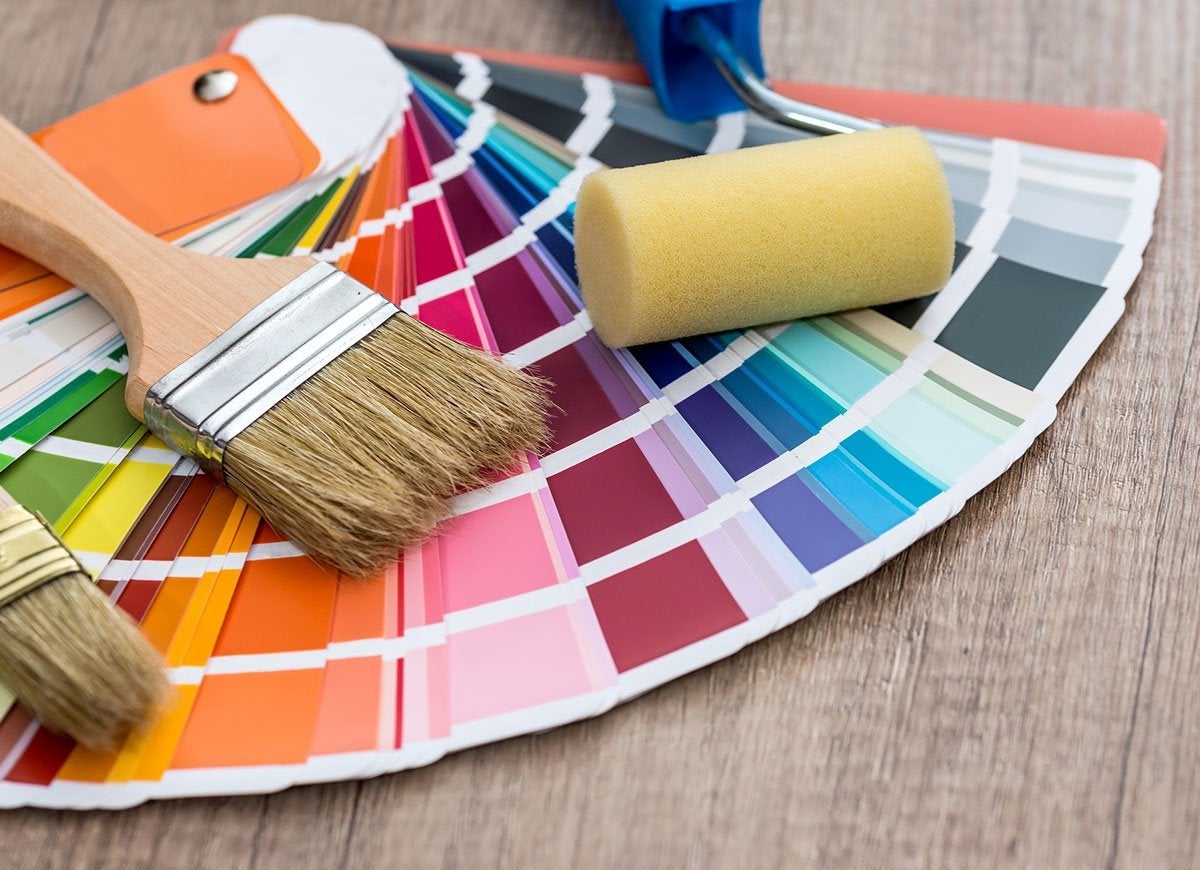
After crunching all the data and engaging in lively debate, industry insiders want to get into their customers’ heads and homes to help them make informed choices. COTY empowers customers to “consider colors they may not have found on their own,” explains Erika Woelfel of Behr.
Decisions Are Emotional
PPG
“We recognized that in today’s anxious, technology-driven society, many of us are feeling overwhelmed and craving a sense of peace and reassurance,” observes Dee Schlotter, senior color manager at PPG. Sue Wadden of Sherwin-Williams affirms: “We discovered that 2020 will see more focus on wellness and being your best self.”
Related: 12 Exterior Paint Colors That’ll Help Sell Your House
This Year, It’s Good to Be Blue
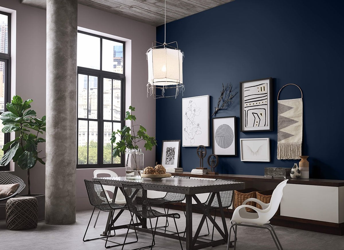
Sherwin-Williams
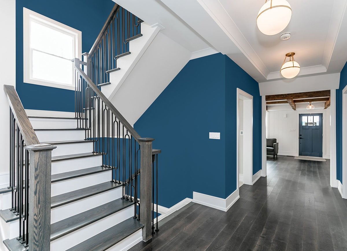
At least three brands have selected shades of blue for their 2020 color of the year: Pantone went with Classic Navy, PPG chose Chinese Porcelain, and Sherwin-Williams selected Naval. “The rich hue creates a calm and grounding environment drawn from the infinite night sky and the mysterious depths of the sea,” says Sue Wadden of Sherwin-Williams.
COTY Leads to Profits
Why choose a COTY? According to Fast Company, brands see a marked increase in all paint sales thanks to the buzz surrounding a single color. In fact, Pantone credits its high level of brand awareness among designers and customers alike to its COTY program.

Everything You Need for a Lush and Healthy Lawn
Keeping your grass green and your plants thriving doesn’t just take a green thumb—it starts with the right tools and supplies.