We may earn revenue from the products available on this page and participate in affiliate programs. Learn More ›
Out With the Old Trends
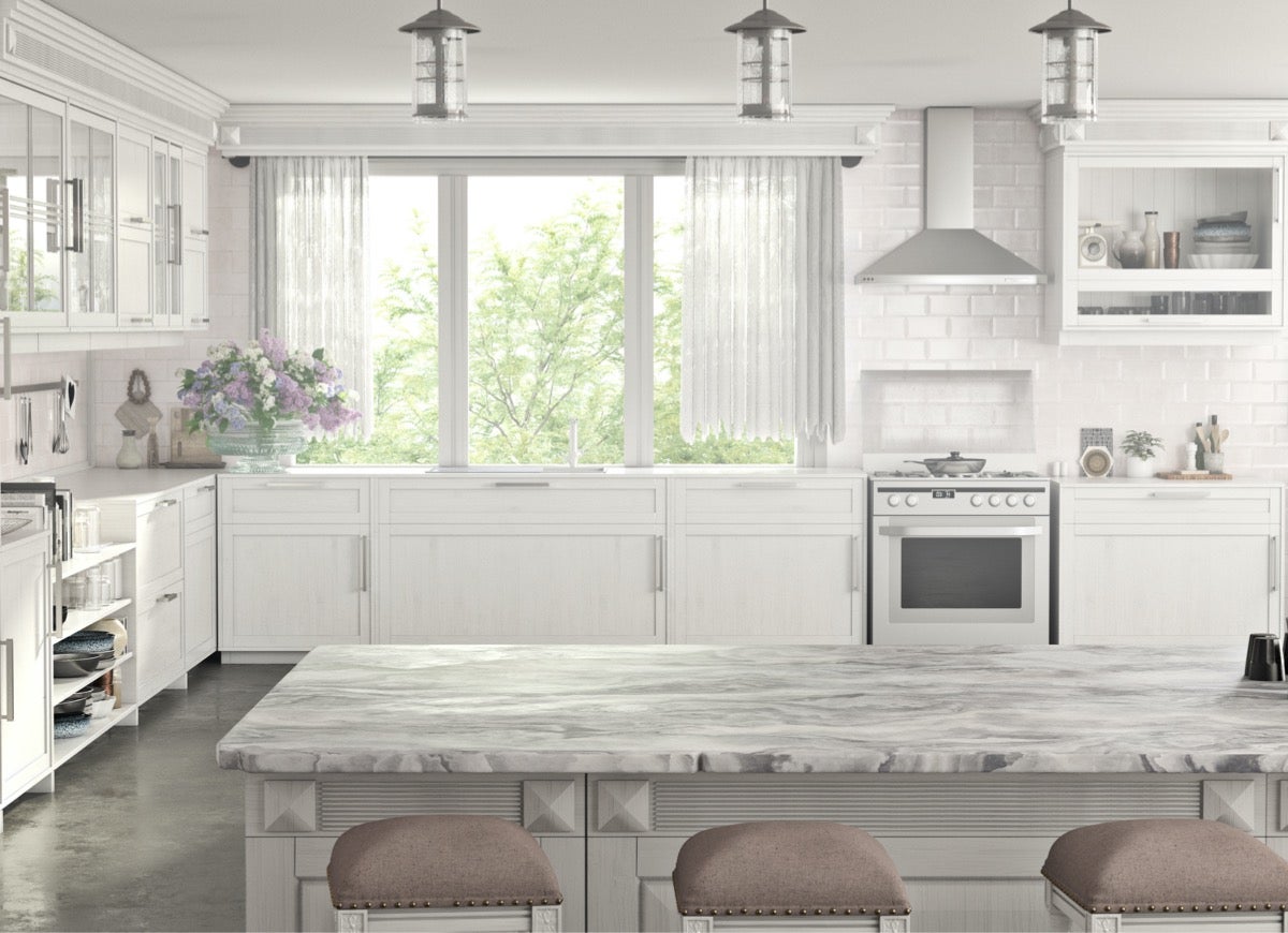
Good riddance to 2020. It was a year of decimated lives and livelihoods, and frankly, it couldn’t end soon enough. And now, 2021 provides a chance to push the reset button. But the pandemic isn’t the only thing to leave behind. There are some home trends that should also do a vanishing act. These are the 10 home trends DIY bloggers hope will disappear in 2021.
Barn Doors
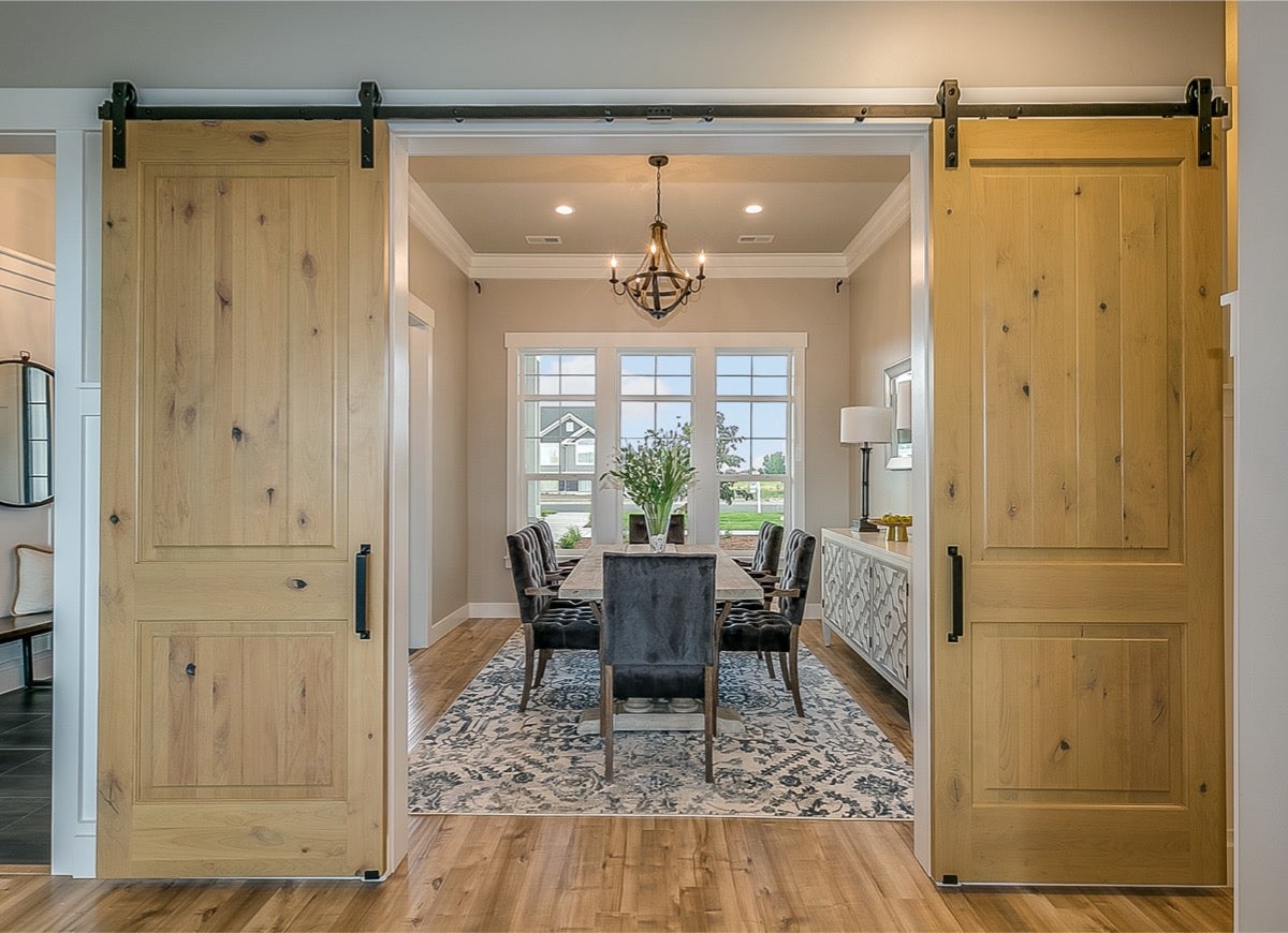
Barn doors are one way to incorporate farmhouse elements in any design. However, Tina Huffman, home and garden blogger at Greenhouse Studio, wants to shut the door on this trend. “Barn doors were made popular by Chip and Joanna, and they can look great, but they can also be tedious and noisy to slide open and shut every time.” And there’s another reason she’s over this trend. “They often don’t provide a secure close like a traditional door, which can be a bit awkward when used in a place where you might want privacy—like the entrance to your master bathroom.”
Monochromatic Neutrals
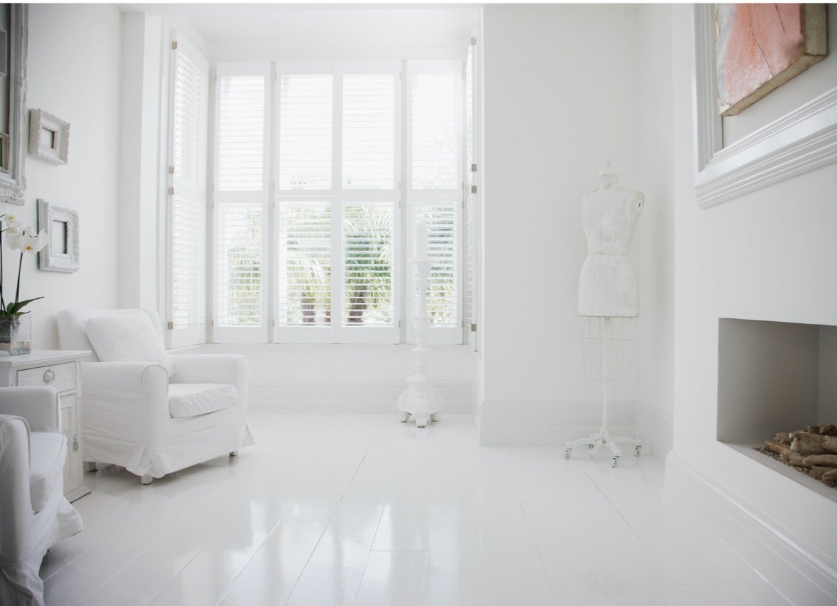
While monochromatic can be good, when taken too far, it becomes monotonous. And Huffman believes that monochromatic neutrals have crossed that line—especially white-on-white and gray-on-gray. “Both are indispensable neutrals, but they’re more impactful when balanced out by other colors,” she says. “Mix up your decor with contrasting neutrals, like off-white with charcoal for example, or with non-neutral accent colors.”
Huffman’s view is shared by Theresa Clement, an Ambler, Penn.-based DIY blogger at MyFixitUpLife. “While white and pale neutrals can create a pleasant and easy-to-add-to backdrop, it’s kind of sterile and too hospital-like for real life.” Clement recommends infusing some texture and life into those uber neutral spaces. “Whether it’s adding vintage sentimental pieces or bold power accents or going with trendy blue chinoiserie pieces, creating spaces that reflect your personality and uplift your mood are so important.” Especially now that we’re spending so much time at home, Clement says the space should be nurturing and comfortable. “Fabrics, colors, and lighting all can easily transform a space into a cozy home-nest.”
An All-White Kitchen
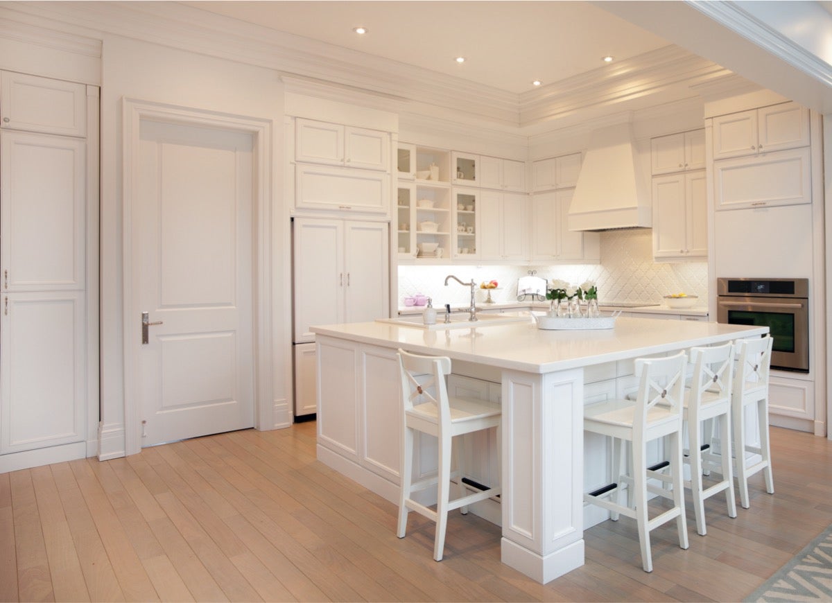
We’ve already heard from two DIY bloggers on why the all-white look has overstayed its welcome. But to Liz Alvarez, blogger at Building Our Rez, the cold, sterile, all-white kitchen in particular rubs her the wrong way. “Don’t get me wrong, we love to keep our own house light and bright, but doing a whole room from top to bottom in all one color can be a yawn.” And if you’re the type of person who actually cooks, she says keeping those white cabinets clean can be a challenge. “If you love the look of a light and airy kitchen but want to add more interest, try leaving the top cabinets white, but paint the bottom cabinets or the island an accent color,” Alvarez recommends. Another option is to get a softer color. “Or you can add a muted color backsplash or bring in some natural wood elements by cladding the back of your island or peninsula in wood.”
Related: 29 Best Paint Colors for a Kitchen You’ll Never Want to Leave
Open Shelving
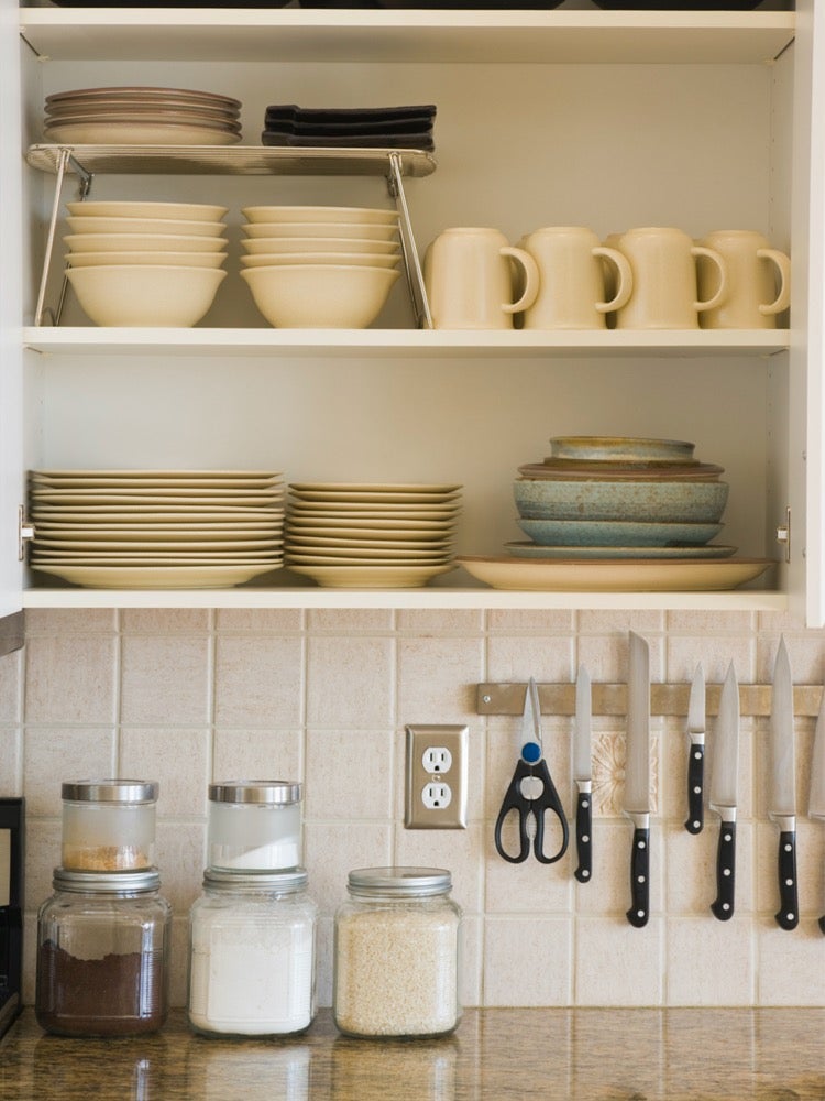
Open shelving in a kitchen provides additional storage and lets you show off some of your favorite items. However, Seattle-based DIY blogger Vineta Jackson, known as The Handyman’s Daughter, believes this trend has gotten out of hand. “While a few open shelves are great for displaying fancy dishes or glassware, an entire kitchen without any upper cabinets is a recipe for disaster,” she explains. For one reason, most people are doing the open-shelving-thing wrong. “Magazines show beautiful kitchens with just a few items per shelf, but in reality you’re just putting all your clutter on display.” And if that’s not bad enough, you’re also creating more work for yourself. “Those fancy dishes will need to be washed before you use them, because dust and dirt will collect on the surface quickly,” Jackson says.
Shiplap
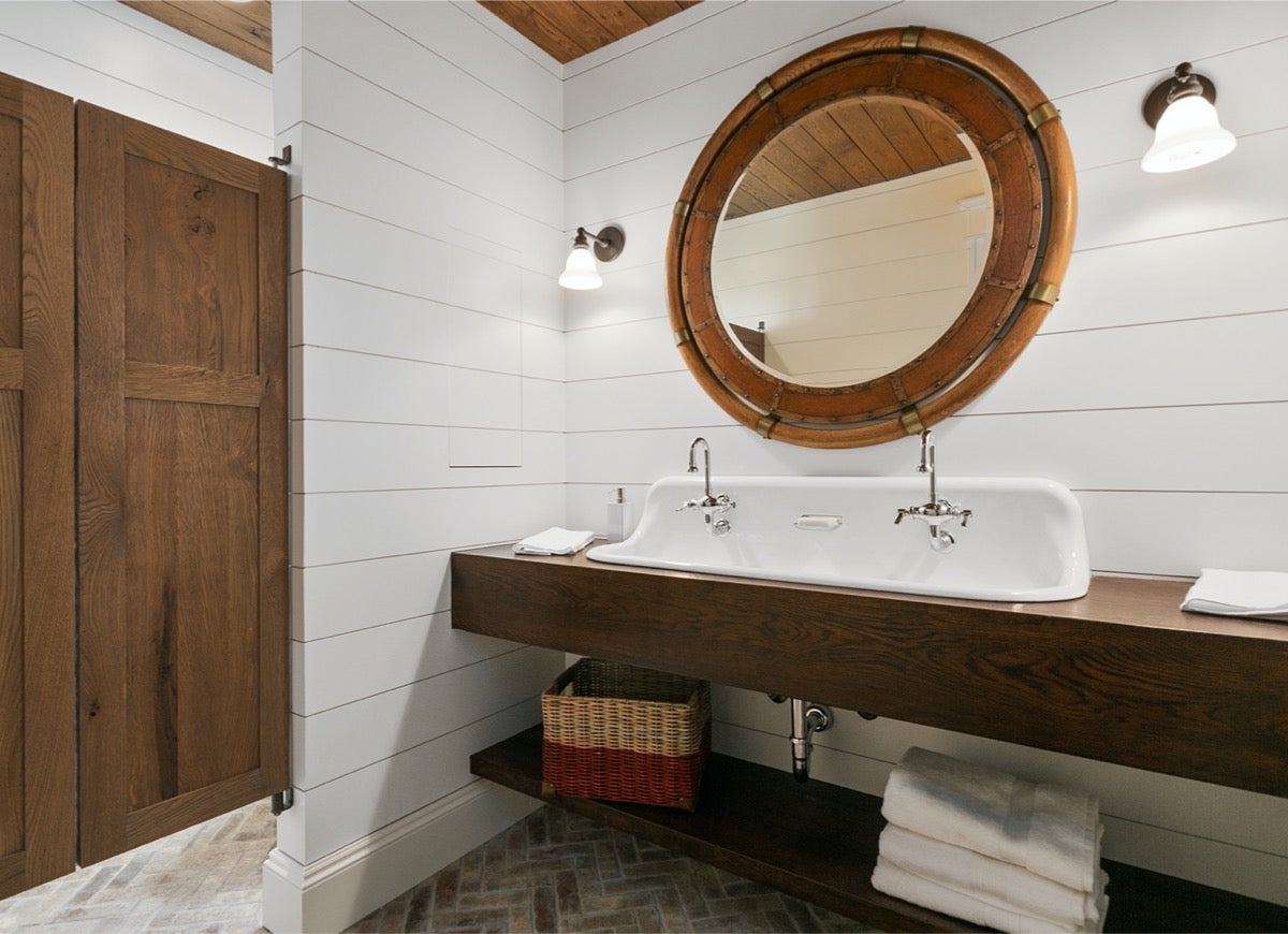
Shiplap is another rustic trend that may have overstayed its welcome. “Shiplap is a trend made popular by the show Fixer Upper that hopefully ends in 2021,” says Jackson. And she has a good reason to dislike this quaint design trend. “These wide wood plank walls are a magnet for dust between the slats, and they create hundreds of holes in your drywall that will need to be patched when you get tired of the look.”
Related: 17 Times Shiplap Made the Room
Open Floor Plans
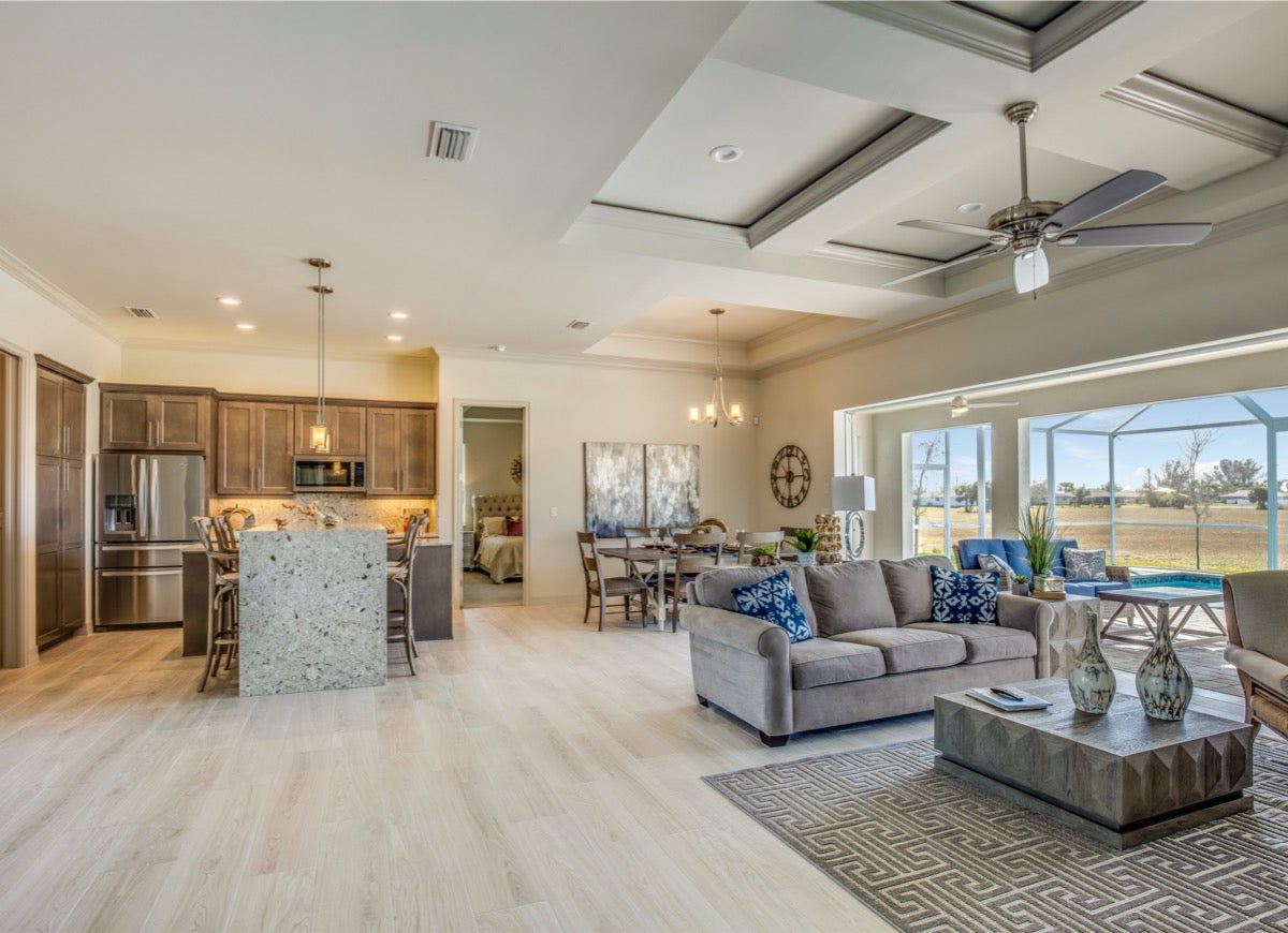
The view goes on forever with open floor plans, and that’s why Clement says she’s glad to see demand for this trend is dying out. “As we have always had a home office and a noisy, hectic household, I have personally never been a fan of the open floor plan,” she explains. “I like rooms within an open-ish floor plan with double-door sized openings that use pocket doors, or other kinds of sliding doors.” And with the pandemic in particular, Clement believes homeowners want the flexibility to create intimate spaces within the larger main floor living space.
Perfectionism
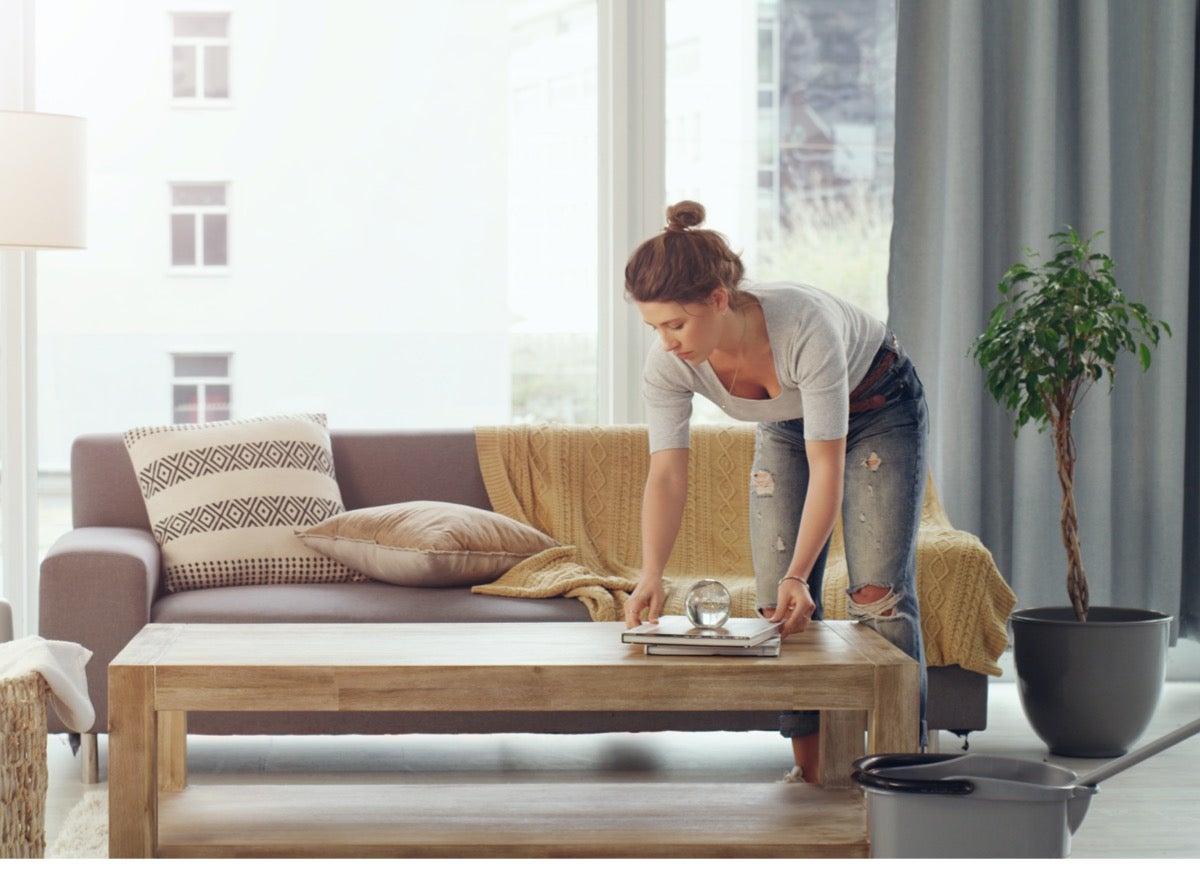
Perfectionism in any area is problematic, and that includes your home. “The perfection trend hasn’t been my favorite, so I hope the obsession with getting spaces Instagram- and Zoom-ready fades a little,” Clement says. She admits that it’s been nice to see inside other people’s homes during video chats. “I like that we’ve seen the real lives of people in pop culture throughout 2020 – we’ve seen their messes and that their kids and pets behave like ours.”
And her suggestion is seconded by JZ Shipp, DIY blogger at Just Might DIY
, who wishes people would stop designing/decorating according to trends. “It’s a home, not a set for a magazine photoshoot,” she says. “By their nature, trends are fleeting, but a home that reflects and brings joy to those who live in it will exude a sense of stability, so fill your home with the colors and things you love, and you can’t go wrong.”
Too Much Painted Furniture or IKEA Hacks
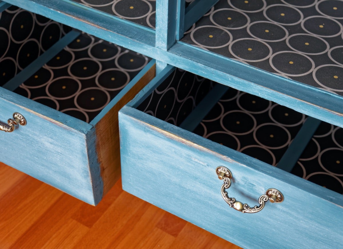
There’s a difference between using creative hacks and having a home that just looks hacked. “I understand the desire to cut costs and come up with something creative and unique for your home, but too much of a good thing can make your home look cheap,” warns Stephanie Purcell, a DIY Blogger at Redesigned Classics. “If you can pull off an effective hack to make your home look more intentional, then go for it, but the key is to off-set it with lasting pieces that are made to stand the test of time.” In fact, if you spend more money on a nice piece of furniture, she says it will save you in the long run. “If you insist on painting your furniture, then take the time and do it correctly, making sure to sand it properly and use high quality primers and paint.” If not, Purcell warns that it will start flaking and look even worse than when you started.
Greige Walls
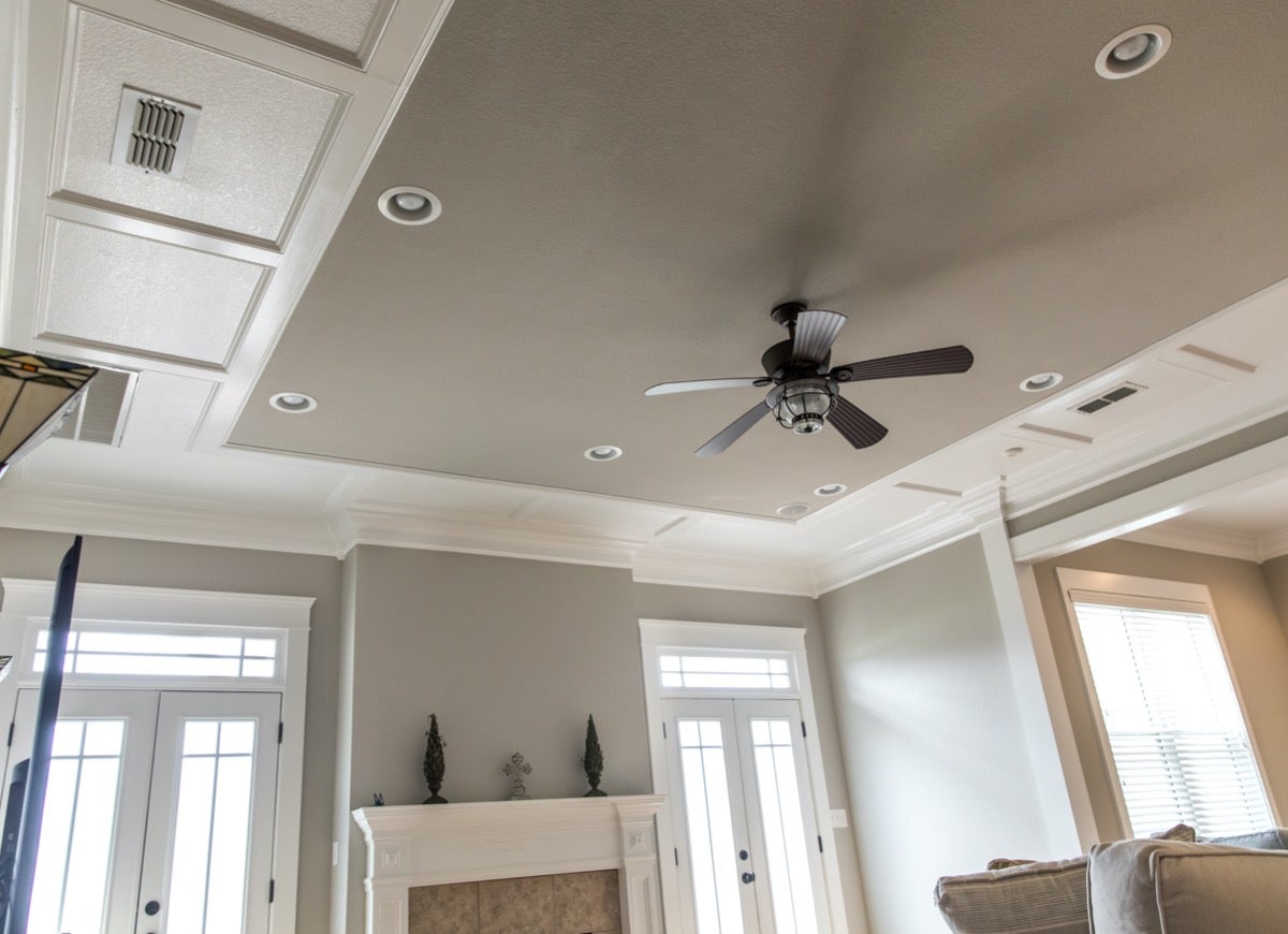
Greige is a combination of gray and beige–and it’s an immensely popular paint color. However, Purcell says it makes homes look drab. “While greige fades perfectly into the background, it lacks any life or style,” she says. “You don’t have to choose a bright green, but a light blue really helps open a space.” And with so many peel-and-stick wallpaper options available, she recommends embracing patterns. “This doesn’t mean you need to have a full jungle theme on your wall, but a subtle gold and white geometric pattern makes a much more interesting backdrop than just a greige wall.”
Random Pops of Color

While pops of color can be good, random pops can look haphazard. “Colourful interiors can be a lot of fun, and adding occasional splashes of colour with artwork, a statement piece of furniture, or soft furnishings can be a great way to introduce colour into your home,” advises Christine Wessling, DIY blogger at Little House On the Corner. However, random pops of color can be fun, but they don’t help to create calm and peaceful interiors, which, after a turbulent year, we’re gravitating towards.” So what does she recommend? “Replacing over-saturated pops of colour with a softer and more muted colour palette, natural textures and materials, along with a more thoughtful approach to interior design, will result in spaces that are much more coherent, serene and sophisticated.
Everything You Need for a Lush and Healthy Lawn
Keeping your grass green and your plants thriving doesn’t just take a green thumb—it starts with the right tools and supplies.
